Setup & Settings Panel Breakdown
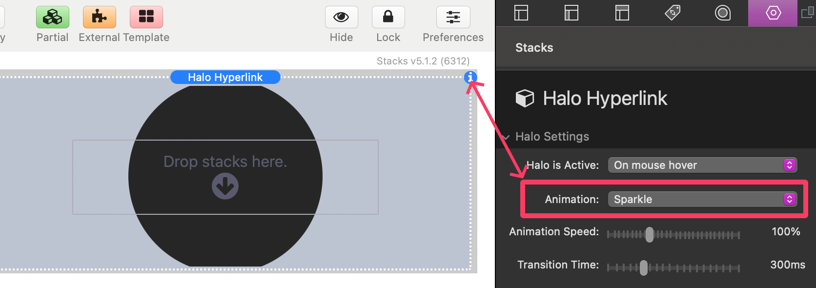
Setup is mostly straight forward. After adding the stack to the editor you can add just about any kind of content to the stack. Then simply select one of the Animation options from the Settings Panel > Halo Settings section.
Halo Settings
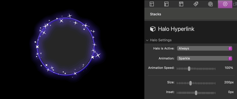
Halo is Active
- Always: The effect is always active when visible in the browser window.
- When centered in the window: The effect activates based on the browser window scroll position. As you scroll up or down, the effect is revealed accordingly.
- On mouse hover: The effect activates when a mouse cursor is over the element. On touch devices, the effect activates based on browser window scroll position.
Animation
Choose from 13 animation options. Animations are not visible in edit mode. Switch to preview mode to see a demonstration of the selected animation.
Animation Speed
Adjust how fast the design animates. Higher percentage values equal faster animation speeds.
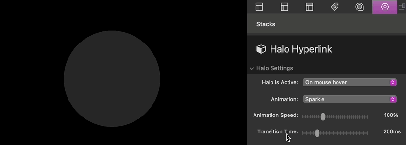
Transition Time
Defines the time in milliseconds it takes for the effect to activate. This settings is only supplied if the Halo is not always active.
Size
Adjust the height and width of the element and effect. The element will automatically resize to fit if there is not enough horizontal space available.
Inset
Adjust the gap or overlap of the element background with the effect. Negative numbers create an overlap while positive numbers create a gap.
Link
Optionally add a URL to make the element clickable, turning it into a hyperlink.
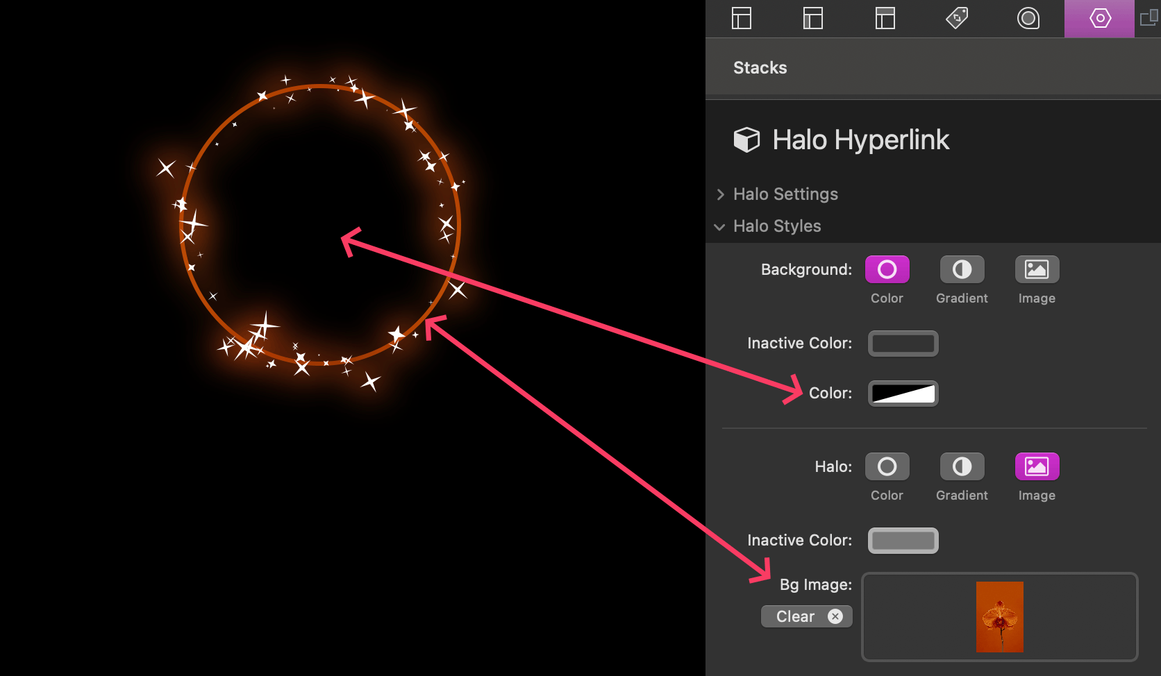
Halo Styles
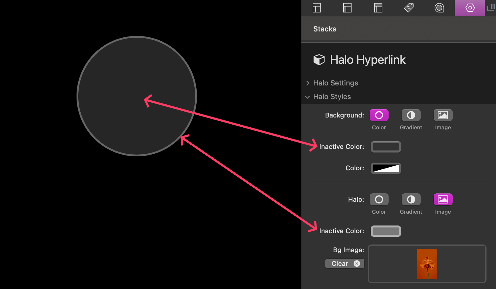
Background
This setting applies to the circular background of the element. There are three options to choose from:
- Color – Use a solid color for the background of the element. If the halo effect is not always active, an additional Inactive Color setting is supplied. This color is displayed if the when the effect is not active.
- Gradient – Define a 2 color gradient that applies across the background of the element.
- Image – Add an image that applies across the background of the element. This option includes optional settings to define a Background Color (for transparent images), add a transparent Overlay Color, apply a Blur effect to the image, and adjust the Image Opacity.
Halo
This setting applies to the color of the circular effect that surrounds the element. There are three options to choose from:
- Color – Use a solid color for the effect. If the halo effect is not always active, an additional Inactive Color setting is supplied. This color applies to the border around the circular background when the effect is not active.
- Gradient – Define a 2 color gradient that applies across the effect.
- Image – Add an image that applies across the effect. This option includes settings to define a Background Color (for transparent images), add a transparent Overlay Color, apply a Blur effect to the image, and adjust the Image Opacity.
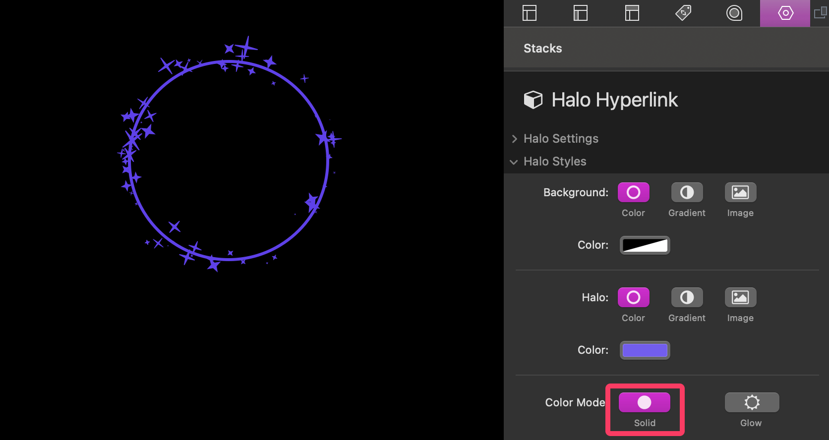
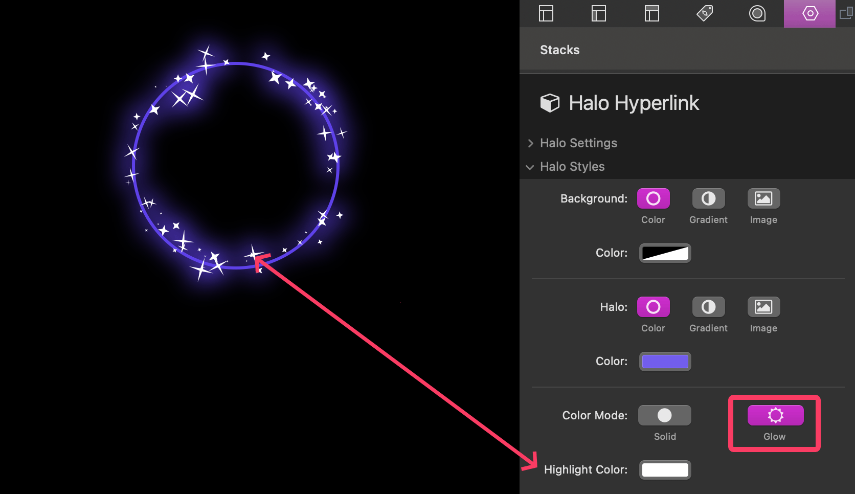
Color Mode
Enable the “Glow” option to apply a glowing effect to the animation. This effect is best seen with darker website backgrounds. You are also given an additional Highlight Color setting to adjust the color of the highlight.
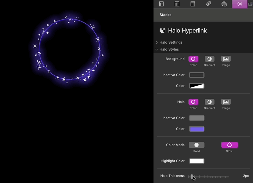
Halo Thickness
Adjust the thickness of the halo effect and the inactive color around the circular background.
Layout
Content Width
Changing the setting to “Define” will allow you to define a Max Width for the content. The content will automatically be centered in the available space.
Margin
Adjust the space around the Stack.