Cycledex setup and styles
Add the Cycledex stack to the editor.
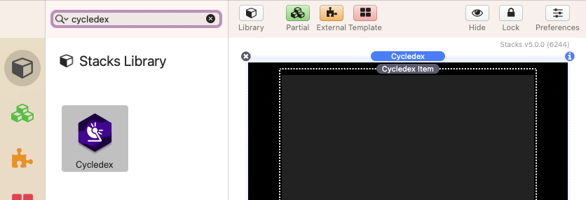
Open the Cycledex stack settings panel to begin setup.
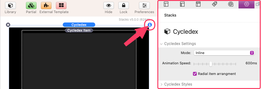
Cycledex Settings
Mode
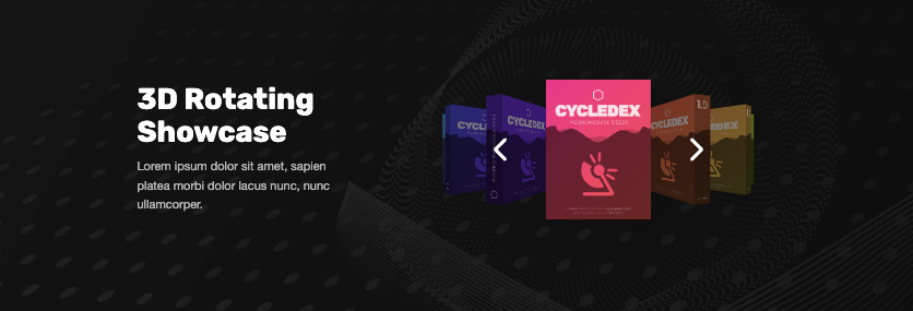
There are two useable modes. “Inline” will display the Cycledex stack where ever it is placed inside of the stacks content. Use the “Trigger activated popup” mode to treat the Cycledex stack as a full page popup that is only visible after clicking a button/link.
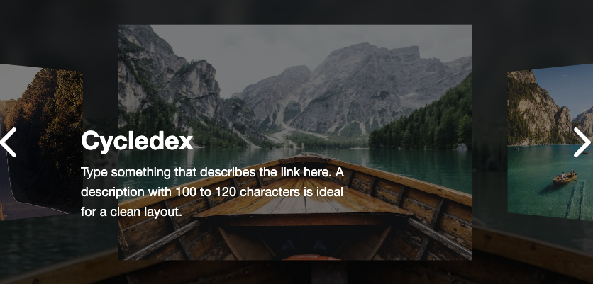
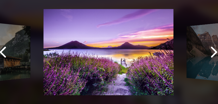
(Mode: Inline)
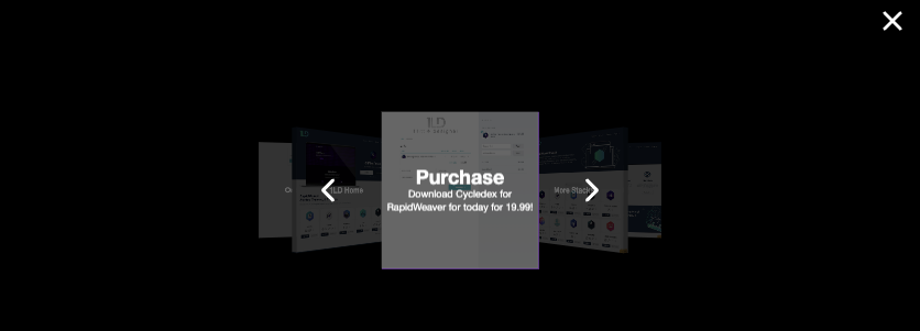
(Mode: Trigger activated popup)
Z-index (Mode: Trigger activated popup)
This value can be adjusted to a higher or lower value if you have issues with the popup is displaying below or above something it should not be.
Animation Speed
Use this slider to adjust the animation speed of the item navigation. The effects of this setting can only be viewed in preview mode or when published.
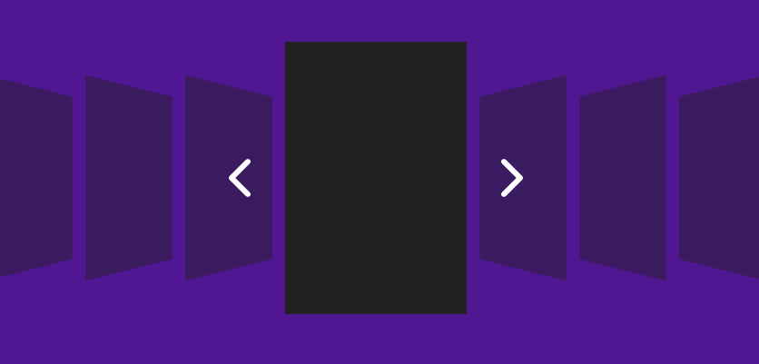
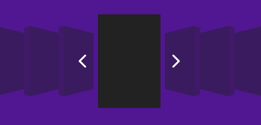
Radial item arrangement
When enabled, the items will display as a 3d circular loop. Disable this option to instead display the items in a linear fashion. The effects of this setting can only be viewed in preview mode or when published.
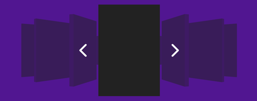
(Radial item arrangement enabled)
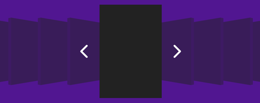
(Radial item arrangement disabled)
Cycledex Styles
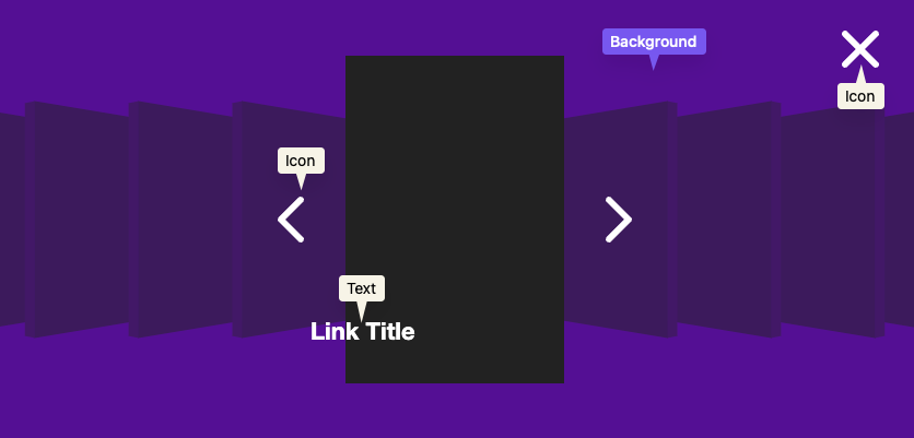
Colors: Background
This color field applies to the space behind the Cycledex items. If the mode is set to “Trigger activated popup” this is the color of the popup overlay.
Colors: Text/Icons
This color field applies to the color of the navigation arrows, close icon, and title and description text.
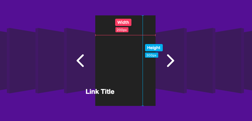
Item Size: Width & Height
These values define the dimensions of each of the Cycledex items. If you intend to use images for the items you will need to adjust the dimensions until you get a good fit. First define a width and then adjust the height to match the dimensions of the photo. If you know the aspect ratio of the photos you will used, it can be used to get an exact fit. For example, if you are using a 5:4 photo in vertical orientation, the height should be 1.25 times (5 divided by 4) the defined width. That means if item width is set to, let’s say, 300px, the height should be set to 375px (300 * 1.25 = 375).
Minimum Height (Mode: Inline)
Use this slider to optionally define a minimum height for the entire Cycledex stack. This value is a percentage of the height of the browser window. This option allows the height to adjust according to the size of the browser or device. The effects of this setting can only be viewed in preview mode or when published.
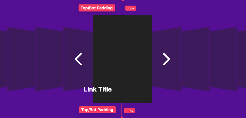
Top/Bot Padding (Mode: Inline)
Use this slider to adjust the space above and below the Cycledex items.
Item Dimming
Use this slider to adjust the transparency of any non-active item. Higher percentages result in increased transparency. The effects of this setting can only be viewed in preview mode or when published.
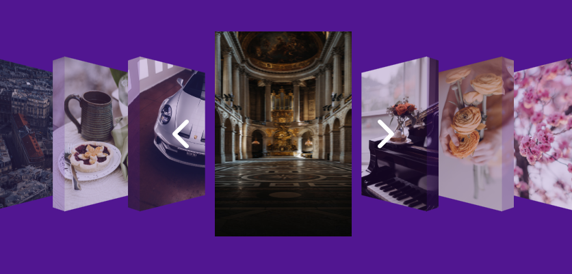
(Item Dimming: 80%)
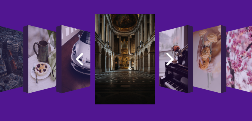
(Item Dimming: 20%)
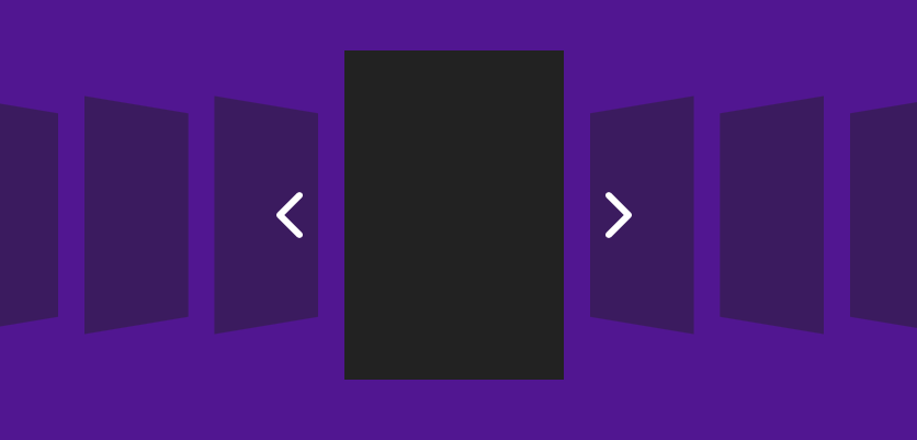
Item Gap
Use this slider to adjust the space between each of the items. The value represents a percentage of the defined item width.The effects of this setting can only be viewed in preview mode or when published.
(Item Gap: 0%)
(Item Gap: 20%)
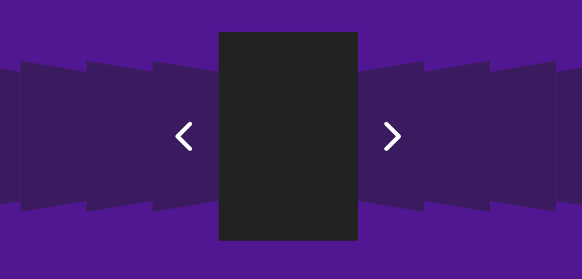
3D Perspective
Use this slider to adjust the perceived 3d depth of the items. Higher pixel values create a flattened appearance while lower values create more pronounced 3d effect. The effects of this setting can only be viewed in preview mode or when published.
(3D Perspective: 2000px)
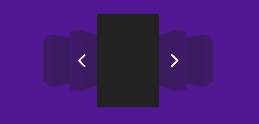
(3D Perspective: 400px)
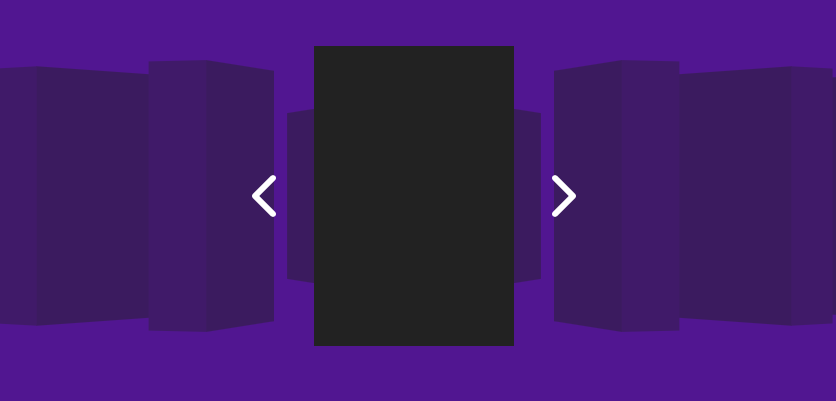
3D Thickness
Use this slider to optionally define a thickness to each of the items along the z axis. The effects of this setting can only be viewed in preview mode or when published.
(3D Thickness: 0px)
(3D Thickness: 40px)
Wrap image around sides (3D Thickness > 0px)
When enabled, this setting wraps the item images around the 3d sides of the items. The effects of this setting can only be viewed in preview mode or when published.
(Wrap image around sides enabled)
(Wrap image around sides disabled)
Title & description scaling effect
When enabled a 3d scaling effect will be applied to the title and description of the active item. The scaled text may overlap the sides of the item as it protrudes. The effects of this setting can only be viewed in preview mode or when published.
Background image effect
When enabled the background behind the Cycledex items will display a blurred and dimmed version of the active item image. The effects of this setting can only be viewed in preview mode or when published.
Opacity (Background image effect enabled)
This slider adjusts the opacity of the background image effect.
Blur (Background image effect enabled)
This slider adjusts the amount of blur applied to the background image effect. A value of 0px will remove the blur.
Title & Description Styles
Title
Optionally adjust title text formatting and sizing by selecting the “Customize” option.
Font Family (Title: Customize)
Optionally define a font family by name for the title to use.
Sizes (Title: Customize)
Define the font size and line height for the title.
Margin (Title: Customize)
Define distances in pixels above and below the title.
Horz. Spacing (Title: Customize)
Define distances in pixels between letters and words in the title.
Font Weight (Title: Customize)
Adjust the weight/thickness of the title. The values supported are determined by the font used.
Description
Optionally adjust description text formatting and sizing by selecting the “Customize” option.
Font Family (Description: Customize)
Optionally define a font family by name for the description to use.
Sizes (Description: Customize)
Define the font size and line height for the description.
Margin (Description: Customize)
Define distances in pixels above and below the description.
Horz. Spacing (Description: Customize)
Define distances in pixels between letters and words in the description.
Font Weight (Description: Customize)
Adjust the weight/thickness of the description. The values supported are determined by the font used.
Align
Use these options to set the horizontal alignment of the title and description.
Vertical Align
Use these options to se the vertical alignment of the title and description.
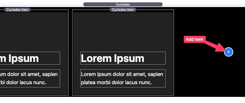
Adding and editing Cycledex items
In the editor, the main Cycledex stack wraps Cycledex Item stacks. More items can be added by using the blue add button.
Select any item and open the stack settings panel to begin customizing the item.
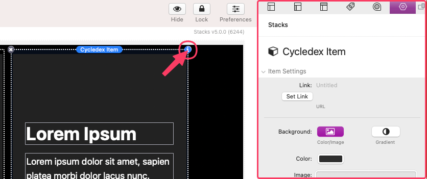
Cycledex Item: Item Settings
Link
This setting allows you to add a link to the entire item. Do not add a link if you do not want the entire item to be a link or if the item is not intended to be a link.
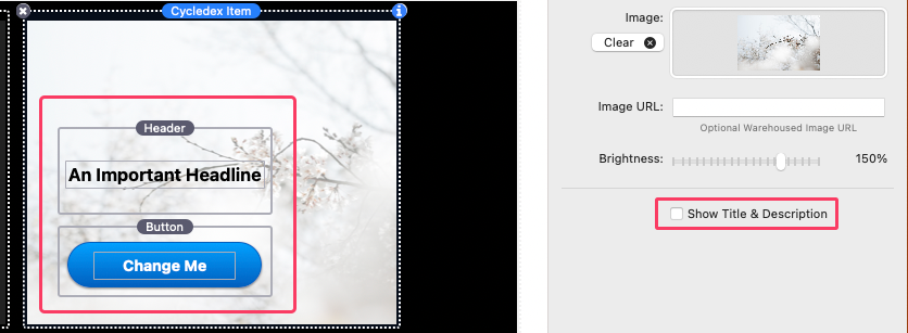
Note: Links and stacks content can alternatively be added in place of the item title and description by disabling “Show Title & Description”
Background
Each item has a definable background color and image. Select the “gradient” option to use a two color gradient background color without an image.
Color
This setting defines the color of the item background when no image has been provided.
Image
Any provided image will cover the entire background of the item. If an image is provided, the background color will not be visible unless the image supports transparency.
Image URL
This optional input field is provided in case you would like to reference a “warehoused” or an externally stored image instead of adding one to the Image field.
Brightness
Adjust the slider to brighten or darken the background image. This can be done to increase contrast between the image and the title and description to help with readability.
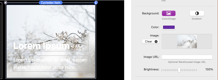
(Brightness: 100%)
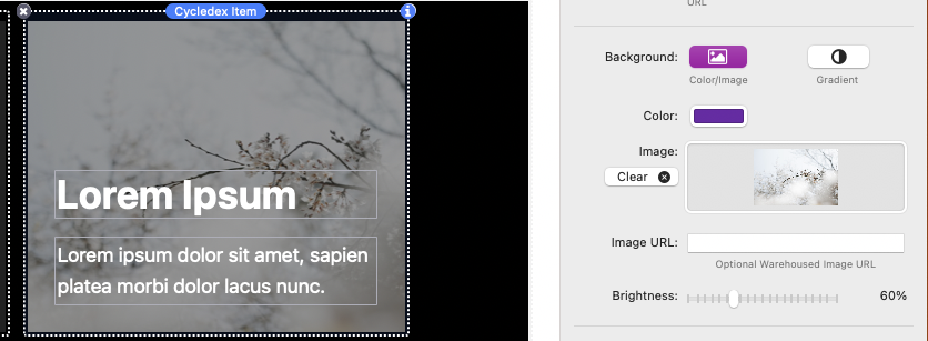
(Brightness: 60%)
Show Title & Description
Disable this setting to remove the title and description text. This will also allow you to optionally add your own stacks content in place of the title and description.
Using the “Trigger activated popup” Mode
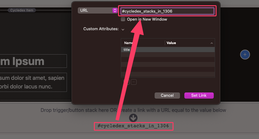
There are two ways the popup can be initiated. The first is by adding any stack into the “drop stacks here” section found at the bottom of the stack in the editor.
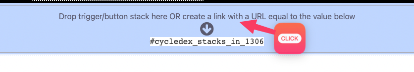
When this trigger/button stack is clicked in preview mode or when published it will initialize the popup.
The second method allows you to use any link to initialize the popup. This can be done by copying the hash value found at the bottom of the stack in the editor and adding it to the link URL/href field.