Setup
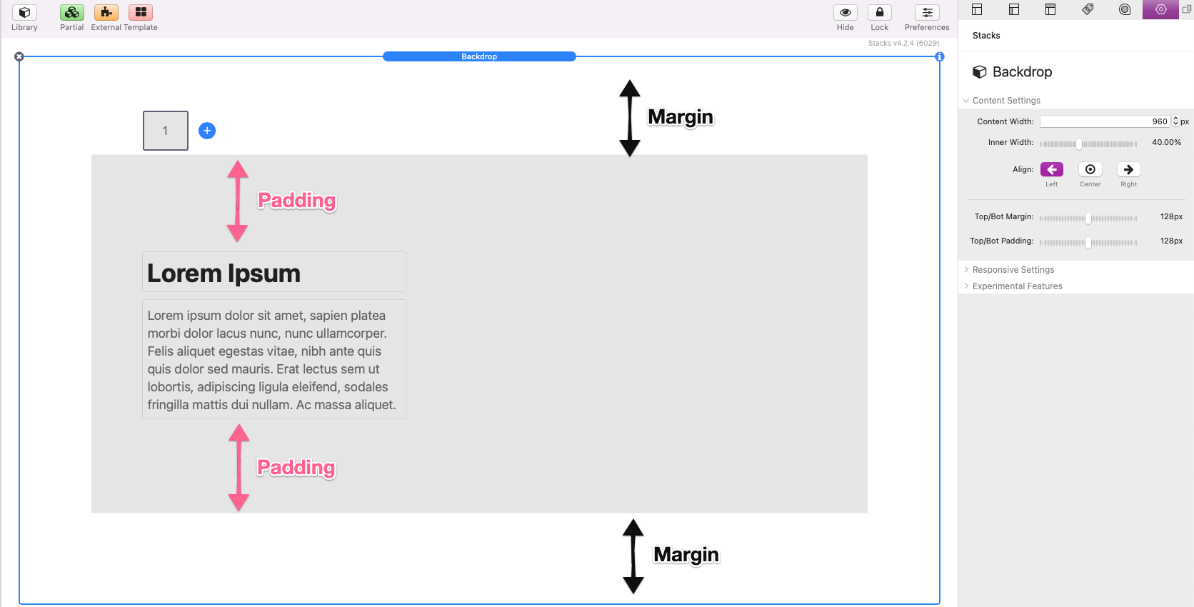
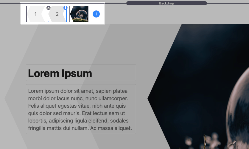
After adding the stack to the editor, take note of the two main sections.
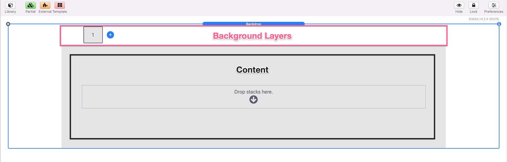
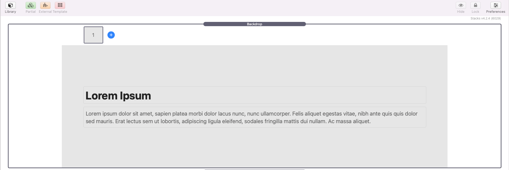
At the top is where the Background Layers are located. A single gray rectangle layer is added by default. A “Drop stacks here” content section is found at the bottom. To get started, add any desired stacks content to this section.
Backdrop: Content Settings
Select the Backdrop stack and open the settings panel.
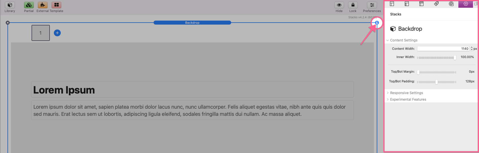
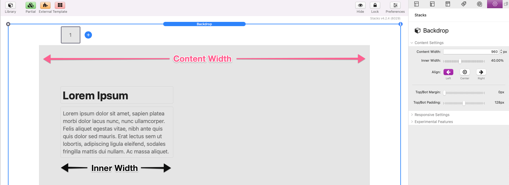
Here we can define a Content Width. This pixel value will be used as the base width of the content placed inside of the stack as well as any added background layers. You can also optionally adjust the Inner Width slider to reduce the width of the added stacks content. A setting to adjust the alignment of the content is provided if the Inner Width is less than 100%.
The Top/Bot Margin slider can be used to adjust the space above and below the Backdrop stack. The Top/Bot Padding slider can be used to adjust the space inside the content.
Backdrop: Responsive Settings
Use these fields to optionally modify device width breakpoints. These defined widths will be used by the Background Layer Hide This Layer setting which will be gone over later in this tutorial.
The Force visibility to browser edges option is provided in case you are using a theme that does not allow content to expand to the browser edges. This feature may not work with every theme.
Now that we have our content added and sized appropriately, we can start adding and editing Background Layers. Click on the default gray rectangle Background Layer and open the settings panel.

In the Shape Settings section you can choose from a list of provided shapes. Some non “generated” options will include adjustment sliders that can be used to modify the them. All “generated” shapes include an input field where you can paste a generated shape path.
You can learn how to generate a shape path from the “Generating Blobs/Waves” tutorial below.
Background Layer: Width Settings
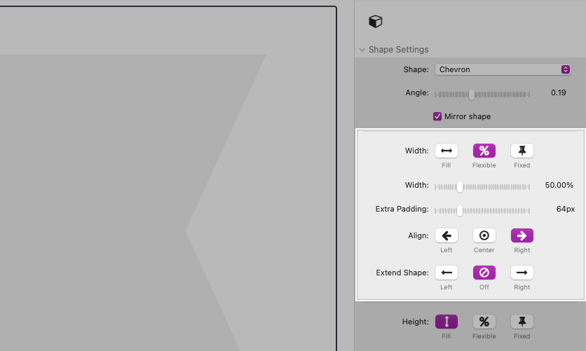
After selecting a shape to use you can then define a width for it. By default it will match the Content Width that we defined in the Backdrop settings.
Use the Width: Flexible option to define a width based on a percentage of the Content Width. The Extra Padding slider can be used to adjust the extra width applied to the left and right of the shape. Use the Align buttons to change the alignment of the shape within the content area.
Beneath the width setting is a special Extend Shape setting. Selecting either “Left” or “Right” will extend the shape in that direction until it reaches the edge of the browser window.
Use the Width: Fixed option to define an exact pixel width for the shape. This width option can also be aligned within the content area using the Align buttons.
Background Layer: Height Settings
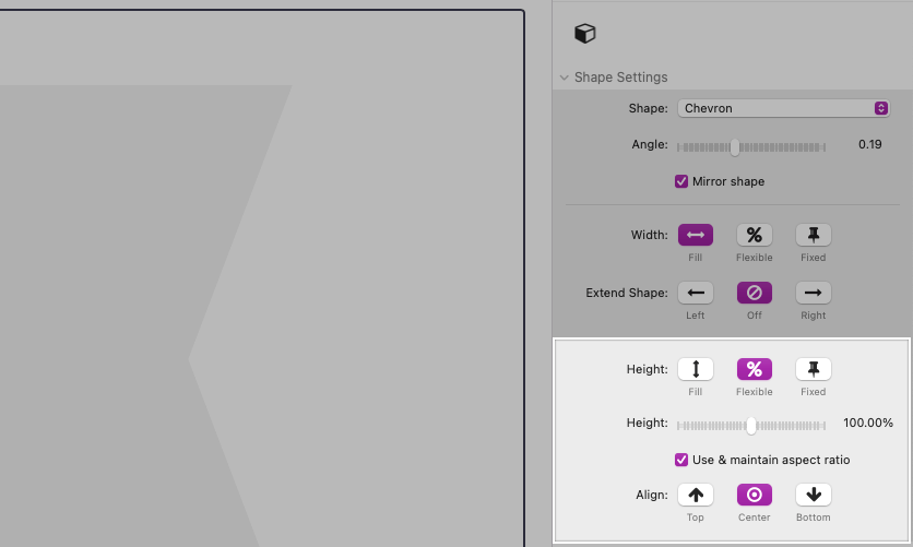
By default the Background Layer will match the height of the content plus any Top/Bot Padding added the Backdrop stack.
Use the Height: Flexible option to define a height based on a percentage instead. Use the Align buttons to change the vertical alignment of the shape within the content area.
A Use & maintain aspect ratio option is provided to have the height be based off of the width of the shape rather than the height of the content. This will make sure the shape maintains a defined aspect and will not distort.
Use the Height: Fixed option to define an exact pixel height for the shape. This height option can also be vertically aligned within the content area using the Align buttons.
Background Layer: Background Fill
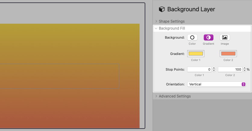
Use the Background Fill settings to define a color, gradient, or image for the selected Background Layer.
Background Layer: Advanced Settings
Each layer has access to a few Advanced Settings. The Blur, Feather, and Transparency sliders apply effects to the selected Background Layer.
Note: The Blur slider is only available if the Background Fill is set to “Image”.
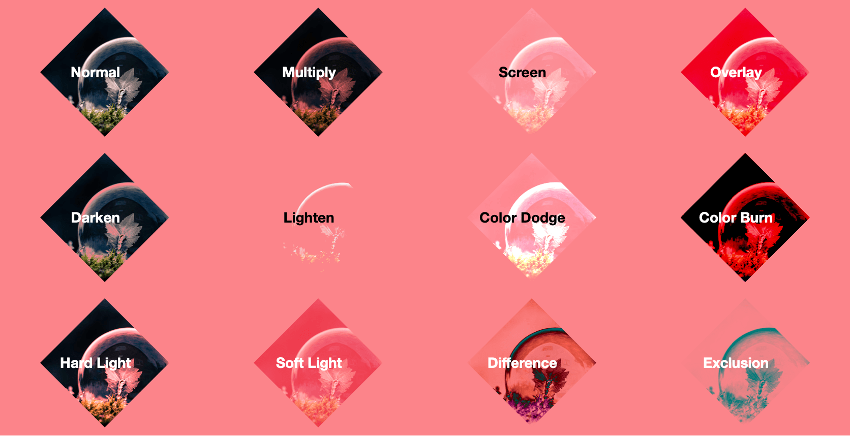
The Blend Mode setting will apply a transparency or blending effect with the elements behind the selected Background Layer. If any option other than “Normal” is selected the Grayscale Blend Mode option will be available. This will remove all color from an image before applying the Blend Mode option.
Note: You must switch to preview to see the effects of the selected Blend Mode.
Refer to this image to get an idea of the effect of each of the Blend Mode options:
X & Y Offset sliders are provided to adjust the horizontal and vertical position of the selected Background Layer.
The Hide This Layer buttons can be used to optionally hide the selected Background Layer for certain devices. This allows you to adjust the appearance of the Background Layers depending on device width. The device breakpoints can be modified in the Backdrop stack Responsive Settings section.
Adding Background Layers
Add up to 6 layers using the blue add button. Newly added layers will display over top of previously added layers. You can drag and drop any layer to change the display order.
Generating Blobs/Waves
When using any of the Background Layer Shape options that include “Generated” in the name you can optionally generate a new randomized shape. To do so, select a Background Layer and open the settings panel.

Choose a “Generated” Shape option and switch to preview mode. Hover over the Backdrop stack to reveal the generator buttons. Clicking the “dice” icon will create a new randomized shape. Continue to use the randomize shape button until you find a shape you would like to use. Click the “download” icon to automatically copy the generated path to the clip board. You can then switch back to edit mode and paste the path into the Blob Path field found in the Background Layer settings panel.