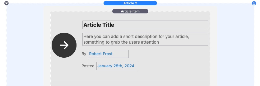
Article Elements Breakdown
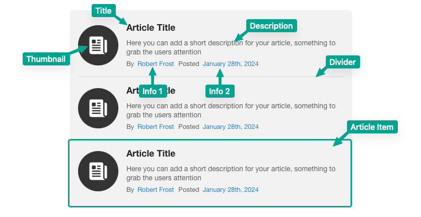
The image below reveals what the various terms used in this tutorial refer to.
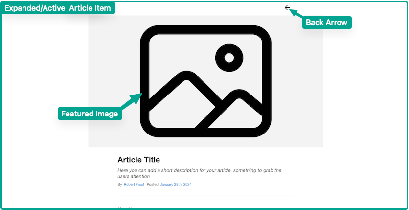
Each Article 2 list is made up of article items. When an article item is clicked, it will expand and fill the entire browser window. The next image reveals what the terms used for the expanded article refer to.
Adding & Editing Article Items
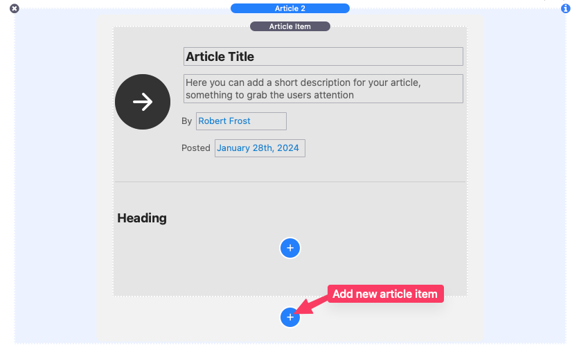
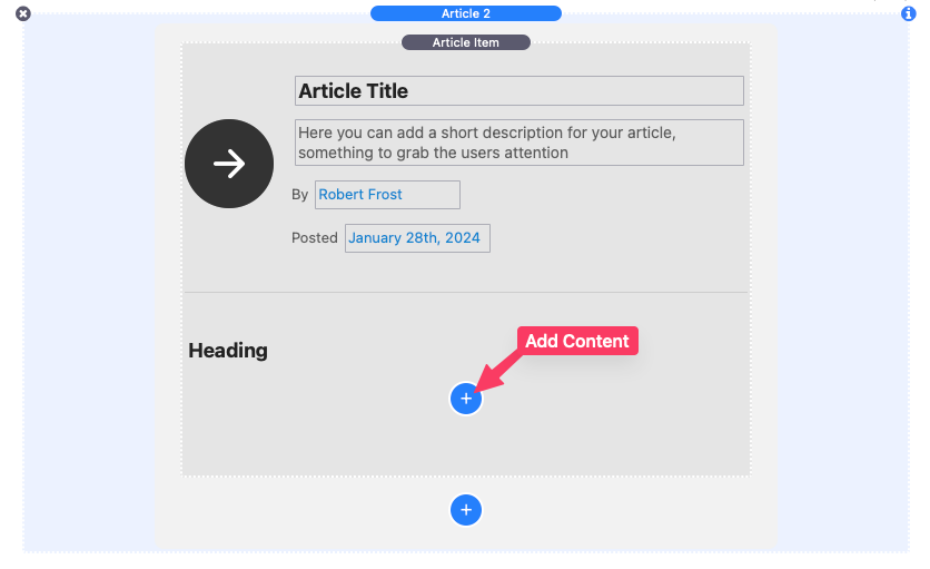
To add new items to a list, click the blue add button found at the very bottom of the stack in the editor.
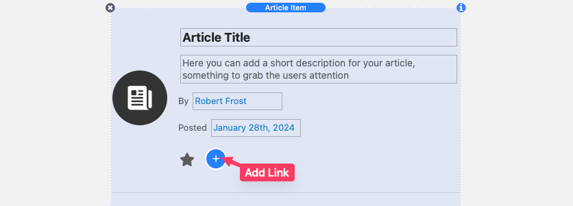
Each article item title, description, and info text can be edited by double clicking the text in the editor.
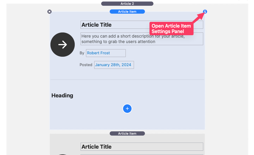
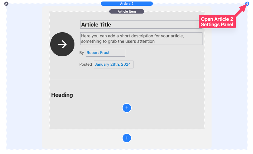
To edit the individual settings of an Article Item, select the item in the editor and open the settings panel.
Article Item Settings
Featured Image
Optionally add a featured image that displays when the article item is expanded. This image will also be used as the thumbnail if no thumbnail icon/image is added or defined. There is also an Image URL field where you can alternatively add the path to a warehoused/uploaded image.
Thumbnail
By default, the thumbnail will display the featured image cropped into a 1:1 aspect ratio if one is provided. If no featured image is provided, an icon will be displayed instead. The “Use image” option will allow you to use a separate image for the thumbnail instead of the featured image. The “Use icon” options allow you to use any icon from the provided icon library as the thumbnail. The thumbnail can also be removed altogether by selecting the “None” option.
Thumb. Position
Choose whether the thumbnail displays on the left or the right of the article item.
Custom Title
Enable this setting to remove the title field in place of a “Drop stacks here” section where you can place your own 3rd-party stacks.
Hide Description / Info 1 / Info 2
There are three settings provided that allow you to optionally hide/remove the different article item text elements.
Add Expanded Header Links
Enable this setting to add custom links that display in the header when the article item is expanded. Refer to the “Adding & Editing Article Links” tutorial below for more info on how to customize these links.
Adding Article Content
Any stack may be dragged and dropped into the content section of an article item.
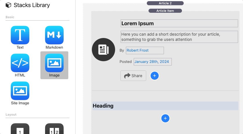
By default, each article item has a built-in Article Content stack added to the content section. To add more built-in content, click the blue add button found at the bottom of the article item in the editor.
The Article Content stack has four commonly used content types to swap between, each with their own settings and features.
Heading
Heading content includes an Align setting to align the text left, center, or right. The Margin is inherited from theme or framework styles but can be overwritten by clicking the “Define” option.
Text Styles are also inherited from the theme or framework styles but can be overwritten by clicking the “Simple” or “Detailed” options.
Text
Text content includes a special Icon Mode setting. When any of the font library options are selected the text will be replaced with an icon. To select a different icon, place the title of the icon you wish to use in the provided Icon Name field. To see a full list of usable icons for a given library, right-click/ctrl-click the URL at the bottom to reveal a popup menu and select “Open URL”.
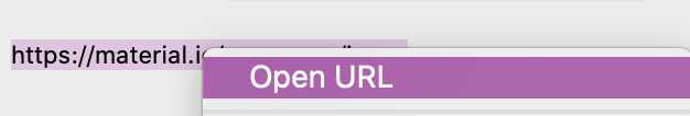
This will open a list of usable icons with their icon names.
Text content includes an Align setting to align the text left, center, or right. The Margin is inherited from the theme or framework styles but can be overwritten by clicking the “Define” option.
Text Styles are also inherited from the theme or framework styles but can be overwritten by clicking the “Simple” or “Detailed” options.
Button
Buttons include a special Icon Mode setting. When any of the font library options are selected an icon will be placed inside the button next to the button text. To change an icon place the title of the icon you wish to use in the provided Icon Name field.
The Link setting will define where the button will navigate to when clicked.
Buttons include an Align setting to align the button to the left, center, or right. The Margin is inherited from theme or framework styles but can be overwritten by clicking the “Define” option.
Buttons Styles are not inherited and must be manually defined using the provided style settings.
Text Styles of the text inside the button are inherited from theme or framework styles but can be overwritten by clicking the “Simple” or “Detailed” options.
Image
By default, a placeholder image is provided to fill in the open space. To use your own image, add it to the Image field or use the Image URL field to link to a warehoused image.
If the Max Width of the image is less than then column width the image, the Align setting will align the image to the left, center, or right. The Margin is inherited from the theme or framework styles but can be overwritten by clicking the “Define” option.
Image Styles are not inherited and must be manually defined using the provided style settings. An Aspect Ratio setting is provided to crop the image into a specific aspect ratio if needed.
Text in the heading, text, and button content types can be edited by double clicking the text in the editor.
Adjusting List Styles & Settings
To edit the styles of an article list as well as the general settings for the article items, select the Article 2 stack in the editor and open the settings panel.
Article List Settings
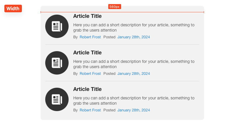
Width
This slider adjusts the width of the article list. The list will be centered if the available horizontal space is larger than the set width. If the list width is larger than the available horizontal space it will shrink to fit.
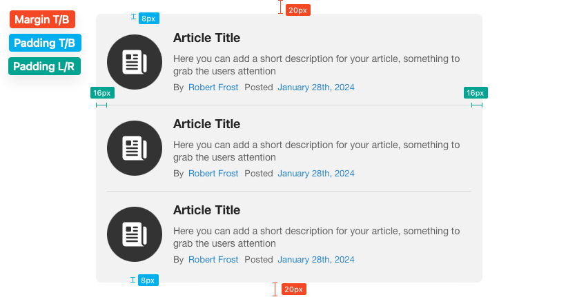
Margin & Padding
The provided sliders adjust the space around and inside the article list. Refer to the image below to see what each slider adjusts.
Border Radius
This slider adjusts the corner rounding of the the article list.
Collapse Content in Edit Mode
If this option is enabled all content sections will be hidden while in edit mode.
Article Items Settings
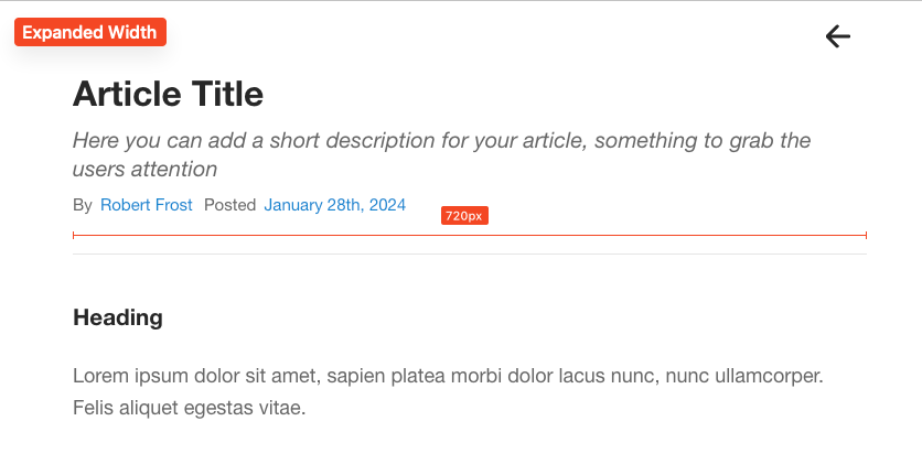
Expanded Width
This slider adjust the content width of an article item when it has been expanded. The content will be centered if the available horizontal space is larger than the set width. If the expanded width is larger than the available horizontal space the content will shrink to fit.
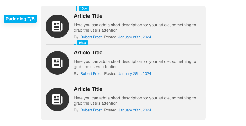
Padding T/B
This slider adjust the space above and below each individual article item in the list.
Z-index
This value can be adjusted to a higher or lower value if you have issues with theme or stack and the expanded article is displaying below or above something it should not be.
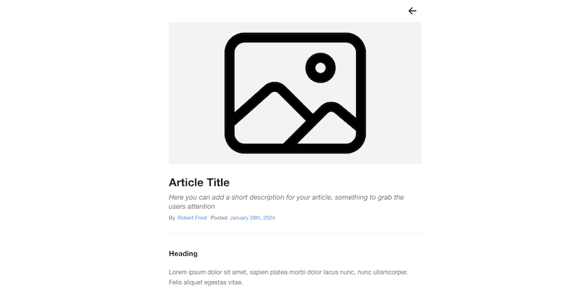
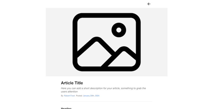
Featured Image
There are four featured image layout options to choose from. The “Matches Expanded Width” option will display the featured image in the expanded article header above the title, matching the expanded width of the content.
The “Define Custom Width” option will also display the featured image in the expanded article header above the title but will allow you to define a custom width for the image.
The “Floats Left” and “Float Right” options will display the featured image in a cropped 1:1 aspect ratio the the left or right of the article header title and description.
Feat. Img Width (Define Custom Width)
This slider adjust the width of the featured image.
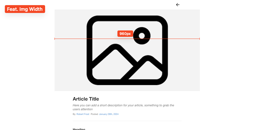
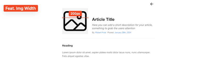
Feat. Img Width (Floats Left or Right)
This slider adjust the width of the featured image.
Aspect Ratio (Define Custom Width)
The featured image will crop to fit the selected aspect ratio in order to keep each article uniform.
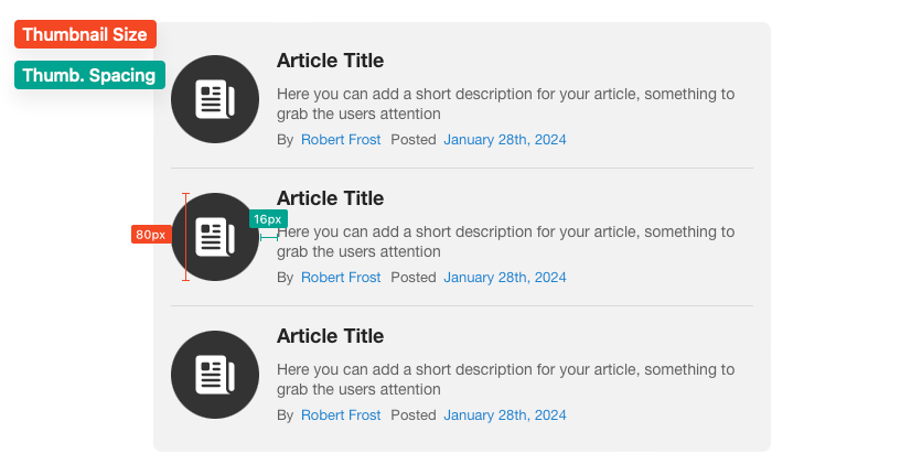
Thumbnail Size & Thumb. Spacing
These sliders adjust the size of the article item thumbnail and the space between the thumbnail and the article title and description.
Thumb. Radius
Adjust the corner rounding of the thumbnail icon background or image.
Title Font
The styles of the article title are inherited from theme or framework but can optionally be overwritten by clicking the “Simple” or “Detailed” options.
Desc. Font
The styles of the article description are inherited from theme or framework default text styles but can optionally be overwritten by clicking the “Simple” or “Detailed” options.
Info 1 & 2 Prefix
Use these fields to change the text found before each of the text elements found below each article description.
Truncate Description Text
Enable this setting to limit how many lines an article item description may wrap to. If the description would wrap past the defined limit, an ellipses “…” will be used to truncate the text. This setting will help keep the article list items more uniform if some items have longer descriptions. When an article item is expanded, the text will no longer be truncated.
Hide Content Divider
Enable this setting to remove the divider line that displays between the article header and article content.
Adding & Editing Article Links
Each article item can optionally have any number of links added to the header by enabling Add Expanded Header Links in the article item’s settings panel. These links will only be visible when an article item is expanded. To add new links click the blue add button found below the article title and description.
To customize a link, select a link when the settings panel is open.
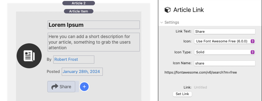
Article Link Settings
Link Text
Use this field to optionally add text to the right of the article link icon.
Icon, Icon Type, Icon Name
Select from a list of font library options and use the Icon Name field to define which icon to use. Use the “None” option to remove the icon. To see a full list of usable icons for a given library, right-click/ctrl-click the URL at the bottom to reveal a popup menu and select “Open URL”.

This will open a list of usable icons with their icon names.
Link
Use this setting to define where the article link will navigate to when clicked.
Link Layout & Styles
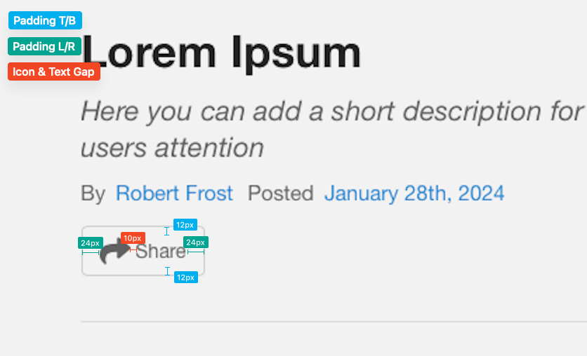
Padding T/B
This slider adjust the space above and below the link icon & text.
Padding L/R
This slider adjusts the space to the left and right of the link icon & text.
Icon & Text Gap
This slider adjusts the space between the link icon and text.