Overview
Adaptive Columns is a set of three RapidWeaver stacks designed to make layouts that adapt themselves to the space they’re given.
What’s included
- Container — a “frame” for any content. Keeps text readable, keeps images from getting huge, centers things, adds background/borders, and controls spacing.
- Sym Columns — makes symmetrical rows of 2–12 columns that all size the same and wrap neatly.
- Asym Columns — makes asymmetrical rows of 2–4 columns where each column can grow/shrink differently so you can “prioritize” one column over the others.
Big idea: All three stacks can have 1, 2, or 3 layouts that switch based on the width of the space they’re in (not the whole browser). We call this Adaptive Mode.
Glossary
- Available width/space: The width the stack has inside its parent. This is what Breakpoints measure.
- Breakpoint: A pixel value that decides which layout (Base/Middle/Wide) to use.
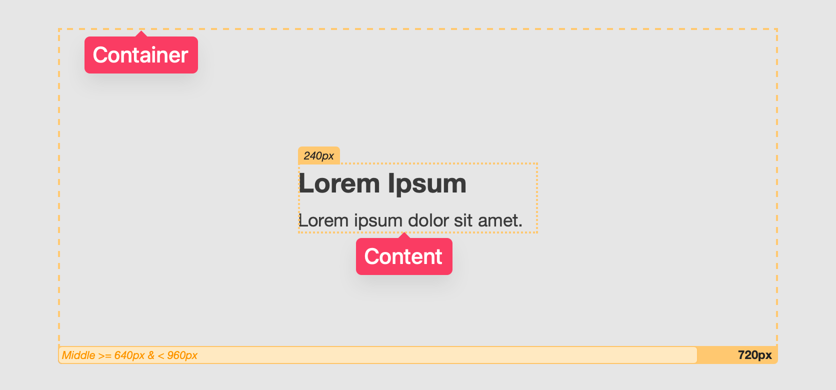
- Container vs. Content: The Container is the box the stack draws; the Content is what you put inside it.
How Adaptive Mode works (Single / Double / Triple)
Adaptive Mode lets a stack switch between 1, 2, or 3 layouts based on the width available to that stack (not the whole browser).
- Single — one layout that always applies, though columns can be configured to wrap automatically.
- Double — two layouts (Base and Wide) with a Breakpoint that decides which one to use.
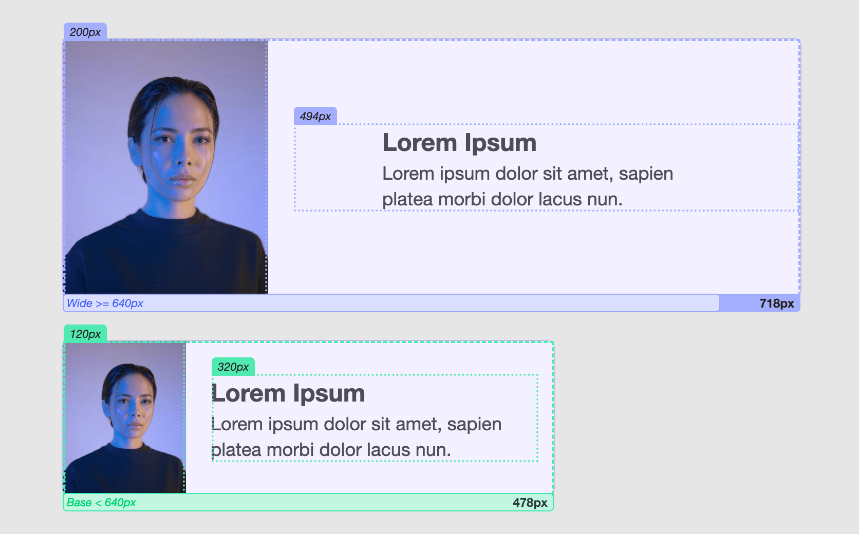
- Triple — three layouts (Base, Middle, Wide) defined by two Breakpoints.
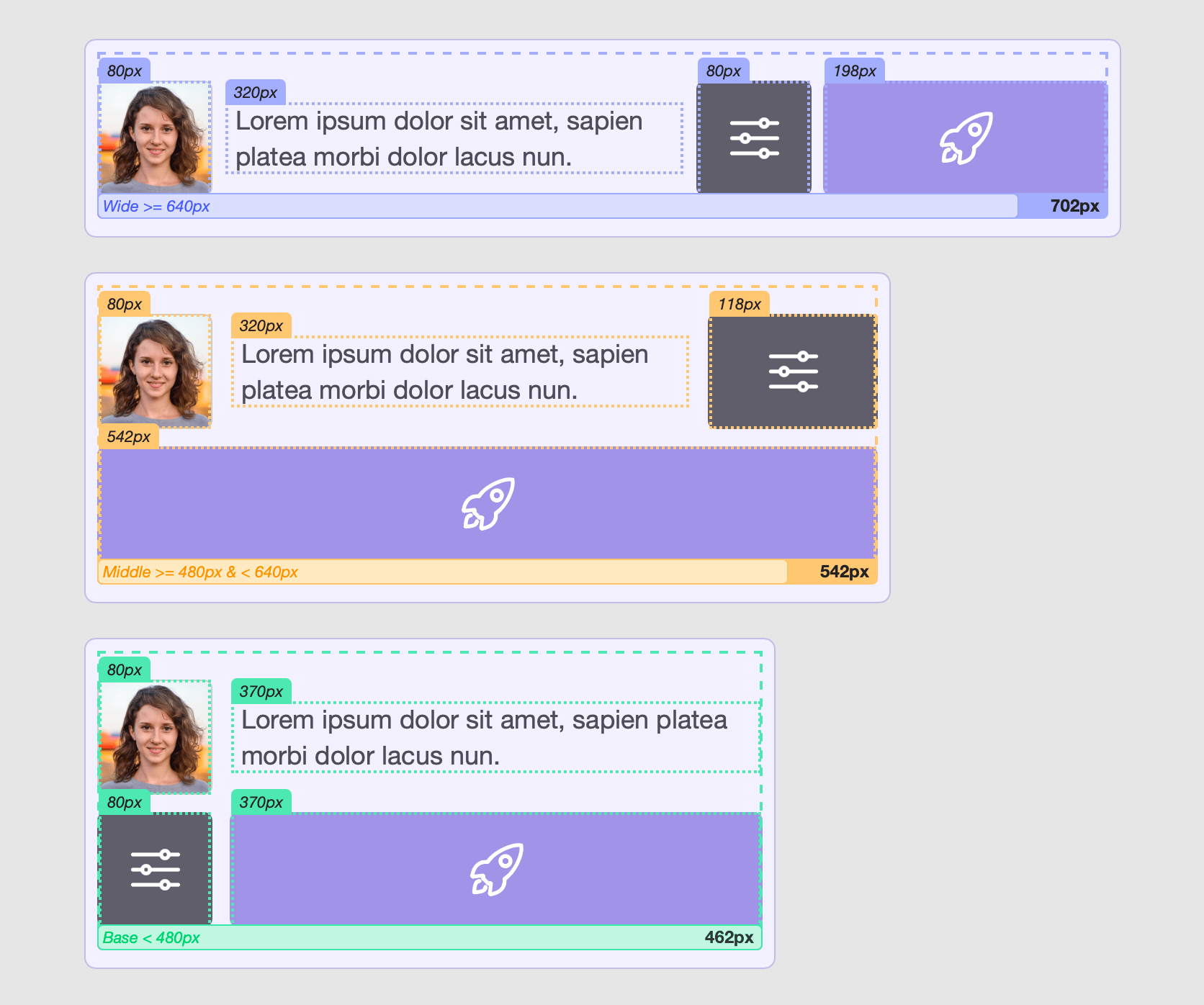
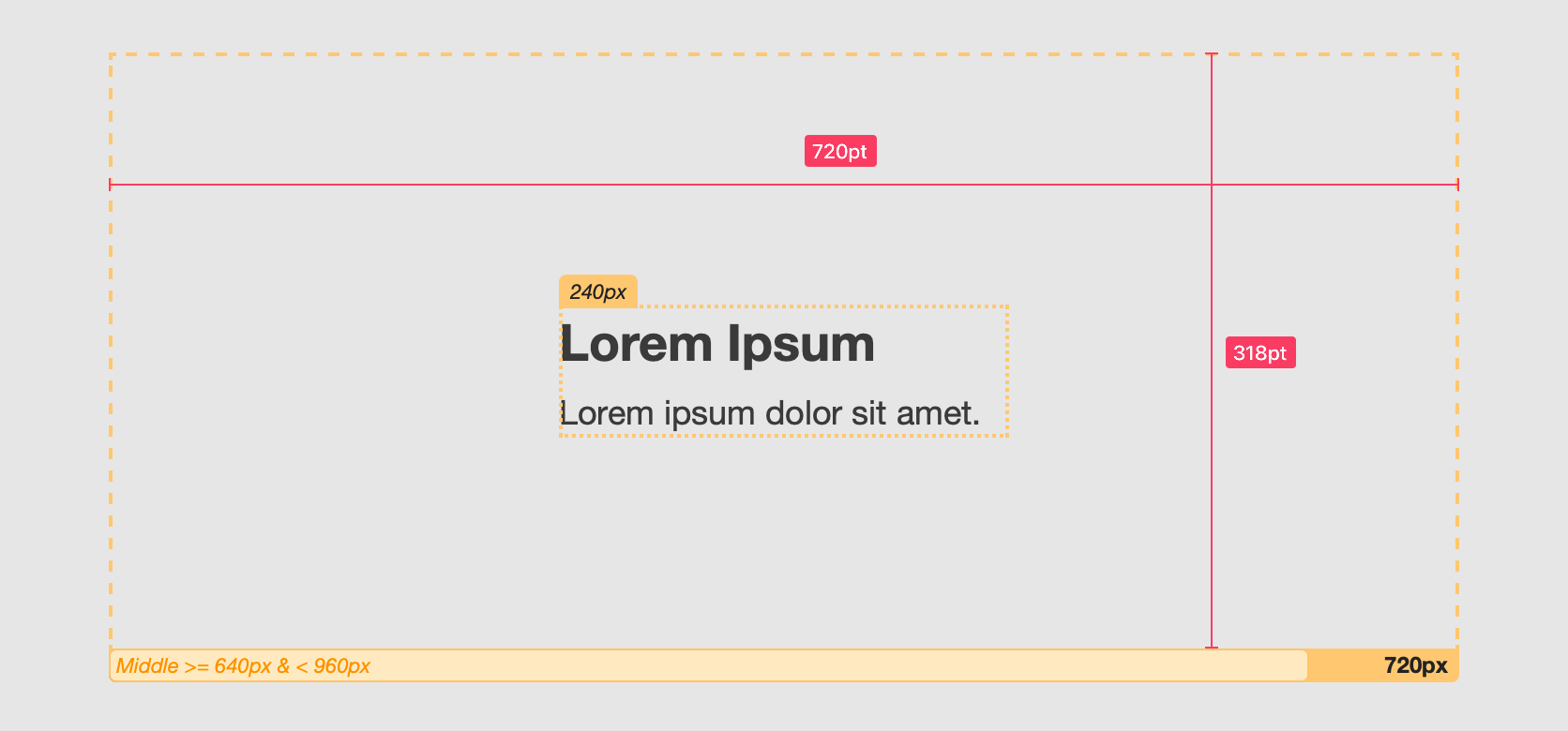
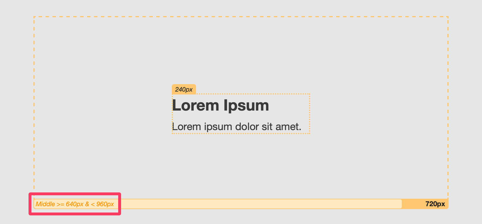
Understanding Breakpoints
- A Breakpoint is a pixel value that refers to the available width of the stack’s container.
- Base — Breakpoint <: Use Base when available width is less than this number.
- Wide — Breakpoint >=: Use Wide when available width is greater than or equal to this number.
- In Triple mode, Middle — Breakpoint >= & < applies between the two values:
- Example: Base < 640 px, Middle 640–959 px, Wide >= 960 px.
Real-time Breakpoint Helper (Preview/Simulator)
When you’re setting up Double or Triple modes, it’s normal to test a few widths to find workable breakpoint values. Each Adaptive Columns stack includes a built-in measurement overlay to make this easy.
What it shows: key measurements of the container, columns, and content, updating live as you change the window/device width.
How to use it
- Switch to Preview or open the Simulator.
- Hold the Control key and hover your mouse over elements in the stack (container, columns, content).
- A small overlay appears showing the relevant measurements.
 4
4
- A small overlay appears showing the relevant measurements.
- Click the element to pin the overlay so it stays visible.
- Now resize the Preview window or adjust the Simulator device width—the numbers update in real time.
- Now resize the Preview window or adjust the Simulator device width—the numbers update in real time.
- Take Note of the widths where your layout looks best, then set your Breakpoints (and any width/alignment sliders) to match.
Why this helps
- You’re measuring the same “available width” the stack uses to decide which layout to apply.
- You get precise numbers for Base/Middle/Wide Breakpoints, and you can confidently tune settings like Content Width, Row Max-Width, Col Min-Width, and Col Max-Width.
Quick examples
- If your content starts to feel cramped around 640 px, set Base — Breakpoint < 640 so Base handles that range.
- For Triple mode, use the overlay to find the comfortable middle band (e.g., 640–960 px) and set Middle — Breakpoint >= 640 & < 960.
Tip: If you don’t see an overlay when hovering, make sure you’re in Preview/Simulator (it won’t appear in Edit mode), and that you’re holding the Control key while hovering. You may need to click on the Preview/Simulator window if it is not in focus.
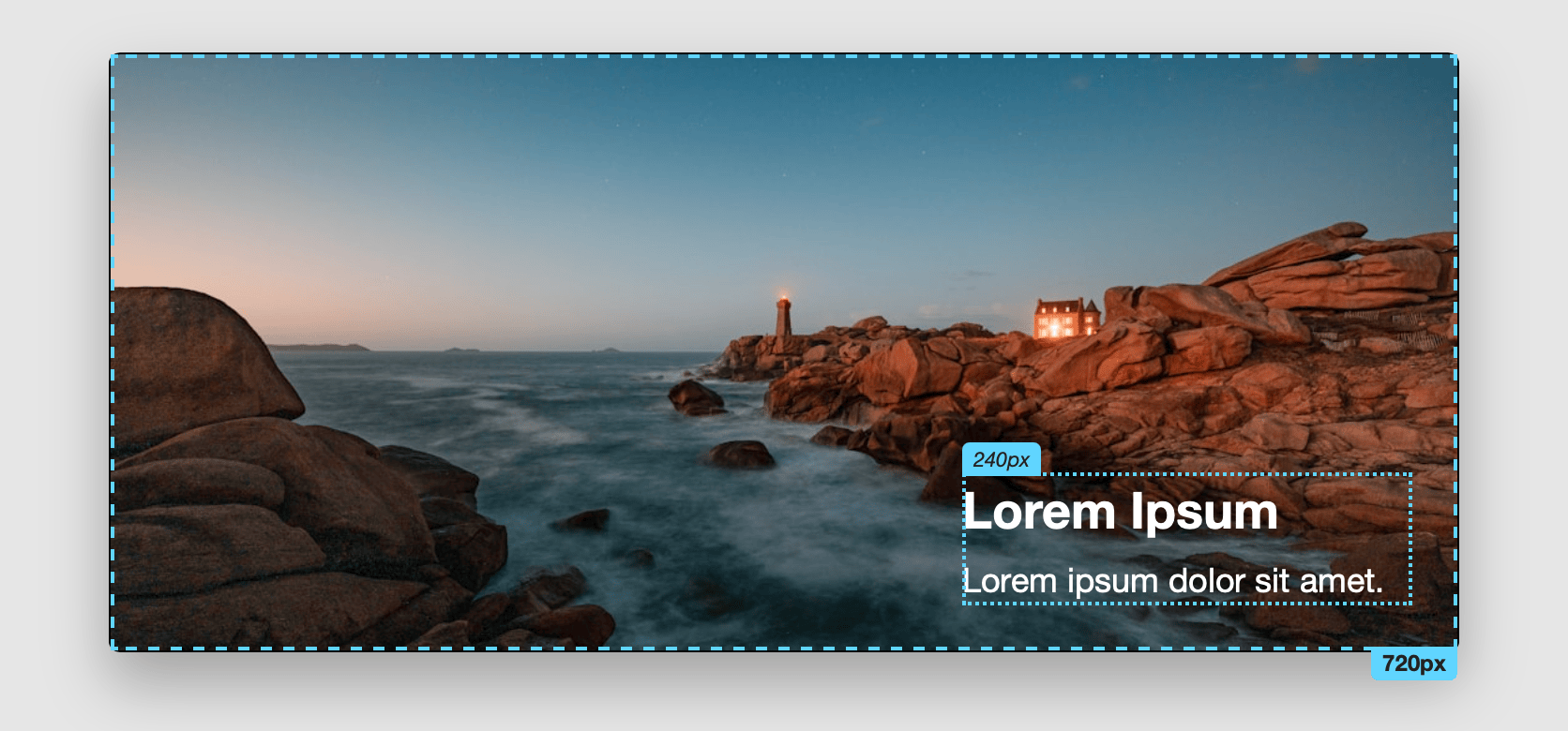
Using the Container Stack
When to use
- Keep paragraphs readable (max line width) without changing text alignment.
- Keep images from taking over the page.
- Center or align content horizontally and/or vertically inside extra space.
- Add a background (color/gradient/image) and optional border around content.
- Change all of the above at 1–3 width ranges (Single/Double/Triple).
Quick start
- Add Container to the page.
- Drop any stacks inside (text, images, buttons, etc.).
- Select Container ? open Settings.
- Choose Adaptive Mode.
- Adjust Base/Middle/Wide Layout settings.
Layout settings
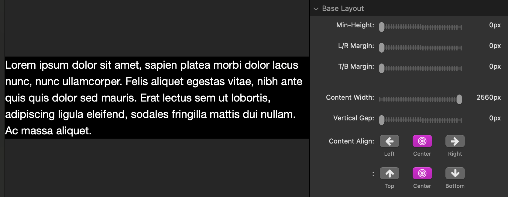
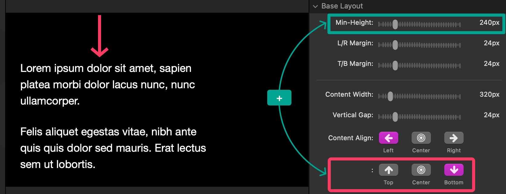
Min-Height
- Sets a minimum height (in pixels) for the container.
- Useful to create vertical “breathing room” above/below content, even if the content is short.
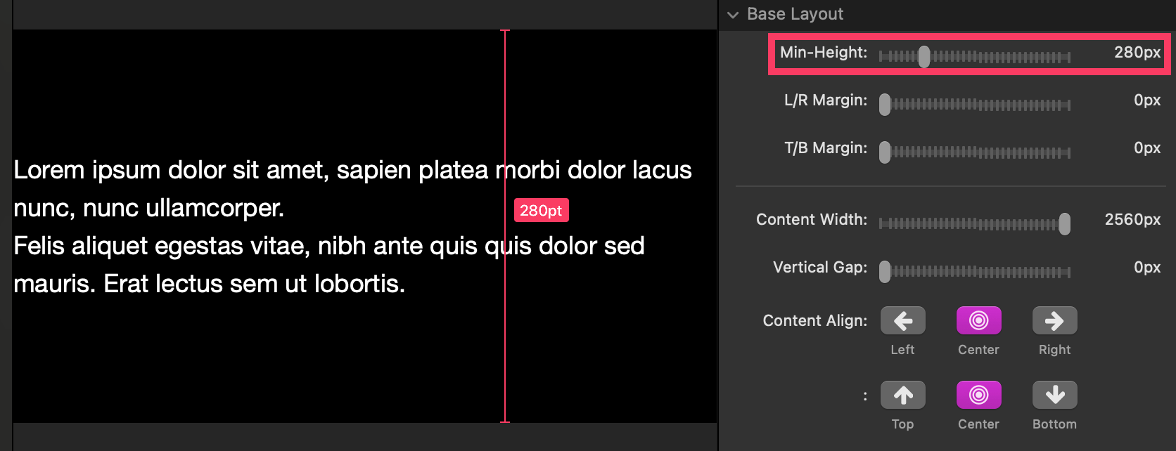
- Tip: If you also align vertically (see Content Align), a larger Min-Height lets you place content at the top / center / bottom.
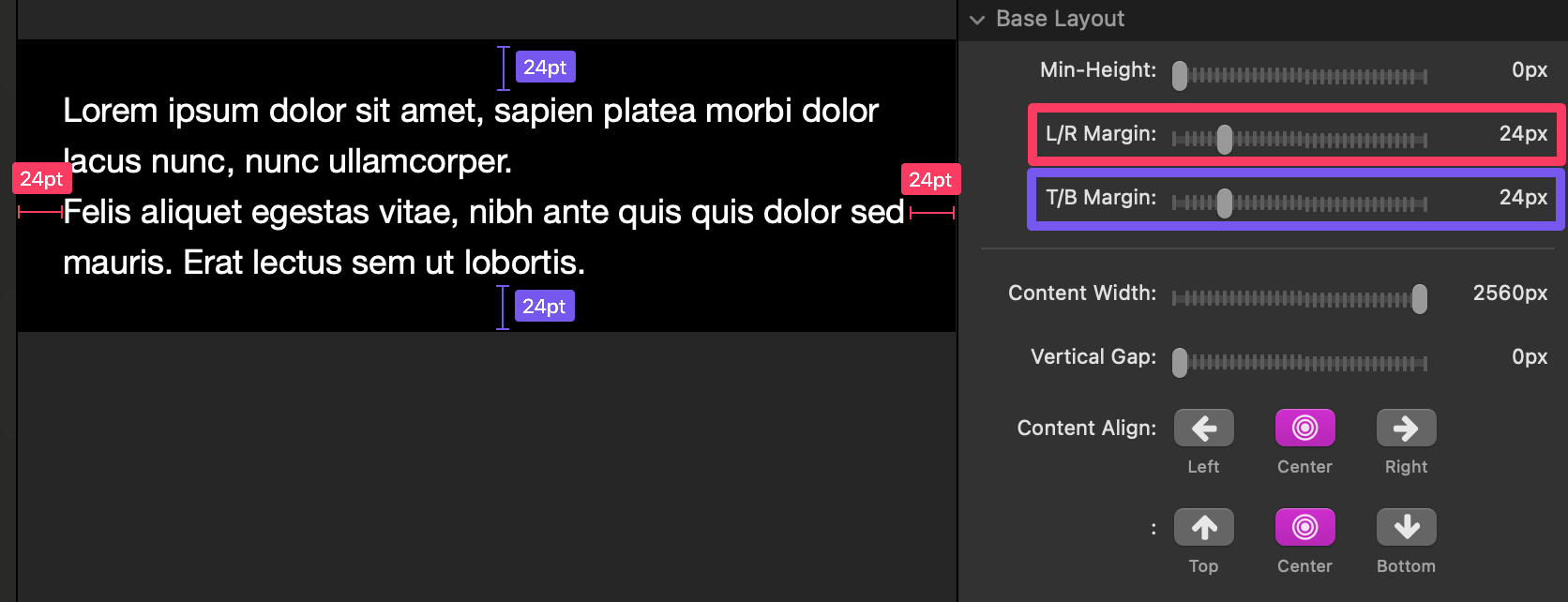
Margins (L/R & T/B)
- Margin = space outside the container.
- T/B Margin adds space above/below the container (it doesn’t make the container taller; it just separates it from items above/below).
- L/R Margin adds space left/right of the container (you’ll notice it most when the container’s width reaches the edges of its parent).
Content Width
- Sets a maximum width for the content inside the container.
- Great for keeping text readable.
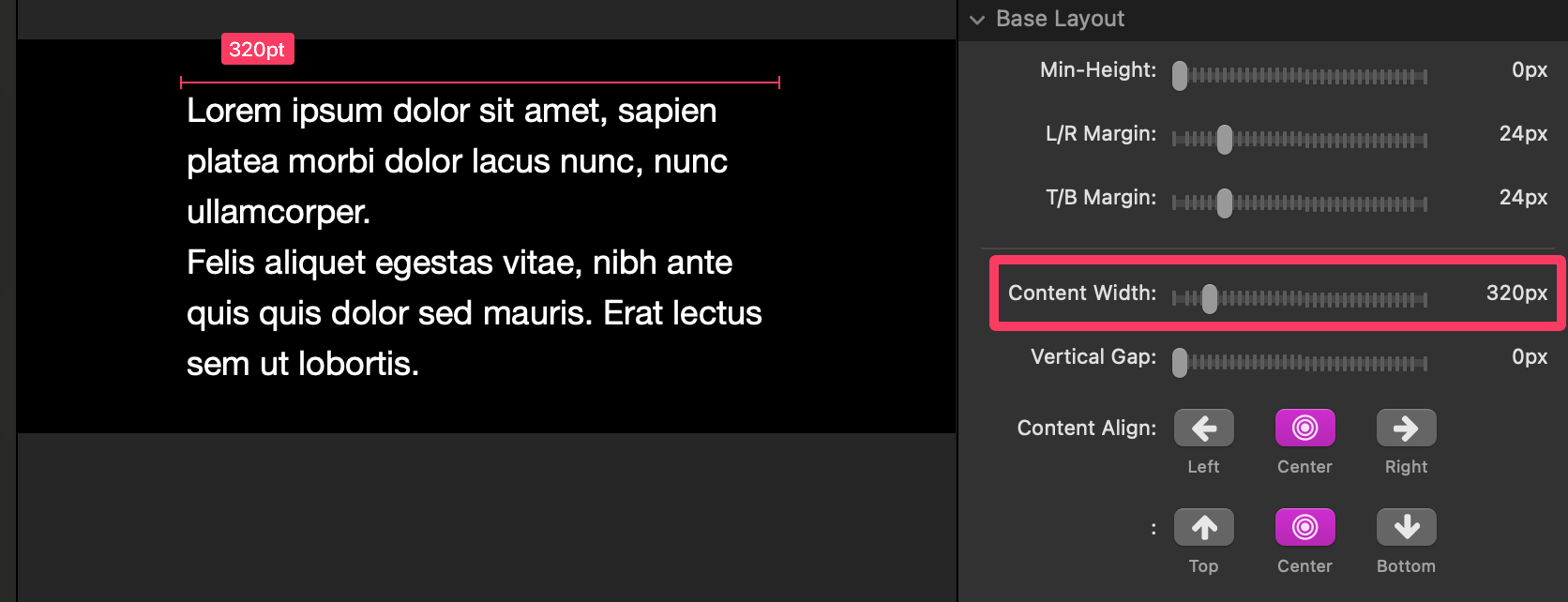
- If the container is wider than this, you’ll see empty space left/right—then Content Align decides where the content sits.
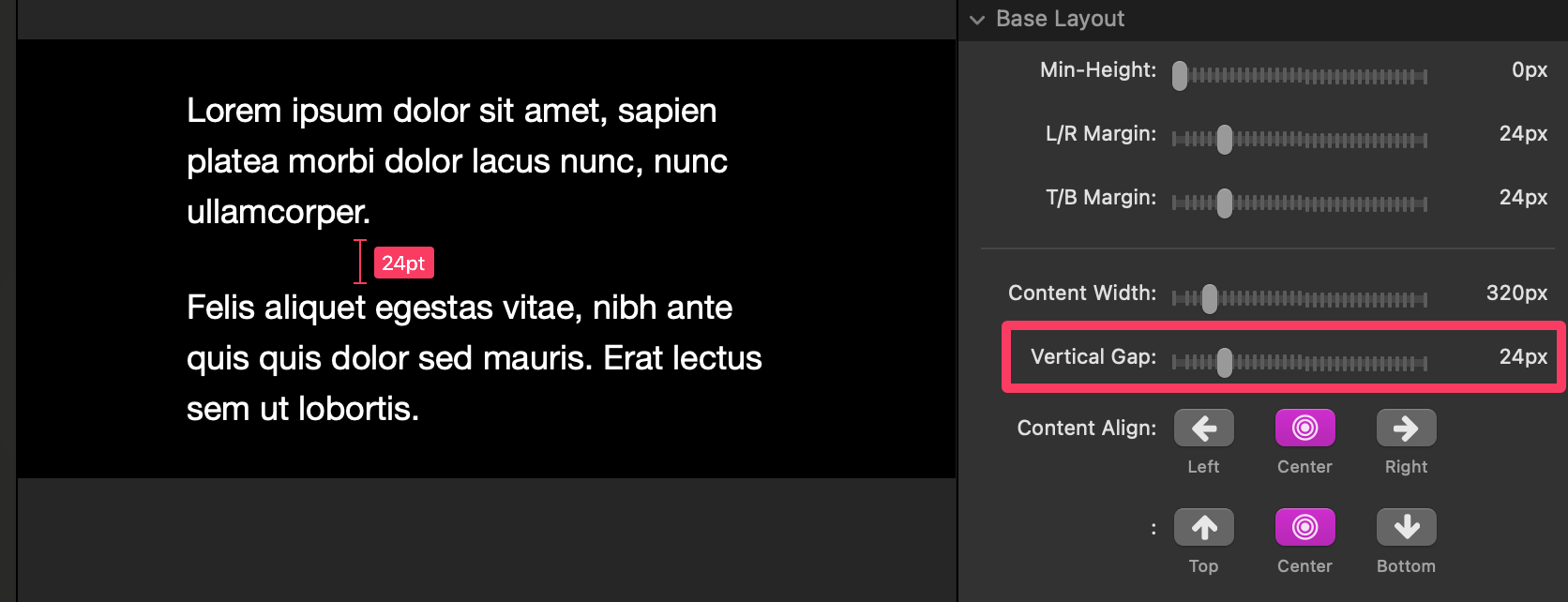
Vertical Gap
- Adds equal vertical spacing between immediate child stacks inside the container.
- Handy when child stacks don’t already have their own top/bottom margins.
Content Align
- Controls horizontal and vertical placement of content when there is extra space.
- If Content Width is smaller than the container:
- Left / Center / Right apply horizontally.
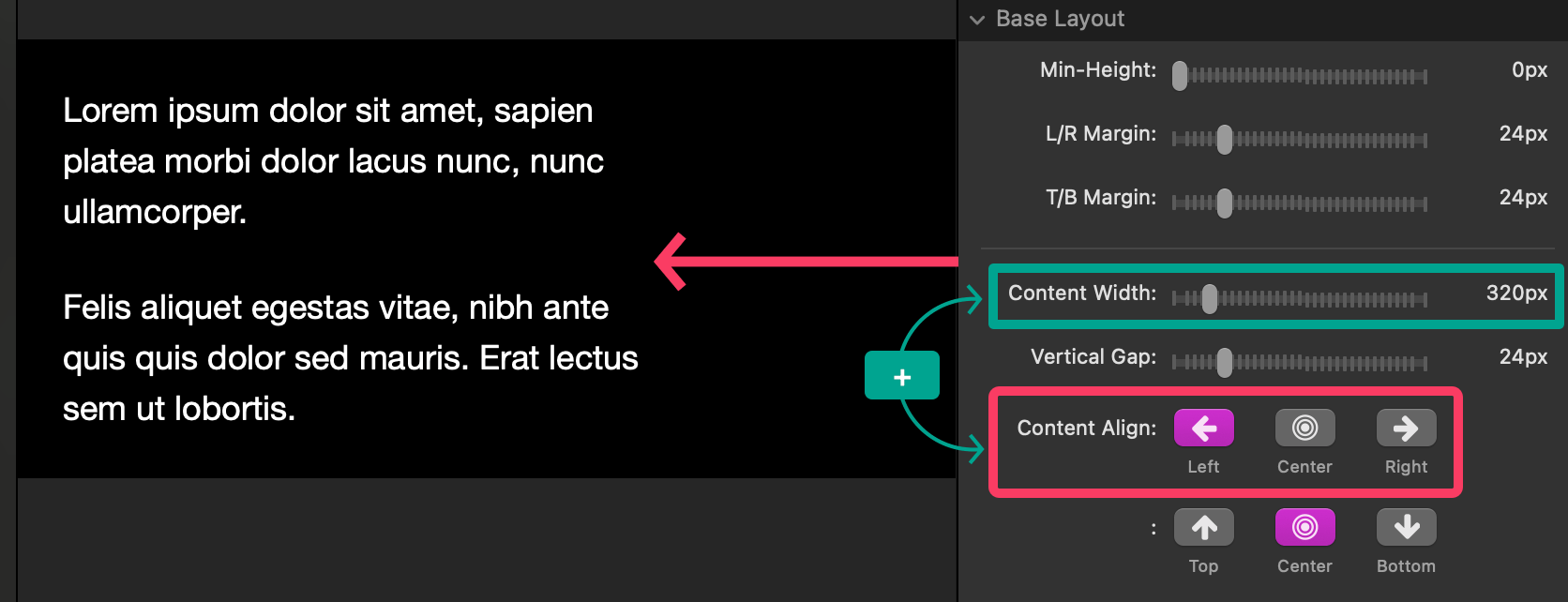
- If Min-Height is taller than the content:
- Top / Center / Bottom apply vertically.
Background
- Optionally add a Color, Gradient, or Image background.
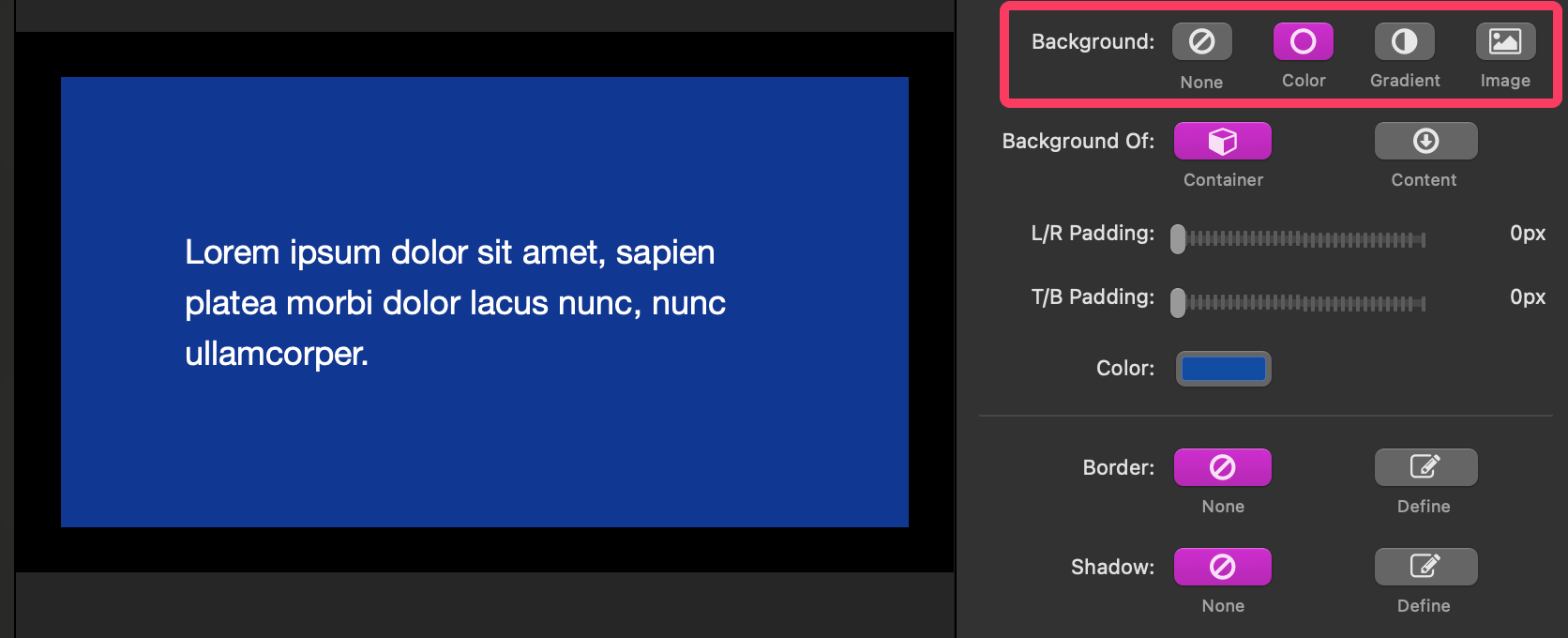
Background Of
- Container — background fills the entire container box (excluding outer margins). Content is aligned within that area.
- Content — background wraps just the content (so it moves with the content when aligned).
You’ll only notice empty margins if content touches the edges.
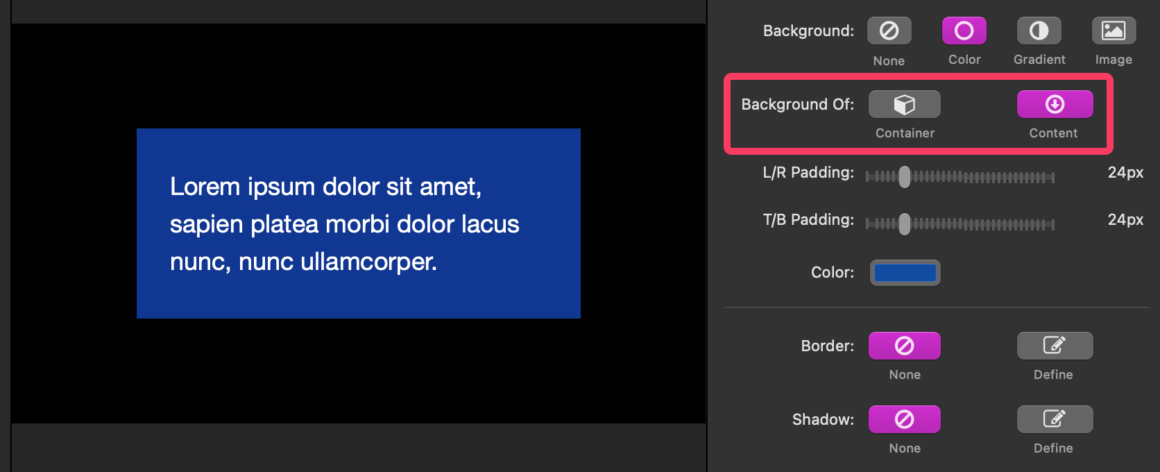
Padding (L/R & T/B)
- Padding = space inside the background, surrounding the content.
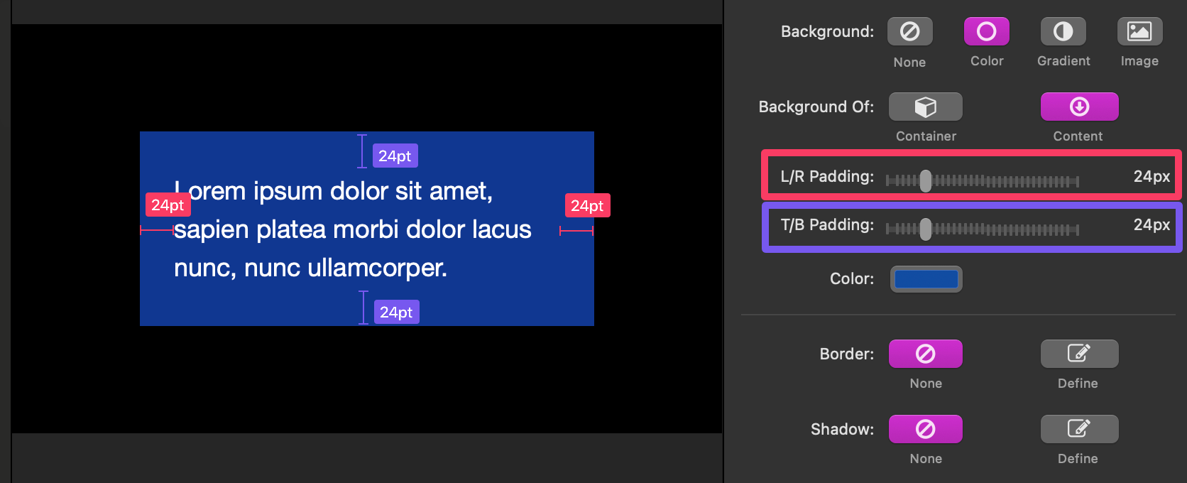
- If Background Of = Container, padding shows when content reaches the background edges (e.g., content centered with a narrow Content Width may not touch the edges, so padding might not be visible until smaller widths).
Border & Shadow
- Border & Shadow controls are exposed if you have added a Color, Gradient, or Image background. They apply to the same area as Background Of (Container or Content). Use this to create cards, callouts, and framed sections.
Tips & common gotchas (Container)
- If Center isn’t doing anything horizontally, check: Is Content Width actually smaller than the container?
- If vertical alignment isn’t working, check: Is Min-Height larger than the content?
- If your background isn’t covering the area you intended, ensure Background Of is set correctly and Padding isn’t zero (when you want space around content).
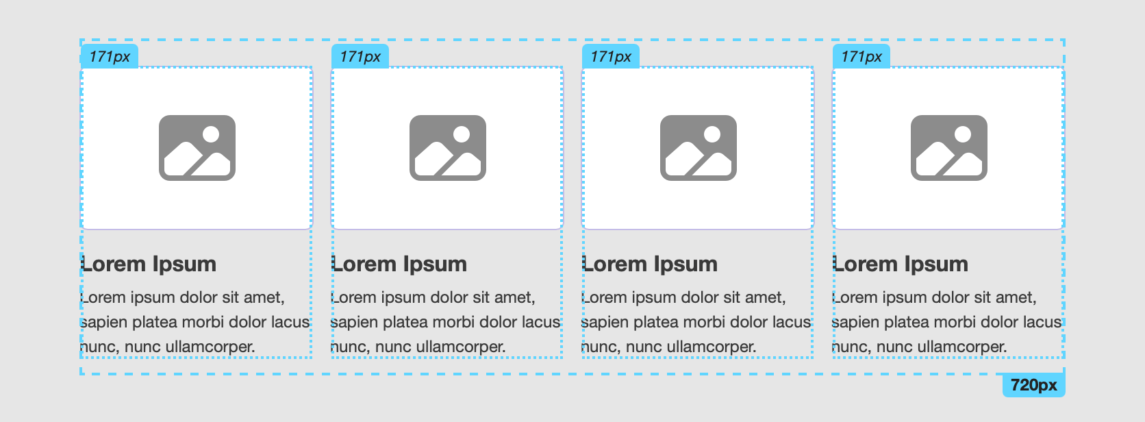
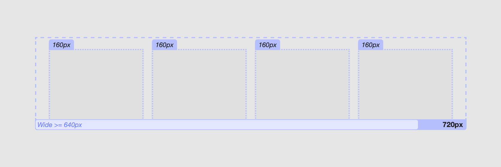
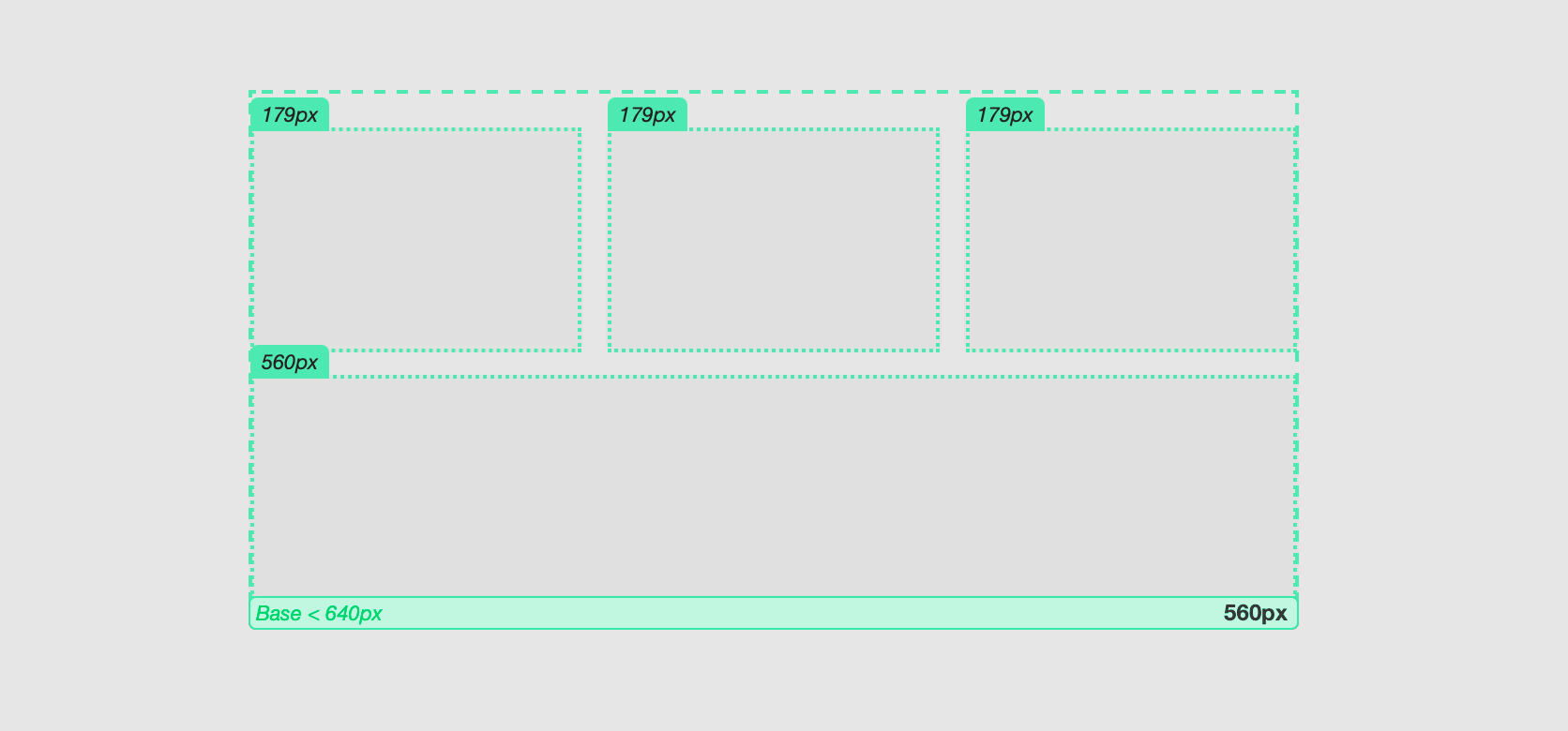
Using the Sym Columns Stack (symmetrical columns)
When to use
- Make even columns (2–12) that all size the same.
- Let columns wrap onto a new row instead of shrinking too small.
- Keep columns from growing too wide.
- Fine-tune alignment and wrapping behavior at up to three width ranges.
Quick start
- Add Sym Columns to the page.
- Set the number of columns with the Sym Columns slider.
- Drop any stacks into each column.
- Choose Adaptive Mode (Single/Double/Triple) and adjust Breakpoints if needed.
Layout settings
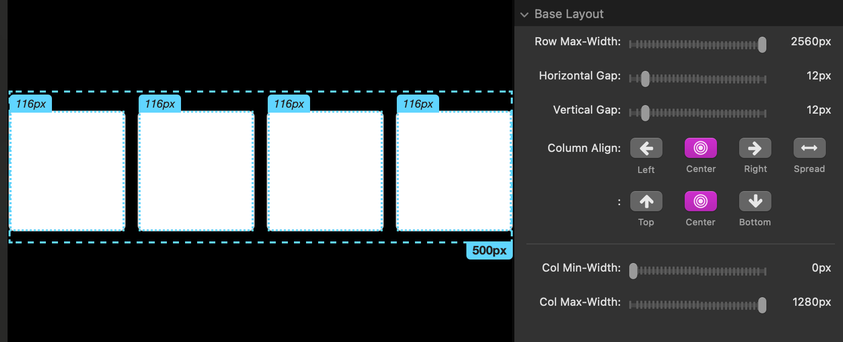
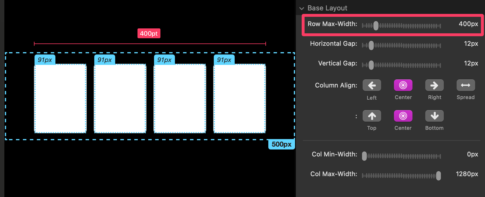
Row Max-Width
- The maximum width of the entire row (all columns side-by-side).
- Keeps the row from stretching too wide; pairs nicely with Column Align.
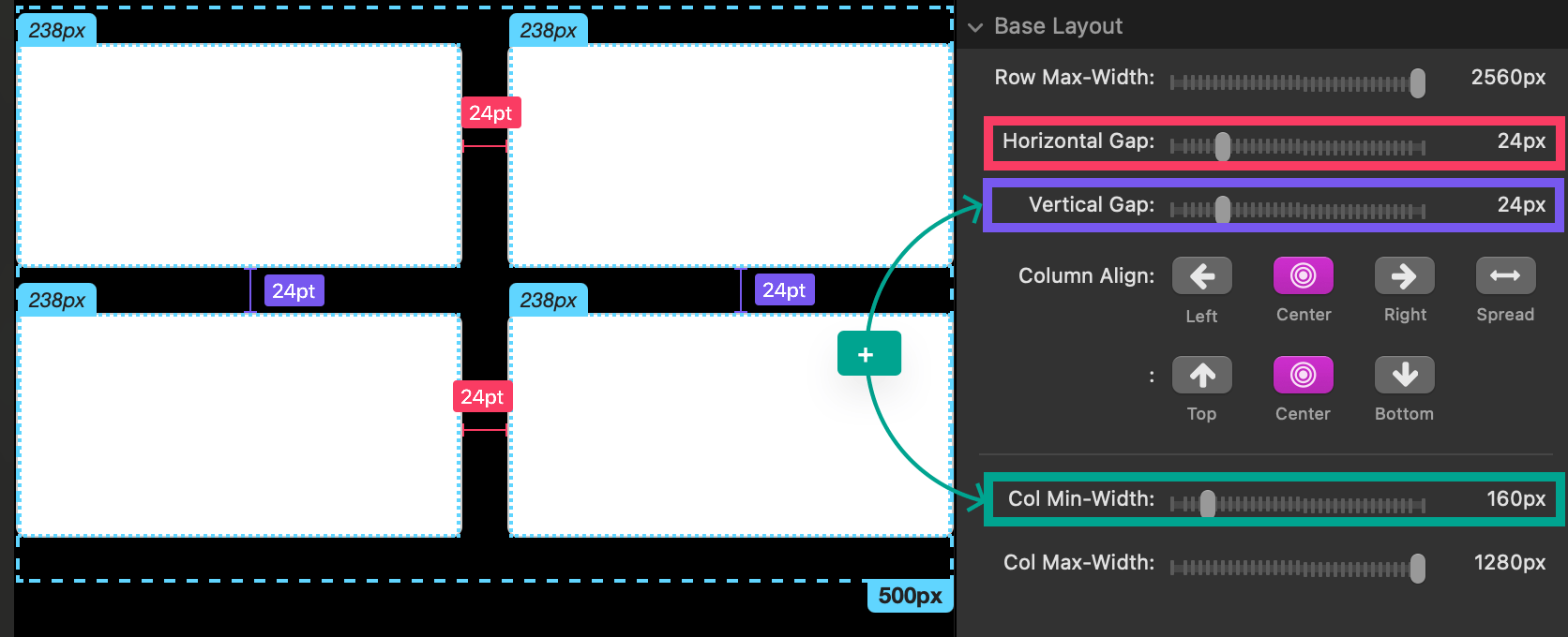
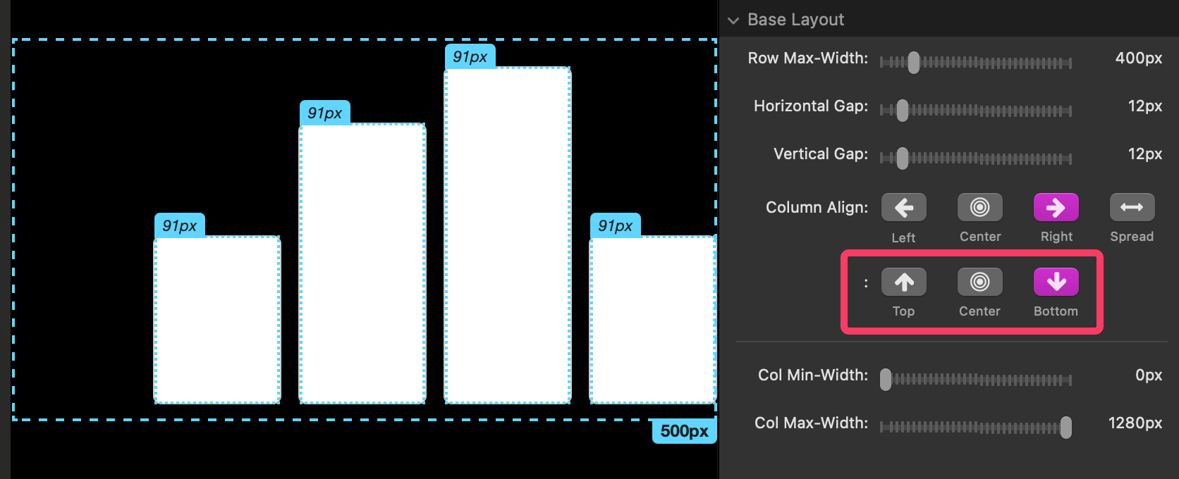
Horizontal & Vertical Gap
- Horizontal Gap is the space between columns in the same row.
- Vertical Gap is the space between rows of columns (only shows when columns wrap to a new row, or when another Sym Columns stack sits directly below).
Column Align
- Controls how the row of columns sits inside extra space:
- Left / Center / Right — position the row as a group.
- Spread — distributes extra space between columns, not on the sides.
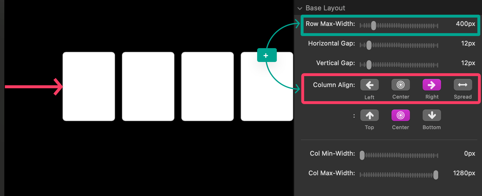
- Also controls vertical alignment of column content relative to the tallest column:
- Top / Center / Bottom (visible when column heights differ).
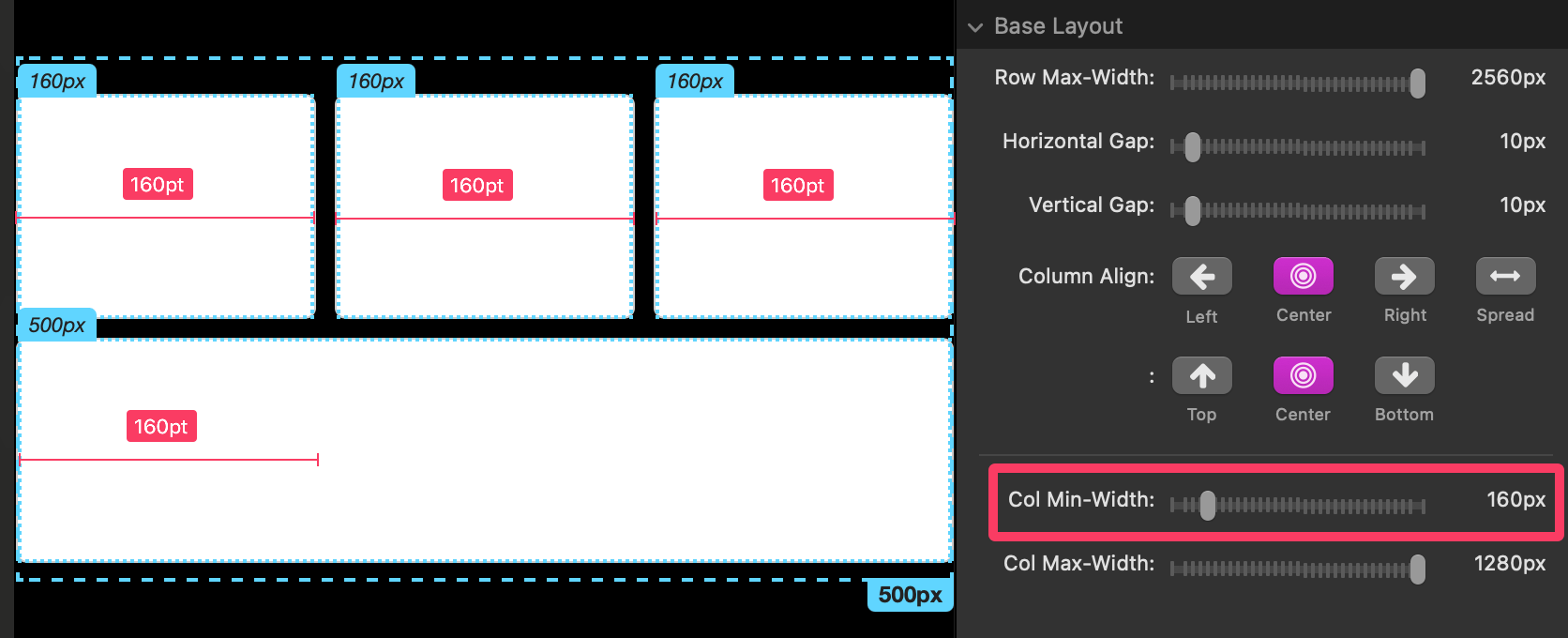
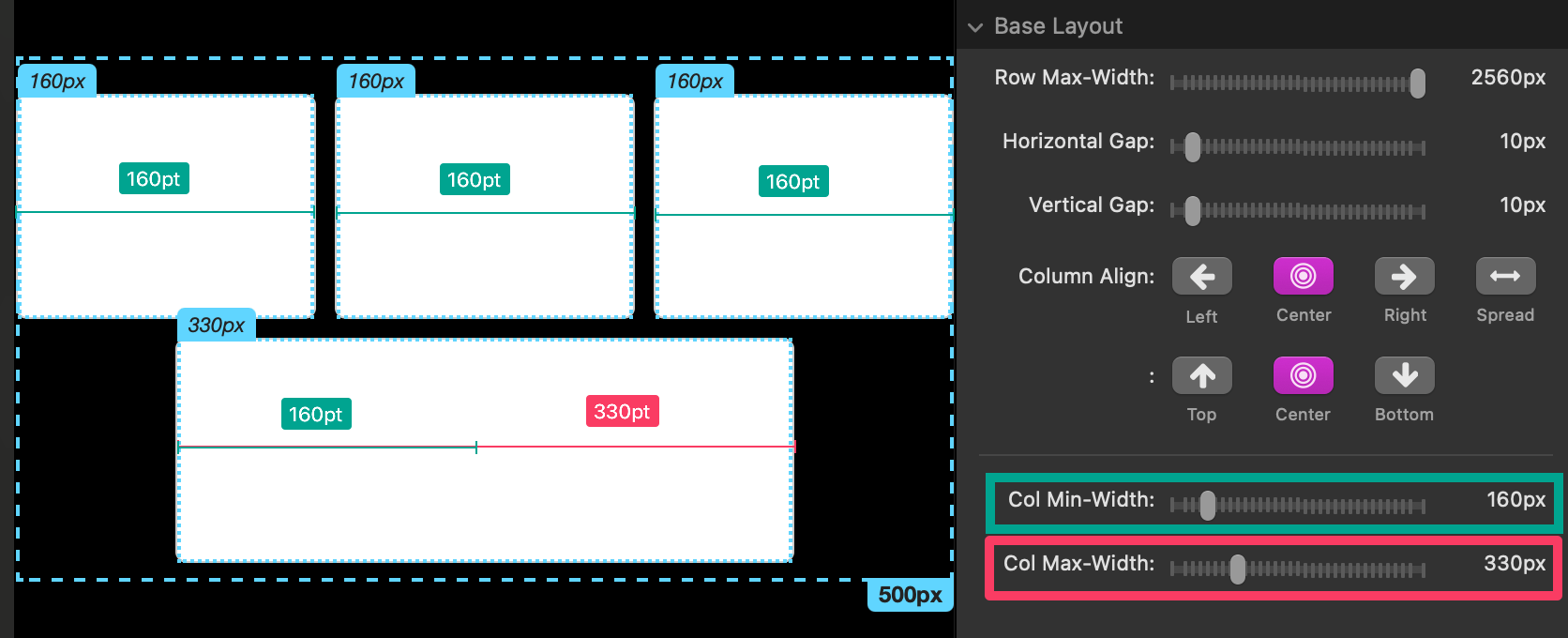
Col Min-Width
- The smallest width a single column can shrink to before wrapping happens.
- If the row gets narrower than the total needed space, overflow columns wrap to a new row.
Col Max-Width
- The largest width a single column is allowed to grow to.
- If (columns × Col Max-Width) + (gaps) is less than Row Max-Width, Column Align (Left/Center/Right/Spread) determines how the leftover space is handled.
Middle & Wide Layout — Modify Layout
- In Double/Triple modes, check Modify Layout to set different alignment/spacing for that specific layout.
- If you leave it off, the layout inherits settings from the one before it.
General Settings — Reverse row wrap
- When enabled, columns that need to wrap will move to a row above instead of below.
- This can help keep important columns earlier in the reading order at narrow widths.
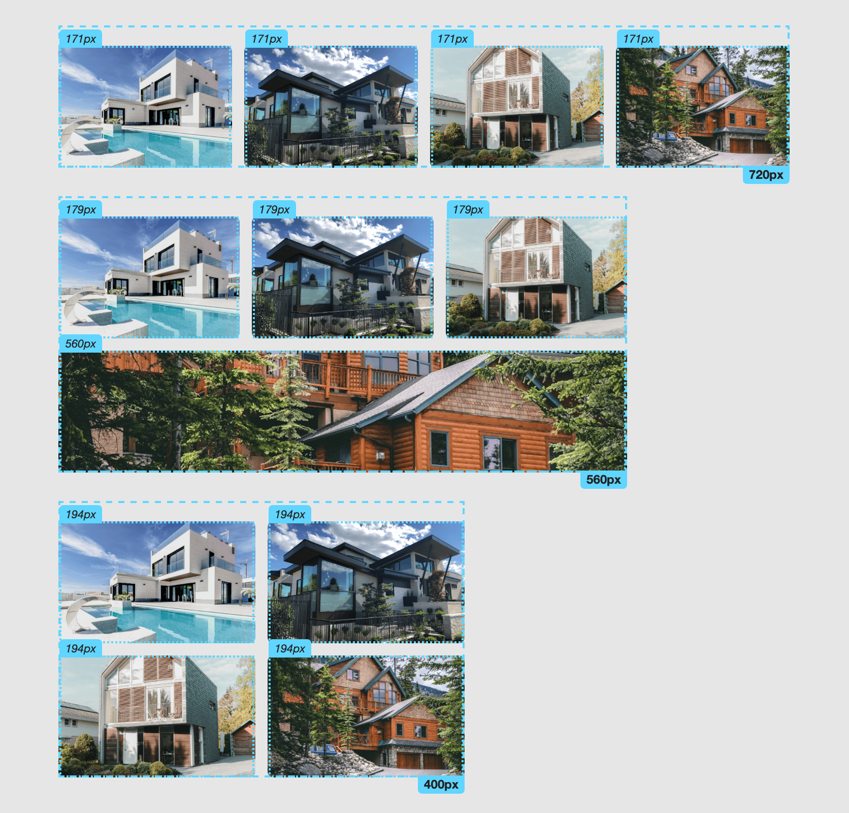
Example recipe (Sym Columns)
- 4 columns, Col Min-Width = 240, Horizontal Gap = 24
- At wide widths -> 4 in one row
- At medium widths ->= wraps to 2 + 2
- At narrow widths -> wraps to 1 + 1 + 1 + 1
- Use Spread at wide widths for a balanced look; Center at medium.
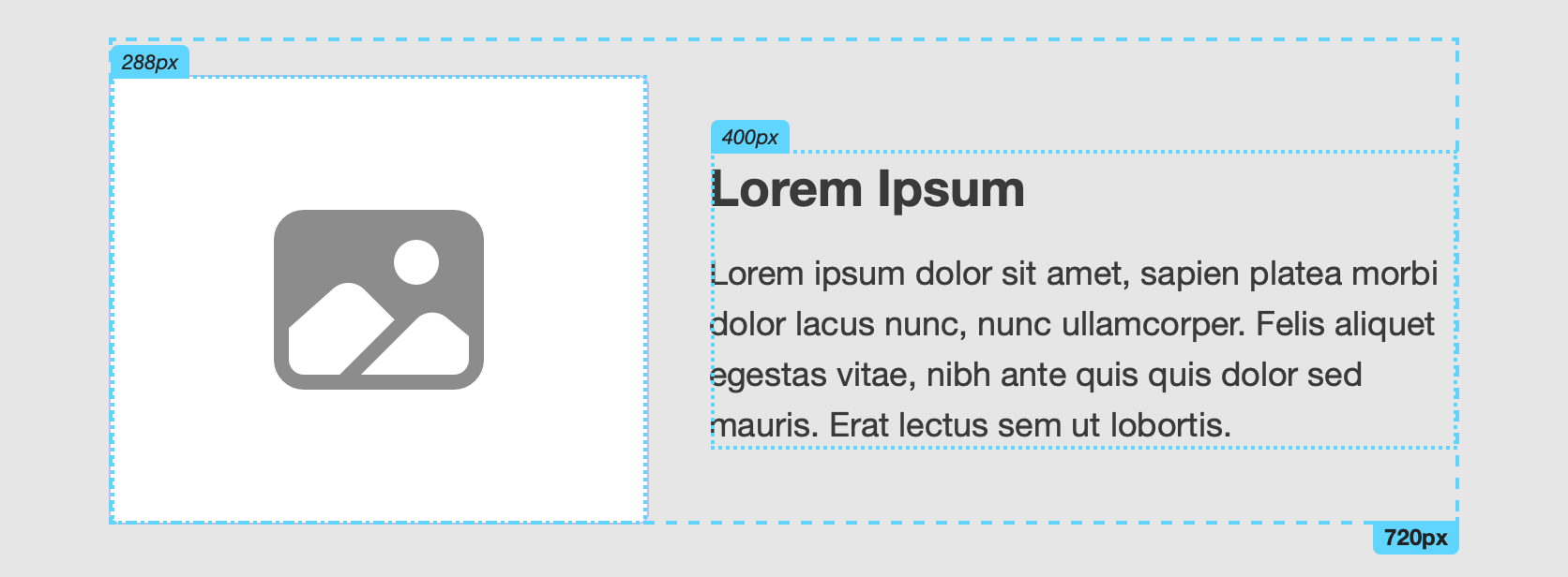
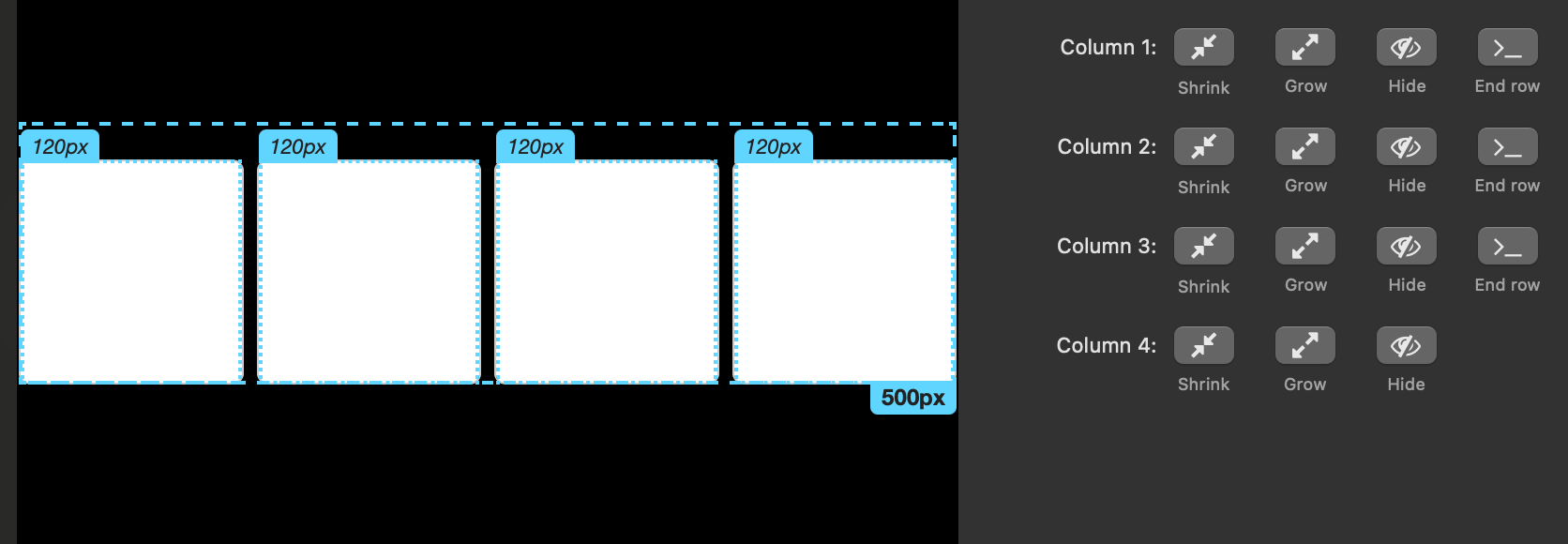
Using The Asym Columns Stack (asymmetrical columns)
When to use
- Make 2–4 columns where each column can behave differently.
- Let a “primary” column grow while others shrink.
- Hide columns at certain widths or force a wrap at a specific point.
- Fine-tune all of this across 1–3 width ranges.
Shared settings
- Any settings that have the same names as in Sym Columns behave the same (Row Max-Width, Gaps, Column Align, etc.).
- Adaptive Modes (Single/Double/Triple) and Breakpoints work the same way as the other stacks.
Unique per-column controls (Columns 1–4)
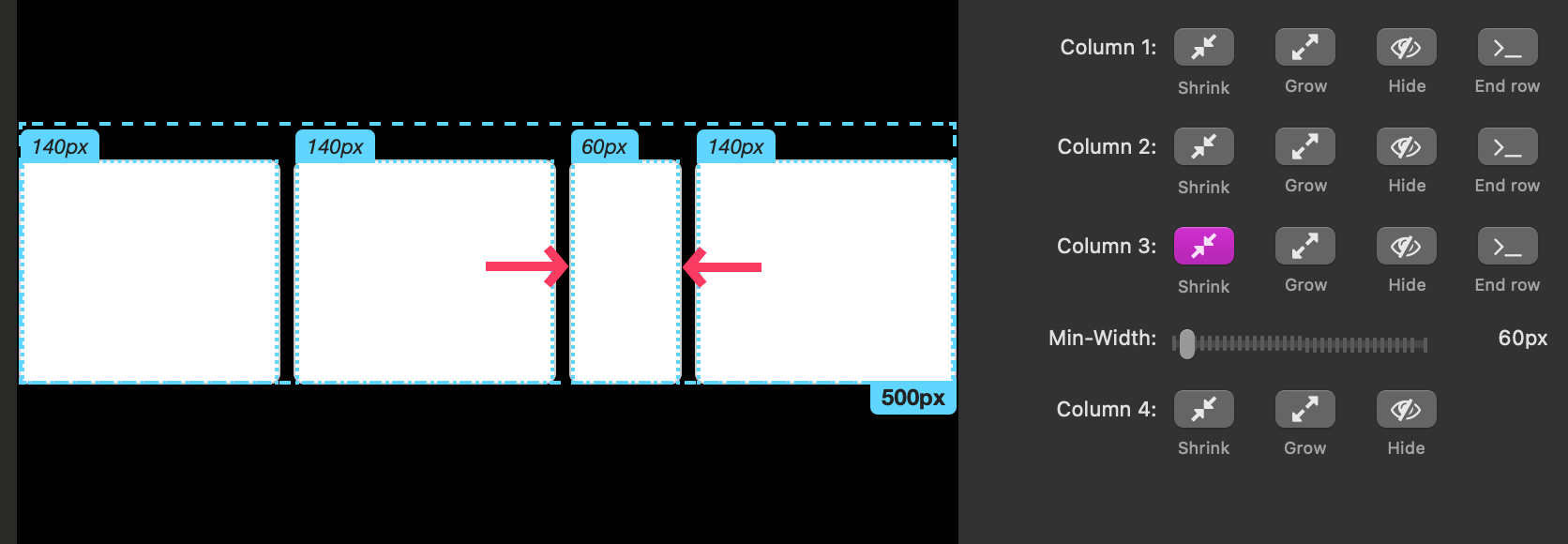
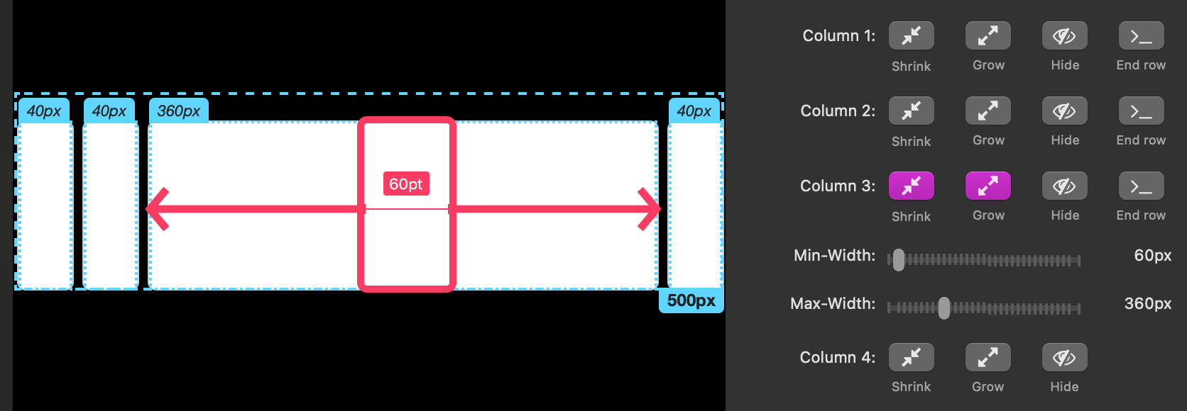
Each column has four toggles plus min/max widths:
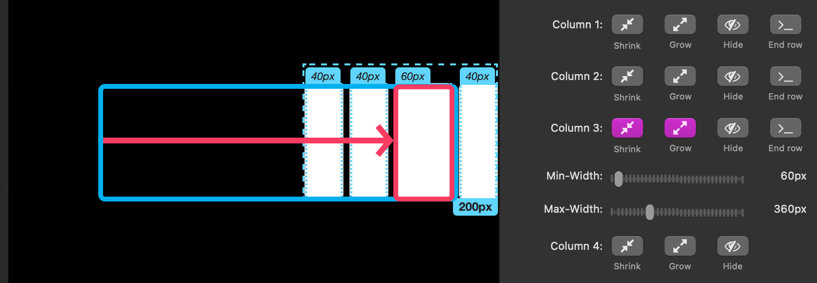
1) Shrink (with Min-Width)
- Forces the column to shrink down to its minimum width.
- If you set Min-Width = 0, the column may shrink so much it looks hidden.
- Set a Min-Width to keep it visible
2) Grow (with Max-Width)
- Allows the column to expand and take leftover space.
- Max-Width caps how wide it can get.
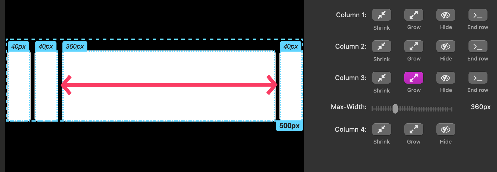
- If multiple columns can grow, they share the leftover space (until each hits its own Max-Width).
Shrink + Grow together: The column won’t shrink below Min-Width as space decreases, and it can expand (up to Max-Width) when there’s extra room.
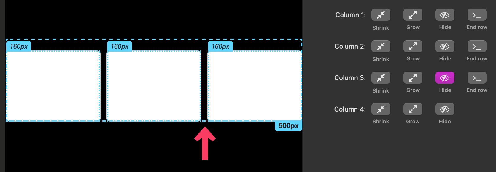
3) Hide
- Removes the visual column but it can still affect layout if Shrink/Grow are on (it still takes space).
- Use when you want fewer columns to display or to keep proportional behavior at certain widths.
4) End row
- Forces following columns to wrap to a new row.
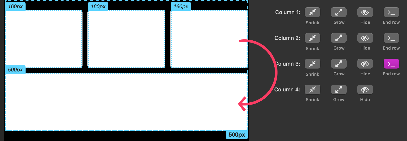
- Very useful in Double/Triple modes to control where the wrap happens in different width ranges.
Example recipe (Asym Columns)
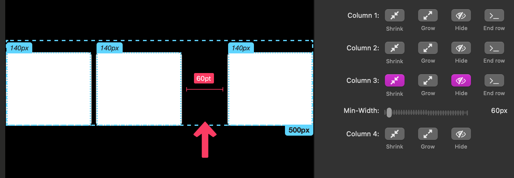
- 3 columns where the middle is the star:
- Col 1: Shrink (Min-Width 220), no Grow
- Col 2: Shrink (Min-Width 280) and Grow (Max-Width 700) ? primary
- Col 3: Shrink (Min-Width 220), no Grow
- Result: Middle column expands nicely on wide screens, all three stack gracefully on narrow screens.
Tips & common gotchas (Asym Columns)
- If a column “disappeared” at a certain width, check the column’s Min-Width. If Shrink is on and Min-Width is 0, it can shrink to nothing at small widths. Raise Min-Width (e.g., 160–220 px).
- If your columns do not appear to wrap when they should, make sure each non-hidden column has Shrink enabled with a Min-Width greater than 0. Columns that do not have a min-width will continue to shrink rather than wrap to a new row.