Adding Anchored Slider
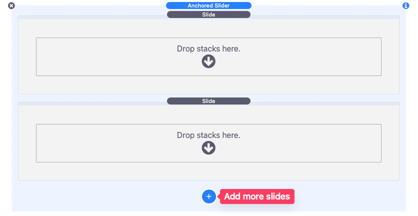
With the editor open, add Anchored Slider to your desired location. Two slide elements will be added by default. The blue “Add” button can be used to add more slides.
Editing Slides
Once a slide has content added to it, select the Slide element in the editor and open the settings panel to modify the appearance and layout.
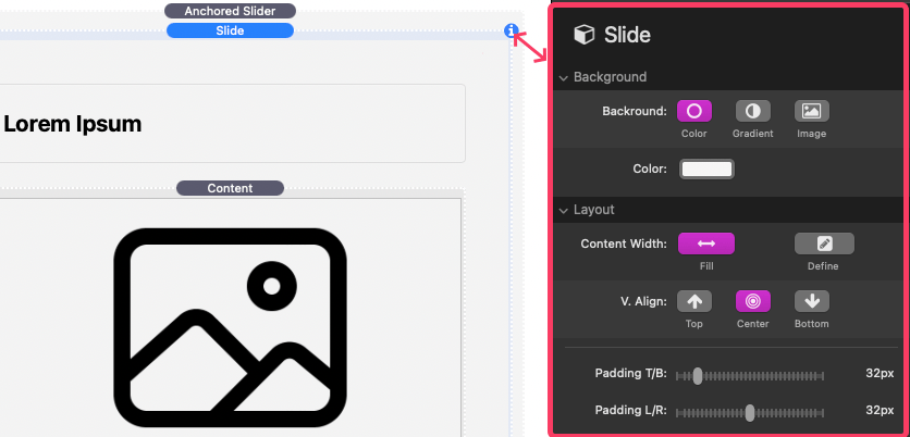
Slide Settings Panel: Background
The Background setting allows you to change the slide background color. You can also alternatively use a gradient or an image. The Image option includes a few additional settings:
Bg Image URL
An optional input field is provided in case you would like to reference a “warehoused” or an externally stored image.
Bg Image Size
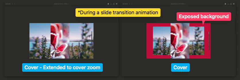
This setting includes a special “Cover – Extended to cover zoom” option. When this option is selected it will cover the entire background of the slide by cropping the image just like the “Cover” option does. However, this option will further crop the image to account for the zoom when the slide is transitioning in or out of focus.
Bg Image Colors: Background
This is the color that is displayed behind the image. This background color can be seen when using Bg Image Size “Contain” or “Cover” options.
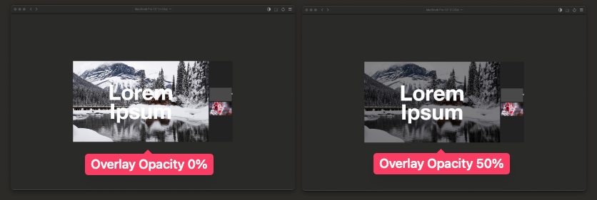
Bg Image Colors: Overlay
This color is displayed overtop the background image. In all cases you will want to make this overlay color partially transparent. The overlay can help increase the contrast between the background image and any content placed in the slide.
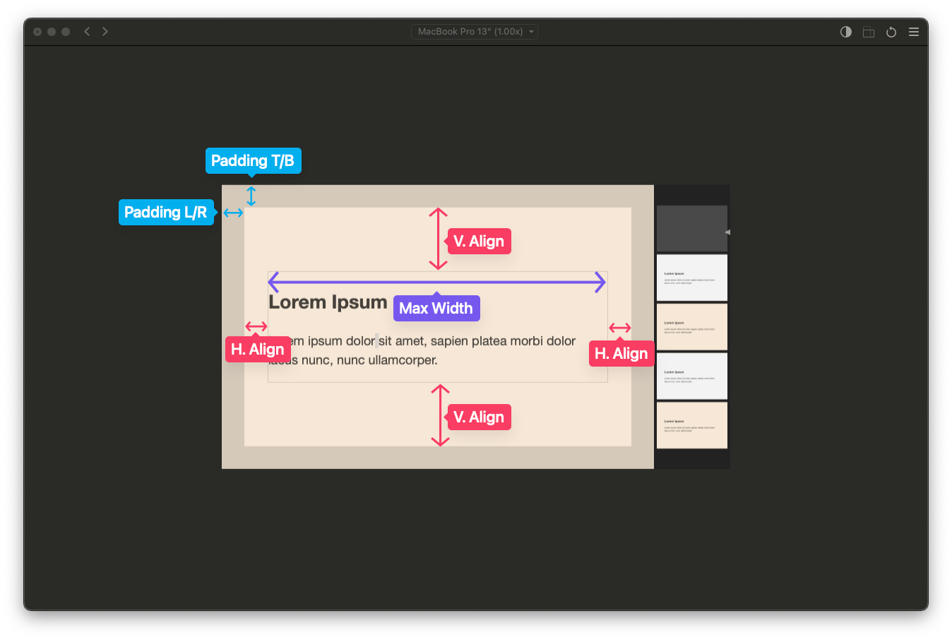
Slide Settings Panel: Layout
Use the layout settings to define a max-width and alignment for the content in the slide. Note that the horizontal alignment only applies to the content if the slide itself is wider than the content max-width. Likewise the vertical alignment only applies to the content if the slide itself is taller than the height of the content.
Slide Settings Panel: Advanced
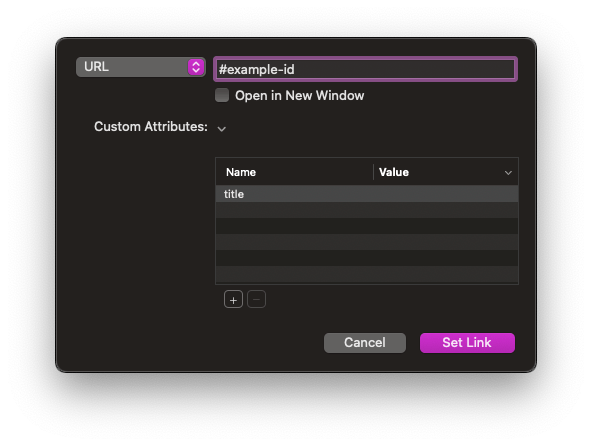
ID #
The ID setting can be used to assign a unique anchor tag for the slide. Do not include the # symbol when adding a value to the field. The value can be used in a link URL to navigate to the slide.
#example-id
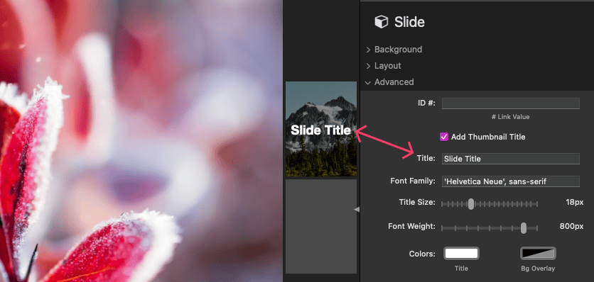
Add thumbnail title
The Add thumbnail title checkbox can be enabled to define a title that displays on top of the slide thumbnail. Note that this only applies if the Anchored Slider settings have thumbnails enabled.
Adjusting Slider Settings
After you have finished setting up each of your slides, select the Anchored Slider stack in the editor and open the settings panel.
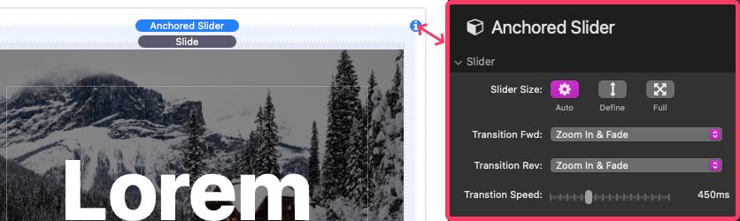
Anchored Slider Settings Panel: Slider
Slider Size
By default the slider will always fill the available width of the container it is placed inside of. The Auto option will automatically determine a height for the slider. Choose the Define option to optionally define the height based on a percent of the browser window. The Full option will force the slider to always fill the entire browser window, even if it means displaying outside the bounds of the container.
Transition Fwd
Select a transition animation for each slide as the page is scrolled downwards. When a slide becomes active, this animation will begin.
Transition Rev
Select a transition animation for each slide as the page is scrolled in reverse or upwards. When a slide becomes active, this animation will begin.
Transition Speed
Defines in milliseconds the duration of the forward and reverse animations.
Anchored Slider Settings Panel: Thumbnail Track
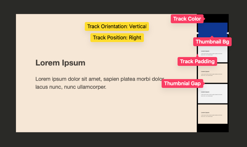
Track Color
Changes the background color of the thumbnail track.
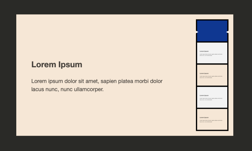
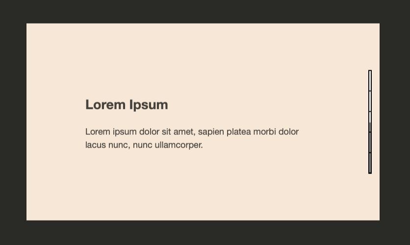
Track Orientation & Position
Sets where the thumbnail track displays, either vertically on the left of right, or horizontally on the top or bottom.
Scroll Speed
Adjusts the scrolling speed of each of the slides by a percentage. A higher percentage speeds up scrolling and reduces the required distance to scroll to activate the next or previous slide.
Thumbnail Bg
Changes the color of the thumbnail background. This background is only visible when the slide is currently active.
Track Padding
Adjusts the space around the thumbnails and inside the track.
Thumbnail Gap
Adjusts the space between each thumbnail.
Indicator Color
Changes the color of the track indicator.
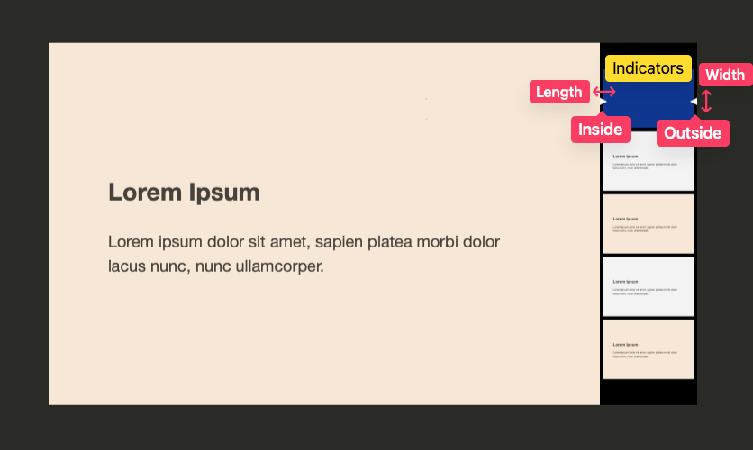
Indicators
Selects which indicators should be shown, one on the inside of the track and one on the outside. Both can be enabled or disabled at the same time.
Indicator Width
Adjusts the size of the indicator along the long side of the track.
Indicator Length
Adjusts the size of the indicator as it overlaps the thumbnails.
Floating track mode
Enable this to place the track overtop of the slides in a condensed format.
Moving track mode
Enable this to allow the thumbnails to animate to show progress instead of the indicator.
No thumbnail mode
Enable this to disable the thumbnails and show a progress bar instead. Setting the available Bar Thickness and Bar Gap settings to 0px will allow you to remove the thumbnail track altogether.
Anchored Slider Settings Panel: Advanced
Z-index
This value can be adjusted if the slider is displaying over top of another element it should not or vise versa.
Offsets
These values adjust the spacing around the slider as it anchors the browser window. These can help prevent the slider from overlapping another element that may also be anchored to the browser window.
Mobile
A few options are provided to adjust the layout of the slider when on mobile devices. The track orientation can be changed to a more touch friendly location or the slider can be disabled altogether, allowing the content to be display statically.
Breakpoint
Define the maximum width at which the Mobile setting option applies.
Fullscreen slider size on mobile
Enable the setting if the container around Anchored Slider does not leave enough space to display the slides normally on small devices. This will allow the slider to automatically fill the entire screen at a maximum of the defined Breakpoint.