
Seaworthy offers a plethora of unique styling controls. Let us go over each option in further detail.
Table of Contents
- Applying Slider
- Extra Content Stack
- General Options
- Page Specific Options
- Slider Options
- Mobile Options
- Extra Content Options
- Text Options
- Changelog
Applying Slider
Step 1:
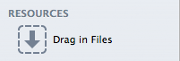
Export your desired images on the Resources section of RapidWeaver. Resources is located on the leftmost side of the application. The slider corresponds to the images exported on this section, so take heed to this when applying them.
Step 2:
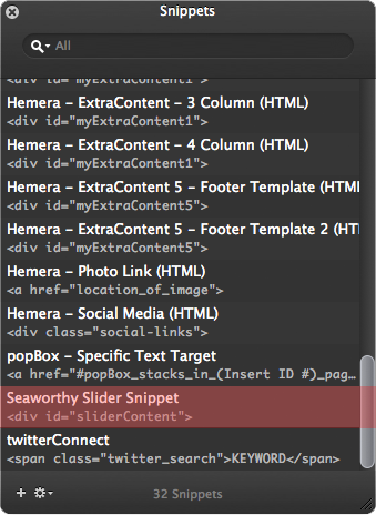
Locate the Seaworthy Slider Snippet on the Snippets section of RapidWeaver. You can also copy and paste it from below.
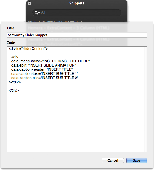
<div id="sliderContent">
<div
 data-image-name="INSERT IMAGE FILE HERE"
 data-split="INSERT SLIDE ANIMATION"
 data-caption-header="INSERT TITLE"
 data-caption-text="INSERT SUB-TITLE 1"
 data-caption-cite="INSERT SUB-TITLE 2"
></div>
</div>
Further examination displays the code for the slider. Each sub-div within the sliderContent div registers as one slide for the slider. Apply another sub-div for two slides, and so forth.
Within each sub-div, there are five data-type options:
- data-image-name: Insert the name of the image file on this section from the “Resources” section.
- *data-split: This determines the transitioning animation for each slide (See below for all types of animations).
- data-caption-header: Adjust the header for each slide.
- data-caption-text: Adjust the middle text for each slide.
- data-caption-cite: Adjust the bottom text for each slide.
*Data Split Animations:
- horizontal
- horizontal-right
- horizontal-left
- horizontal-clockwise
- horizontal-counterclockwise
- vertical
- vertical-top
- vertical-bottom
- vertical-clockwise
- vertical-counterclockwise
Step 3:
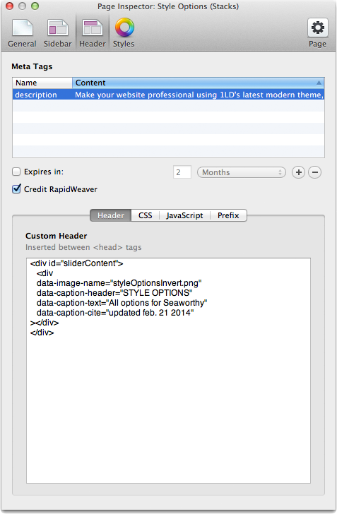
Attach the snippet onto the Header of the Header section of the Page Inspector. Refer to the image above for reference. At this point, your slider is active and ready for previewing. Remember to adjust the size of the slider on the Style Options section, since the default option for the slider is set to None.
Note: RapidWeaver’s auto formatting will sometimes change straight quotation symbols ” into curly ones “. Curly quotes do not work inside HTML code. In order to replace the curly quotes with the correct straight quotes you can select and delete them and then retype them in. Alternatively, whenever you apply “Ignore Formatting” to HTML code it will automatically change the curly quotes to straight quotes.
Extra Content Stack
*Applies to Stack page only.
Step 1:
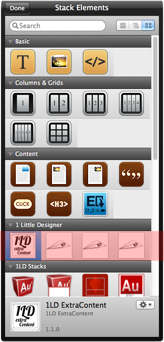
Locate the Extra Content stack within your Stack Elements page. Apply the stack anywhere on the page.
Step 2:
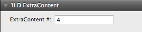
Input the number value on the Extra Content stack’s option area. The number value dictates where the Extra Content stack will be placed:
- 1 = Post-Header
- 2 = Top Pre-Stack (Before Stacks)
- 3 = Middle Pre-Stack (Before Stacks)
- 4 = Bottom Pre-Stack (Before Stacks)
- 5 = Top Post-Stack (After Stacks)
- 6 = Middle Post-Stack (After Stacks)
- 7 = Bottom Post-Stack (After Stacks)
General Options
General options dictate the overall styling of the RapidWeaver page.
GENERAL: Header Width
Header width determines the total width of the header. Alternate between the traditional 960px or full width header.
GENERAL: Footer Width
Footer width determines the total width of the footer. Alternate between the traditional 960px or full width footer. To omit the footer, select “None”.
GENERAL: Sidebar Width
Footer width determines the total width of the footer. Alternate between the traditional 960px or full width footer. To omit the footer, select “None”.
GENERAL: Colours
Set general colours for the following:
- General Background
- Page Background
- Title/Description Background
- Header
- Menu
- Menu Hover
- Footer Background
- Footer Border
- Footer Sitemap Divider
- Sidebar Border
Page Specific Options
Page specific options dictate styling specific to a particular RapidWeaver page.
PAGE SPECIFIC: Page Title/Description Width
Page Title/Description width determines the total width of the page title & description. Alternate between the traditional 960px or full width sizes. To omit the page title & description, select “None” (Applies to all pages involving the page title & description).
PAGE SPECIFIC: Presentation Style
Presentation Style allows the user to display their photos, movies, and miscellaneous files in either a gallery or list fashion (Applies to Photo Gallery, Movie Album, and File Share pages).
PAGE SPECIFIC: Lightbox Icons
Adjust the Lightbox Icons to either a light or dark color (Applies to Photo Gallery page).
PAGE SPECIFIC: Movie Preview Size
Adjust the size of the movie preview. Sizes are based on sizing options for Photo Gallery image previews in order to regulate page consistency (Applies to Movie Gallery page).
PAGE SPECIFIC: Colours
Set page specific colours for the following:
- Title/Description Background
- List Divider
- Gallery Lightbox
- Blog Link Background
- Form Field Focus
- Form Reset
- Form Submit
- File Share Title
Slider Options
Slider options dictate the overall styling of the slider.
SLIDER: Sizes
Adjust the size of the slider. User has the ability to alternate between the traditional 960 or full width, as well as the overall height of the slider.
SLIDER: Caption Position
Position the caption text to the left, right, or middle of the slider.
SLIDER: Colours
Set slider colours for the following:
- Navigation Arrows
- Slider Pagination
Mobile Options
Mobile options dictate styling for the mobile navigation menu. (Viewable only on mobile devices).
MOBILE: Menu Shadowing
Enable shadowing for depth purposes.
MOBILE: Menu Highlighting
Adjust the navigation highlighting to either a light or dark color.
MOBILE: Colours
Set mobile navigation colours for the following:
- Menu Button
- Menu Background
- Menu Link
- Menu Link Hover
- Menu Current Link
Extra Content Options
Extra Content options dictate styling for the Extra Content Stack.
EXTRA CONTENT: Set Max Width
Enable max width for area within the Extra Content stack, overriding the page’s base width value.
EXTRA CONTENT: Colours
Set extra content colours for the following:
- EC 1 (Post-Header)
- EC 2 (Top Pre-Stack)
- EC 3 (Middle Pre-Stack)
- EC 4 (Bottom Pre-Stack)
- EC 5 (Top Post-Stack)
- EC 6 (Middle Post-Stack)
- EC 7 (Bottom Post-Stack)
Text Options
Text options dictate styling for text.
TEXT: General Font
Adjust the font for the general content text.
TEXT: Page Title Font
Adjust the font for the page title.
TEXT: Site Title Font
Adjust the font for the site title.
TEXT: Site Description Font
Adjust the font for the site description.
TEXT: Heading Font
Adjust the font for heading text (h1, h2, h3, etc.).
TEXT: Colours
Set text colours for the following:
- Page Text
- Page Links
- Page Navigation
- Title
- Description
- Sub-Title
- Sub-Description
- Menu Text
- Footer Text
- Sidebar Text
- Slider Title
- Slider Blockquote
- Lightbox Text
- Form Reset Text
- Form Submit Text
- Fileshare Title