Here is a customer review/tutorial by William Winter
Getting Started
Step 0: Download and install stack.
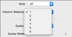
Step 1: Drag the stack onto the page . After dragging the stack onto the page, select the amount of columns that you want displayed. The selector for that can be found in the stack options under (Column Selection).
Step 2: Input the content that you want into the stack.
Grid Activation
The grid is an option that will reduce the amount of times that you have to drag Responsive Grids onto a page.
Step 1: Turn on the grid option to activate it. “note:anything in the stack prior will be disappear”
Step 2: Select the amount of rows that you want to use. “The default is 2”
Spacing Options
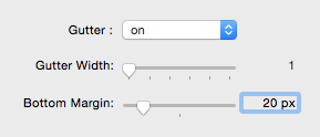
Gutter: The gutter has to option to turn off and on.
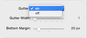
Gutter Width: Select the width of the gutter if you have the Gutter option turned on.
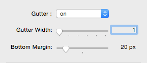
Bottom Margin: Input how much spacing you want bellow Responsive Grids.
Break Points
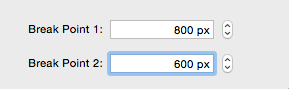
Break Point 1: Input the break point for the first media query. “This is usually for tablets on portrait mode.”
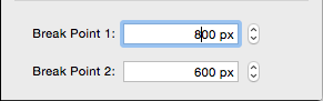
Break Point 2: Insert the amount of pixels you want for the second break point. “This is typically for mobile phones.”
Advanced options
2 column , single column spacing , single column width , image options
2 Column
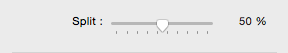
Split: Split is an option unique to the 2 columns option. Choose whether you want the stack to be a 50/50, 40/60, etc.
Single Column Spacing
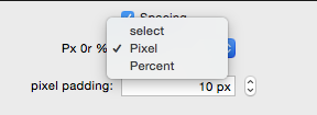
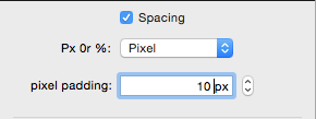
The Spacing option is the option for the padding on the top and bottom of the single column stack. This become very helpful if you are doing a single page website or even a portfolio site.
Step 1: Turn on spacing. 
Step 2: Select whether you want to use pixels or percentage.
Step 3: Input the amount you want on the top and bottom. “There maybe be more spacing on the bottom if you have an amount higher than Zero on the margin bottom option.”
Single Column Width
Control the max width of the single column. This is a great option if you want something to be a certain size and positioned in a certain way. “It will still be responsive! “
Step 1: Turn on the Max-Width option to activate it.
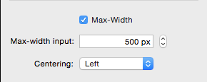
Step 2: Input how large you want your stack to be.
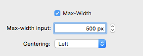
Step 3: Select the position of the stack. “center is very useful”
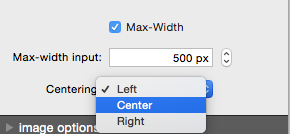
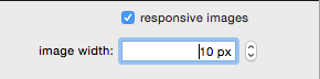
Image Options
You have a choice to have images be responsive.
Step 1: Activate responsive images.
Step 2: Input how wide you want your image to be.