Slider Images
Step 1: Add all the images you want to use to the Resources section. 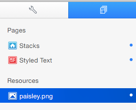 Step 2: Navigate to the HTML Header Section of the Page Inspector.
 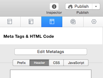 Step 3: Copy and Paste the code below into the text area.
<div data-src="%resource(IMAGE_NAME.jpg)%" data-fx="simpleFade">
  <div class="camera_caption fadeFromBottom"> Caption here </div>
</div>
Step 4: Change “IMAGE_NAME.jpg” to exactly match the name of your image in the Resources section (case sensitive) Step 5: Change “Caption here” to your desired caption or delete the entire section if you wish not to display a caption. Delete:
<div class="camera_caption fadeFromBottom">
  Caption here
</div>
Step 6: Repeat steps 3-5 untill you have as many photos you want to display in the slider, preview and you are complete.
Slider Transition Effects
Step 1: After you have added images to your slider you will notice a data-fx value after the resource names. You can change the data-fx value to one of the values below to get a different transition effect. ‘random’ ‘simpleFade’ ‘curtainTopLeft’ ‘curtainTopRight’ ‘curtainBottomLeft’ ‘curtainBottomRight’ ‘curtainSliceLeft’ ‘curtainSliceRight’ ‘blindCurtainTopLeft’ ‘blindCurtainTopRight’ ‘blindCurtainBottomLeft’ ‘blindCurtainBottomRight’ ‘blindCurtainSliceBottom’ ‘blindCurtainSliceTop’ ‘stampede’ ‘mosaic’ ‘mosaicReverse’ ‘mosaicRandom’ ‘mosaicSpiral’ ‘mosaicSpiralReverse’ ‘topLeftBottomRight’ ‘bottomRightTopLeft’ ‘bottomLeftTopRight’ ‘bottomLeftTopRight’ ‘scrollLeft’ ‘scrollRight’ ‘scrollHorz’ ‘scrollBottom’ ‘scrollTop’ Example: data-fx=”simpleFade” would be changed to data-fx=”curtainTopRight” for a curtain transition effect.
Single Image Banner
Step 1: Add the image you want to use to the Resources section. Step 2: Navigate to the HTML Header Section of the Page Inspector. Step 3: Copy and Paste the code below into the text area.
<img src="%resource(IMAGE_NAME.jpg)%" alt="Banner">
Step 4: Change IMAGE_NAME.jpg to match the name of your resource. Preview and you are done!
Background Image
Step 1: Add the image you want to use to the Resources section. Step 2: Navigate to the HTML > CSS Section of the Page Inspector.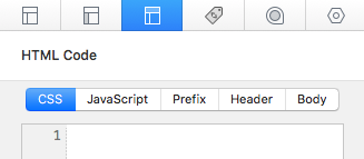 Step 3: Copy and Paste the code below into the text area.
1 2 3 |
#pageWrap {
     background-image: url(%resource(IMAGE_NAME.jpg)%);
}
|
Step 4: Change IMAGE_NAME.jpg to match the name of your resource. Preview and you are done! Note: If your web page does not contain much content & the image is not stretching to the bottom of the browser window, add the code below to your Header-CSS section. This will force the image to fit to the browser window.
1 2 3 4 5 |
#pageWrap {
     position: absolute;
     top:0;
     bottom:0;
}
|
Extra-Content (non-Stacks page)
Step 1: Navigate to the Sidebar Tab of the Page Inspector. 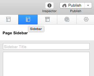 Note: if you are using a styled text page you may also use the Main Content editor Step 2: Copy and Paste the code below into the text area.
<div id="myExtraContent1">
  Extra-Content 1 content Here
</div>
<div id="myExtraContent2">
  Extra-Content 2 content Here
</div>
<div id="myExtraContent3">
  Extra-Content 3 content Here
</div>
<div id="myExtraContent4">
  Extra-Content 4 content Here
</div>
Step 3: Highlight all the code & select Ignore Formatting from the Format Drop down menu (or press command + . ). Step 4: Add your desired content to each section. Highlight everything between
<div id="myExtraContent1">
</div>
& select Ignore Formatting from the Format Drop down menu (or press command + . ). Step 5: Preview and you are complete. Your finished code in the Sidebar(or Main Content editor) should be simular to the screen shot below. 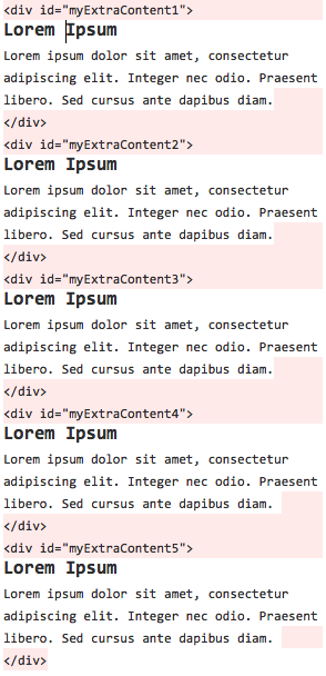
Create Button
Step 1: Type into the editor whatever you would like the button to read.  Step 2: Highlight your text & select the Add Link button.
 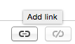 or
or  Step 3: Type in the URL or select where you would like the button to navigate to. Step 4: Add a new Custom Attribute Named: class with the Value: button
 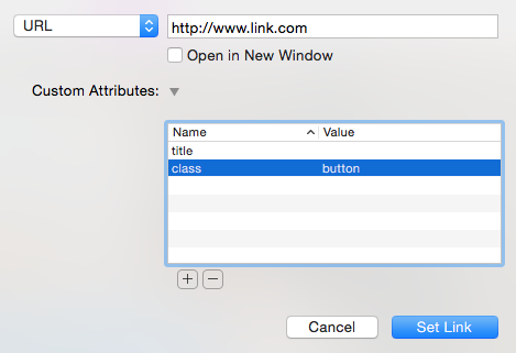 Click Set Link and you are done!
Social Media Icons
Step 1: Find the Social Media Icon you want you use from the Glyph Chart below:  Step 2: Type the corresponding letter or number into your desired location. Step 3: Highlight your letter or number and select the Add Link button. or Step 4: Type in the URL to your social media page & add a new Custom Attribute named “class” with the value “social”
 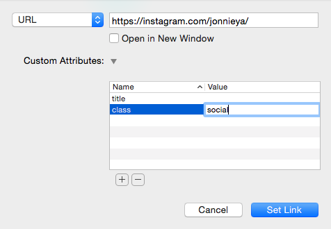 *check the Open in New Window Box if you do not want visitors to leave your page when clicking on the link Click Set Link and you are done!
Engraved Content Separators
Step 1: Copy the CSS code below & paste it into your Page Inspector’s HTML CSS section.
1 2 3 4 5 6 |
hr {
     height: 1px;
     background: rgba(0,0,0, .4);
     border: none;
     border-bottom: 1px solid rgba(255, 255, 255, 0.2);
}
|
Step 2: Type in the following code where you would like the seperator to appear:
<hr>
Preview and you are done!
Glass-like Promo Boxes
Step 1: Copy the CSS code below & paste it into your Page Inspector’s HTML CSS section.
1 2 3 4 5 6 |
.glass,.glass:before {
     padding: 0px 15px;
     text-align: center;
     width: 150px;
     height: 150px;
}
|
Step 2: Copy the code below & paste it into the editor.
<div class="glass"> Content Here </div>
Step 3: Highlight the code & select Ignore Formatting from the Format Drop down menu (or press command + . ). Step 4: Highlight “Content Here” between the div tags and select Ignore Formatting from the Format Drop down menu again (or press command + . ). Step 5: Add content in-between the div tags & preview to see what you have done. Step 6: You may notice the glass box area does not match your content. To edit the height & width of your boxes go to the Page Inspector’s HTML CSS section. Adjust the height and width values in the CSS code you pasted at the begining of the tutorial. Repeat steps 2-5 untill you have a desirable amount of Promo Boxes.