How to Setup Phantom (Version 3.0.0)
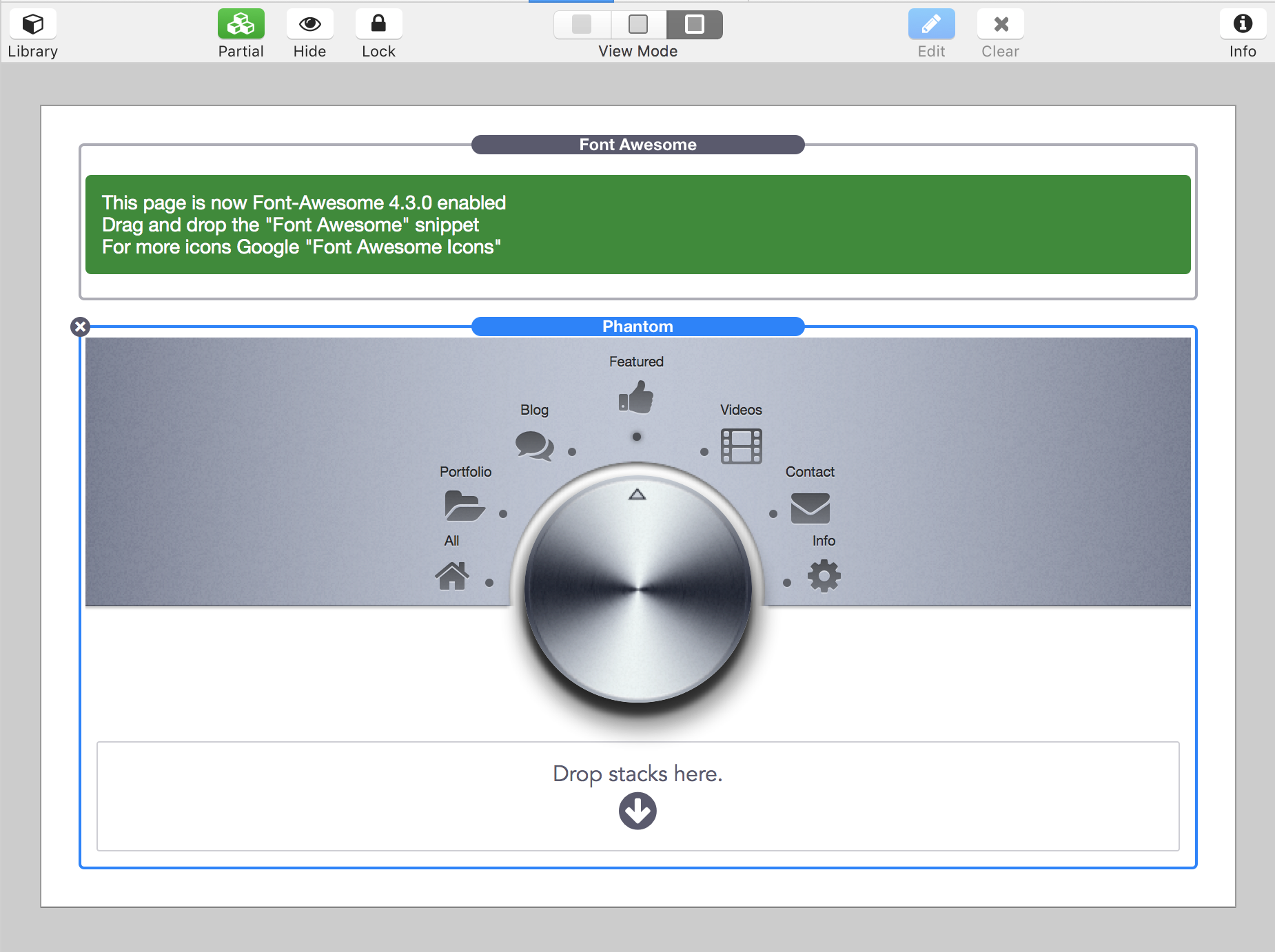
1. Before adding Phantom to your stacks page, you must first add the included Font-Awesome Stack to any spot on the stacks page (this stack is only visible in edit mode and enables the Font Awesome icon library). The container stack, simply titled ‘Phantom’, can then be placed into the stack’s editor wherever you would like it to display.
Note: For some reason, RapidWeaver’s Edit mode has trouble loading in images in when changes are made. When using the Knob/Dial version of Phantom, sometimes the knob graphics will not display properly while in edit mode only. If this happens, you must switch to preview mode to get a look at how the knob and background panel will appear.
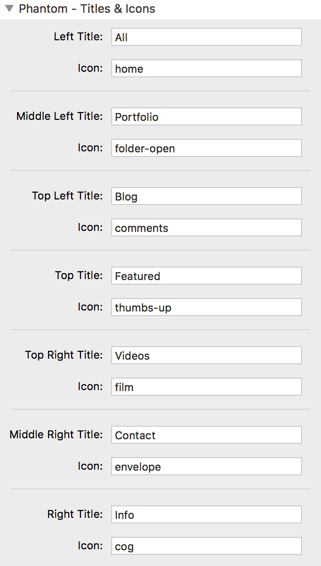
2. In Phantom’s settings panel navigate to the section titled “Titles & Icons” (If you are not using the Knob/Dial mode, the title and icons are found in the Phantom stack itself in the stacks editor). You will see default titles and icons for each of the seven categories (arranged by their position on the knob’s background panel). You can change the titles to whatever you would like (spaces between words are allowed, for example “My Favorites”). To change the icons just replace the default icon classnames with the classnames of the Font Awesome icons you want to use. Font Awesome classnames can be found at http://fontawesome.io/icons. Example: To use the “bus” icon you would type “bus” into the Icon field.
3. Now you can add your sortable content using the Phantom Element stack. This stack is placed inside the “Drop stacks here” section of the Phantom stack. Once you have added your first element stack, go to the settings panel. In the field labeled “Title” you will see the default value “All”. This means that whatever content is placed inside this element stack will display for every category, no matter which one is selected. However, in my example I want this element to only display when the “Info” titled category is selected, so I would replace “All” with “Info”. Lets say I also want this element to display when the “Featured” category is selected so I would add a comma and type “Featured” (do not leave any spaces between the words and commas).
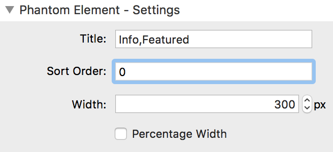
4. You will also see a field titled “Sort Order” in the settings panel of the Phantom Element stack. This will allow you to sort your elements in descending order (Higher numbers will display first). By default this field has a date format in case you wanted to sort by date, this can be removed however and replaced by a simple numbering system. Under that option you have a width setting. You can either declare a specific pixel width or enable “Percentage Width”.
Note: If you enable the percentage width option you will need to select the Phantom stack and in its settings panel under the heading “Advanced Settings” enable “Percentage Mode”. This will then allow you to choose between two modes titled “Fourths” and “Thirds”. If you are using the widths 100%, 75%, 50%, and 25% you will need to use the “Fourths” mode. If you use the 100%, 66%, and 33% widths you will need to use the “Thirds” mode. These modes help Phantom keep your elements aligned and sorted correctly in the “masonry” effect. You should not mix pixel width elements (300px for example) with percentage width elements inside the same Phantom stack. Phantom may have trouble calculating the positions of the elements for the “masonry” effect.
5. Repeat steps 3 & 4 until you have added all the content you wish to add.
Definition of Terms
Knob/Dial – Turned on by default, the Knob/Dial is an animated graphic menu that is useful for creating one page websites with a unique loading effect. You can us the buttons mode by disabling this option. The buttons mode is more useful as a sorting section used inside of a page. Think of it as a responsive and animated tab-like layout section.
Knob/Dial Appearance:
- Menu items: Choose to display 2-7 icons with sortable categories.
- Dial/Knob: Choose a theme for the knob.
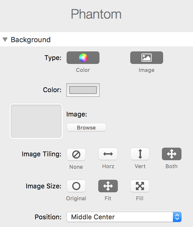
- Background: Choose a theme for the knob’s background panel. The option “Custom/Inherit Default Background” will allow you to set your own color or pattern for the background panel. Just adjust Phantom’s “Background” Settings.
- Show Titles: Controls if text is shown in the sorting menu. This option is turned on by default, unchecking it will display only the icons.
- Only On Hover: This option displays if Show Titles has been enabled. Turning this on will hide the titles and only show them when the mouse has hovered over the icon.
- Font Size: Adjust the size of the titles.
- Icon Size: Adjust the size of the icons.
- Optional Logo: Allows you to add a logo image to the background panel.
Knob/Dial Off (button) Appearance:
- Theme: These options switch the visual style of the navigation/sorting menu.
- Alignments: this will allow you to align the buttons the left, right, or center.
- Menu items: By default this is set to 3, but can range from 0 – 10.
- X & Y Padding: These settings control how much space is inside the buttons.
Knob/Dial Colors:
- Icons/Titles: Change the default color of the icons and titles. To adjust individual icon and title color see the section title “Changing icon colors” below.
- Opacity: Sets a percentage opacity for the titles to allow them to blend with the background panel.
- Active Color: The color of the bullet/dot when a category is active.
- Hover Color: The color of the bullet/dot when a category is mouse hovered.
- Enable Hover Color: If disabled, the bullets/dots will not highlight when hovered.
- Colors Apply to Icons: If enabled, the bullets/dots/ will no longer highlight, and the icons will instead.
Knob/Dial Off (button) Colors:
- Button: The color of the inactive buttons.
- Active Button: The color of the button when a category is active.
Advanced Settings:
- Secondary Phantom: Enable this option if you have more than one Phantom on a page. For the first Phantom stack placed on the page however, this option should be disabled because one needs to act as the primary stack. This helps reduce load times.
- External Links: Set a link to any of the Knob/Dial categories to have that icon redirect to another page. Note: You may want to add a Phantom Element stack with a loading message linked to the category with a external link. When the icon/category is selected, Phantom will still sort the elements and the external link take time to load.
- Percentage Mode: This option will allow you to choose between two modes titled “Fourths” and “Thirds”. If you are using the widths 100%, 75%, 50%, and 25% you will need to use the “Fourths” mode. If you use the 100%, 66%, and 33% widths you will need to use the “Thirds” mode. These modes help Phantom keep your elements aligned and sorted correctly in the “masonry” effect. You should not mix pixel width elements (300px for example) with percentage width elements inside the same Phantom stack. Phantom may have trouble calculating the positions of the elements for the “masonry” effect.
- Responsive Settings: Enabling this option will allow you to declare specific responsive breakpoints and allow you to set a max width for the overall content for those specific breakpoints. By default, when this option is disabled, the content width will fill the full width of wherever it is placed.
Inner Element Controls:
- Title: This sets the title that matches the navigation menu title. The title is case sensitive. To set the inner element to multiple titles separate titles by a comma and do not include any spaces.
- Width: This sets the container width of the inner element by pixels.
- Percentage Width: This option will only have effect if the ‘Percentage Mode’ is selected in the Phantom stack .
Changing icon colors
Phantom comes with a CSS snippet (also found below) that you can use to change the colors of specific icons and titles. This snippet can be placed into the Page Inspector > HTML > CSS section if you want to apply the styles to a single page or inside the Settings > Code > Site-wide CSS section if you would like to apply the styles to the entire website.
/* Phantom Advanced CSS
Place this snippet in the Page Inspector > HTML > CSS section if you would like to modify a single page. If you would instead like to modify all pages together, place this snippet in the Settings > Code > Site-wide CSS section.
===============
SPECIFIC ICON COLORS
Use Hexadecimal Color Values. These values can be found in the Color Picker > Color Sliders > RGB Sliders section. The value will appear after you have selected the color you wish to use.
Example:
To change the first page’s icon color from red (#DC5350) to teal (#19979) you would change #icon-1’s “color: #DC5350;” to “color: #19979;”
================ */
.left-icon i {
  color: #FFFFFF !important;
}
.middle-left-icon i {
  color: #DC5350 !important;
}
.top-left-icon i {
  color: #F07B30 !important;
}
.top-icon i {
  color: #F9D246 !important;
}
.top-right-icon i {
  color: #5DB862 !important;
}
.middle-right-icon i {
  color: #3795CF !important;
}
.right-icon i {
  color: #842FC4 !important;
}
/* ===============
SPECIFIC Title COLORS
================ */
.left-icon div {
 color: #FFFFFF !important;
}
.middle-left-icon div {
 color: #DC5350 !important;
}
.top-left-icon div {
 color: #F07B30 !important;
}
.top-icon div {
 color: #F9D246 !important;
}
.top-right-icon div {
 color: #5DB862 !important;
}
.middle-right-icon div {
 color: #3795CF !important;
}
.right-icon div {
 color: #842FC4 !important;
}
How to use custom icons
1. Add your icon images to the Resources section of RapidWeaver and rename the files “custom1” all the way up to “custom10” if you are using 10 images.

Step 2: Place each corresponding image name into the Icon Title box until you have linked each icon image to the correct Title.

Step 3: Copy and paste the code below into the Page Inspector > Header > CSS section.
.fa-custom1 {
	background-image: url(%resource(custom1.png)%) !important;
}
.fa-custom2 {
	background-image: url(%resource(custom2.png)%) !important;
}
.fa-custom3 {
	background-image: url(%resource(custom3.png)%) !important;
}
.fa-custom4 {
	background-image: url(%resource(custom4.png)%) !important;
}
.fa-custom5 {
	background-image: url(%resource(custom5.png)%) !important;
}
.fa-custom6 {
	background-image: url(%resource(custom6.png)%) !important;
}
.fa-custom7 {
	background-image: url(%resource(custom7.png)%) !important;
}
.fa-custom8 {
	background-image: url(%resource(custom8.png)%) !important;
}
.fa-custom9 {
	background-image: url(%resource(custom9.png)%) !important;
}
.fa-custom10 {
	background-image: url(%resource(custom10.png)%) !important;
}

Step 3: Double check that your files are named correctly (The name and the extension of each file is case sensitive). Preview and you are complete.
Note that this example assumes you are using png files. If you are using jpeg or jpg files you will need to edit the copy and paste code. Just change the .png extensions to match the file type you are using for the icons.
Example:
.fa-custom1 {
	background-image: url(%resource(custom1.jpeg)%) !important;
}