Menu Sub Titles
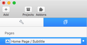
To add a sub title to a top level menu page, double click the page title in the “Pages” section (left side of the RapidWeaver window).
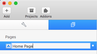
After the title of your page (“Home Page” in this example) type in a forward slash “/”. This will let Omnicon know to separate the next couple of words from the title of the page and create a subtitle from it. After the forward slash add a sub title for your page.
Note: Sub titles are not supported in sub menu pages (second level menu items).
Menu Icons
To change the icon for a top level menu page, double click the page title in the “Pages” section (left side of the RapidWeaver window).
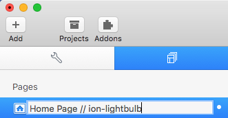
If you have not added a sub title to your page and do not wish to add one, type in 2 forward slashes “//” after your page title. If you wish to add a sub title (tutorial on how to do so above) or have already added a subtitle, type in one forward slash “/”. This will let Omnicon know that what ever you place after this second slash will be the icon you want to use.
You can find a list of usable icons in the cheatsheet file (included when you downloaded Omnicon). After you find the icon you want to use, just type it’s classname after the second forward slash. (You can also refer to this page: http://ionicons.com/ for a list of usable icons and their classnames)
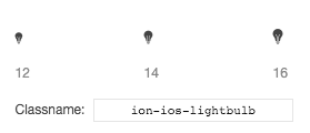
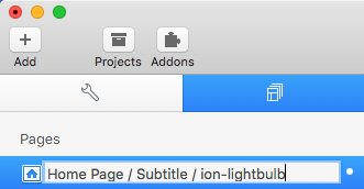
In my example I will be using a lightbulb and it’s classname is “ion-ios-lightbulb”.
Icon example input with no sub title:
Icon example input including a sub title:
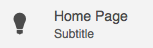
Press enter to save your changes. When you preview your page you will see something like this:
Note: You can also use Font-Awesome Icons. Just be sure to add the Font-Awesome Stack or Font-Awesome as a resource. The only difference in set up is you will need to type “fa fa-” (thats two “fa”s and a dash) before the Font-Awesome classname you want to use. Font-Awesome classnames can be found at http://fontawesome.io/icons. Example: To use the “bus” icon you would type “fa fa-bus” after the second slash.
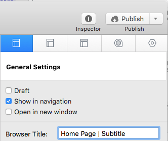
By default RapidWeaver will grab whatever you type into the page title and use it as the browser title (This is the title that displays in the tab of your page visitor’s browser, in the Site Map page, in the breadcrumb trail, in Google search results , and also in the themes own search results). You wouldn’t want your browser title to display as “Home Page / Subtitle / ion-lightbulb”. So in order to set your own browser title you will need to go to your Page Inspector > General Settings tab > Browser Title and type in the page name as you want it to display.
Note: Icons are not supported in sub menu page titles (Second level menu items).
Banner Image
To add a banner you can insert an image anywhere you like (Anywhere in a stacks page or in the sidebar for a non-stacks page). Once you have added your image, click the add link button.
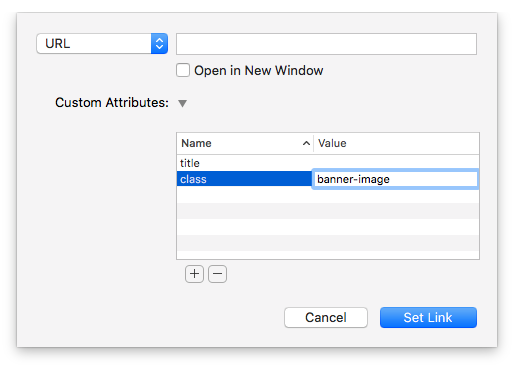
In the link settings menu add a new Custom Attribute titled “class” with the value “banner-image” then click “Set Link”.
Omnicon will now grab this linked image and move it to the formatted banner spot.
Slider Stacks
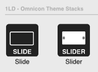
To set up the slider, first drag and drop the Slider Stack into the Stacks editor.
Then drag and drop the Slide Stack into the “Drop stacks here” section located underneath the heading “Add Slide Stacks Below”. Repeat this step until you have as many slides as you want to use.
Now select one of the Slide Stacks and in the settings panel on the right side of the RapidWeaver window, underneath the section labeled “Slide Settings”, click the button titled “Browse”. Locate the image you wish to use. Repeat this step for all of the slides you have added.
You also have options to change the transition animations for each slide as well as add caption settings. To change a caption just double click the caption text.
Column and Row Stacks
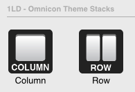
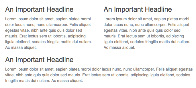
You can use these included stacks to set up responsive columns. First, drag and drop the Row stack into your stacks page. You will be placing the Column stacks inside of this stack. Row stacks have two settings “Type” and “Column Align”. We will cover the “Column Align” in a bit, but first, lets look the the setting “Type”. This allows you to declare how many columns you want to display next to each other, by default it is set to display 3 columns. For this example we will be using 3 columns so we will leave this setting on it’s default value. Next we need to drag in one Column stack for each of the numbered column sections.
Note: Column stacks must always be placed inside of Row stacks to function correctly.
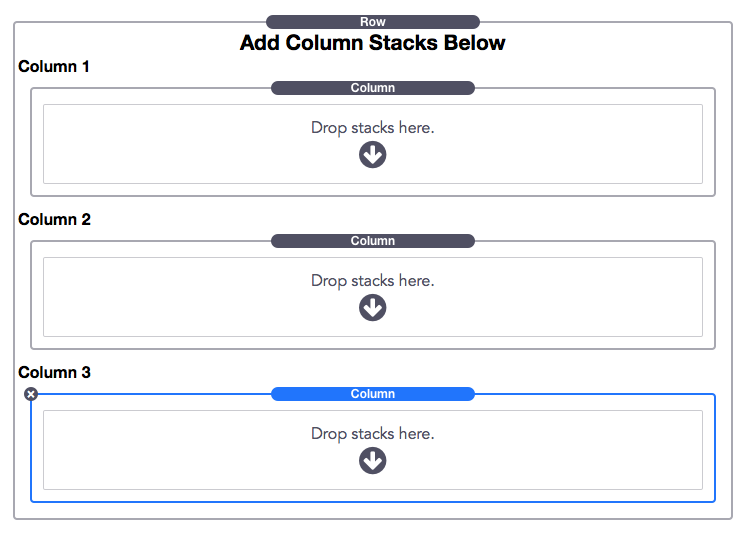
Now you can add content to each Column stack’s “Drop stacks here” section. In my example I will be adding titles and text.
The Second setting “Column Align” allows you to change the alignment of all the contained Column stacks. By default the columns will be aligned to the center of the content with open space to the left and right. You also have an option to left align (open space to only the right of the content) or have the columns stretch to fit the entire width of the content (no space left or right of the content).
Each Column stack has its own settings for how wide you would like them to display at the different breakpoints (certain widths that correspond to different screen sizes, from mobile screens to large desktops). This way you can control how the columns will display on each individual device.
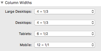
These values are arranged in numbers from 1 to 12. For example, 2 stands for 2/12 (or 1/6 20% of the entire row’s width ) and 12 stands for 12/12 (or 100% full width). Since in my example I want to display 3 columns in desktop browsers I will need to make sure each Column stack’s “Large Desktop” and “Desktop” settings are set to “4 = 1/3”. This means each column will be 4/12 -> 1/3 (or 33%) wide on those devices.
Desktop browser example:

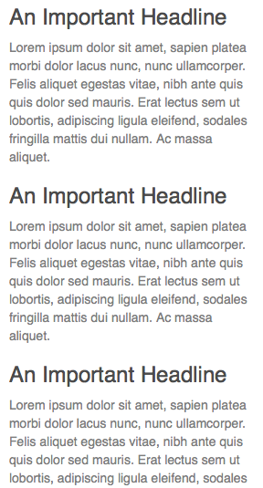
Since tablet screens are considerably smaller than desktops’, I have increased the value for the first to columns to be “6 = 1/2” (or 50%) wide. These two columns will still display next to eachother. The 3rd column stack I will set to “12 = 1/1”, that way it will display at full width beneath the other two columns.
Tablet browser example:
Finally I will set each Column “Mobile” Setting to “12 = 1/1”, that way they will each display at full width on small mobile screens.
Lightbox Images
By default, any image you add to a “Photo Album” page (with the Album Type set to “Gallery”) will automatically open in a lightbox.
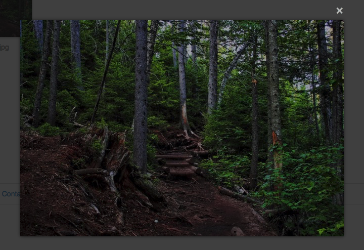
If you would like to use the lightbox on a page other than the Photo Album page, just add the image anywhere you like. Once you have added your image, click the add link button.
In the link settings menu add a new Custom Attribute titled “class” with the value “lightbox” then click “Set Link”.

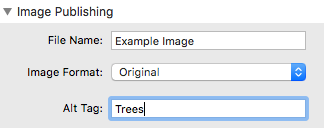
That’s all there is to it. If you would like to change the images display title in the lightbox just change its “alt tag”. By default it will show the file’s name as the title.
Icons
Omnicon comes with a cheatsheet file (You can also find it here: http://ionicons.com/cheatsheet.html) that will give you selectable icons that you can copy and paste into RapidWeaver. Just find the icon you want to use and copy the icon found in the “Selectable” field.
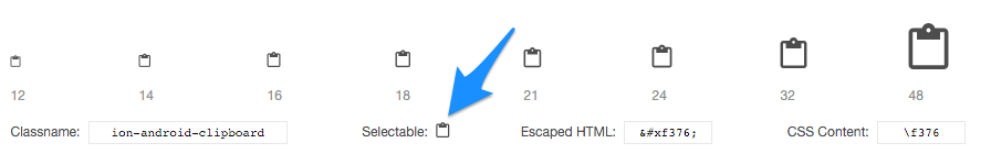
Once you have copied the icon, just paste into any styled text field (text editor, text stack, sidebar). You can then format it just like you would format any other text using RapidWeaver (change color, font-size, etc).
Styles
Styles Breakdown
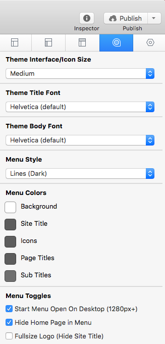
Menu & Sidebar Mode (v1.5.0+): Choose between 3 different display modes. “Visible” is default and will show the menu and sidebar on the left and right of the content. “Off Canvas” will hide the menu and sidebar and they will only be visible when they have been toggled. “Off Canvas / Fixed Topbar” is the same as “Off Canvas” but will keep the Topbar stuck to the top of the browser window so you always have an option to open the menu or sidebar no matter how far down the page you have scrolled.
Theme Interface/Icon Size: Choose between 3 different size settings for the Menu Icons/links, toggle buttons, and topbar.
Theme Title Font: Changes the font of all headers, including the site title.
Theme Body Font: Changes the font for all the text on the page, excluding headers.
Menu Style: Adjust the display styling of the menu. ‘Lines(Dark)’ will add subtle darkened dividing lines between the menu items. ‘Lines(Light)’ will add subtle lighted dividing lines between the menu items. Detailed will add detailed dividing lines between the menu items as well as add a textured background. ‘Custom pattern’ will remove the dividing lines and allow you to use the advanced styles CSS snippet (more info below) to add your own background pattern (by default it will use a step pattern until you define your own).
Logo Fit: Choose how your logo will display. If you have a small square logo and want to use text for the title the option “Square w/ Text Title” will work best. The “Fill” option is useful if your logo image contains the title and you do not need to use text, note however that the logo image will shrink when the menu is collapsed. “Fill and Clip” is useful if your logo image contains the title and has a small square logo on the left of the title, when the menu is collapsed the images will not shrink but part of it will be hidden on the right side.
Menu Toggles:
- Start Menu Open On Desktop: Enable to have the menu show fully expanded when visitor’s browsers are at least 1280px wide.
- Hide Home Page in Menu: Enable this to hide the home page in the menu. Since the logo already acts as a homepage link, some users may find the home page link redundant.
- Fullsize Logo: Enable this to hide your site title and display your logo at full width of the menu. The logo will automatically shrink when the menu is collapsed. When disabled, the logo will only fill the same amount of space an icon would.
- Fixed Position: Enable this to have the menu stay in place while the page is scrolled.
Topbar Style: Adjust the display styling of the topbar. ‘Lines(Dark)’ will add subtle darkened dividing lines between the toggles. ‘Lines(Light)’ will add subtle lighted dividing lines between the toggles. Detailed will add detailed dividing lines between the toggles as well as add a textured background. ‘Custom pattern’ will remove the dividing lines and allow you to use the advanced styles CSS snippet (more info below) to add your own background pattern (by default it will use a step pattern until you define your own). ‘Collapsed’ will place the topbar over top of a banner or slider if you have one on the page.
Topbar Toggles:
- Hide Search Bar:
- Show Site Title in Mobile:
Content Styles: Adjust the display styling of the content. ‘Lines(Dark)’ will add subtle darkened dividing lines between the footer and content. ‘Lines(Light)’ will add subtle lighted dividing lines between the footer and content. Detailed will add detailed dividing lines between the footer and content as well as add a textured background. ‘Custom pattern’ will remove the dividing lines and allow you to use the advanced styles CSS snippet (more info below) to add your own background pattern (by default it will use a step pattern until you define your own).
Content Toggles:
- Stacks Page: Enable to remove padding from the content. Leave this disabled if you are not using a stacks page.
- Show Site Slogan: Enable this to place your Site Slogan centered above the content.
Sidebar Style: Adjust the display styling of the content. ‘Detailed’ will add a textured background. ‘Custom pattern’ will allow you to use the advanced styles CSS snippet (more info below) to add your own background pattern (by default it will use a step pattern until you define your own).
Sidebar Toggles:
- Start Sidebar Open On Desktop: Enable to have the sidebar show fully expanded when visitor’s browsers are at least 1280px wide.
- Fixed Position: Enable this to have the sidebar stay in place while the page is scrolled.
Footer Toggles:
- Alight Left: Enable to align the copyright text and breadcrumbs right to match any left aligned content.
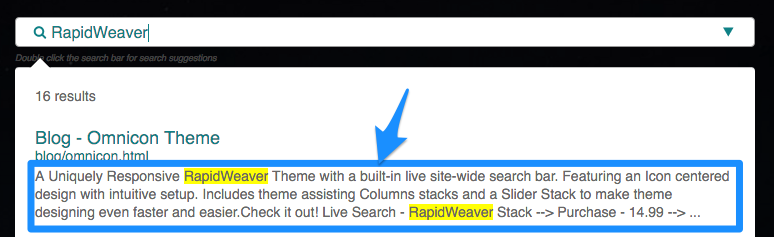
Searchbar – Custom Page Summary
By default, the search function will display the first 60 words as the description for each page in the search results.
Below is a snippet that you can place inside any text area to mark where you want the search results to grab the description from (Stacks and non-Stacks pages).
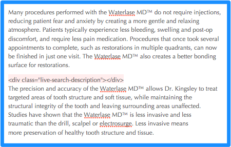
<div class="live-search-description"></div>
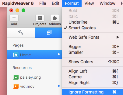
To change the description on any page, drag and drop the snippet into a text area above the text you want to display as the description for that page. Then highlight the snippet and choose “Ignore Formatting” from the Format drop down menu.
In the example below, I have placed the Description Marker below the first paragraph and above the second. Now when this page shows up in the search results it will ignore the first paragraph and display the text from the second paragraph, highlighting any terms found in the description.
Advanced CSS Styles (Copy/Paste & Edit)
Omnicon comes with a CSS snippet (also found below) that you can use to get advanced control over some of the theme’s styles.
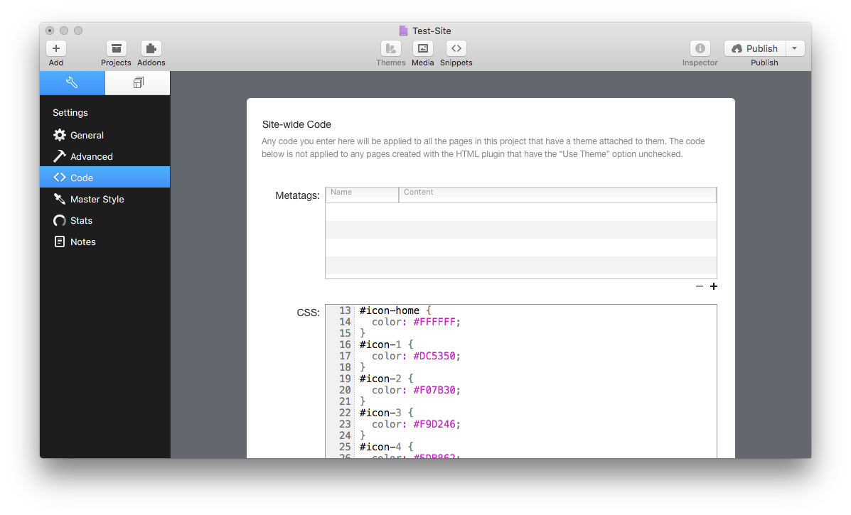
This snippet can be placed into the Page Inspector > HTML > CSS section if you want to apply the styles to a single page:
or inside the Settings > Code > Site-wide CSS section if you would like to apply the styles to the entire website:
/* Omnicon Advanced CSS
Place this snippet in the Page Inspector > HTML > CSS section if you would like to modify a single page. If you would instead like to modify all pages together, place this snippet in the Settings > Code > Site-wide CSS section.
===============
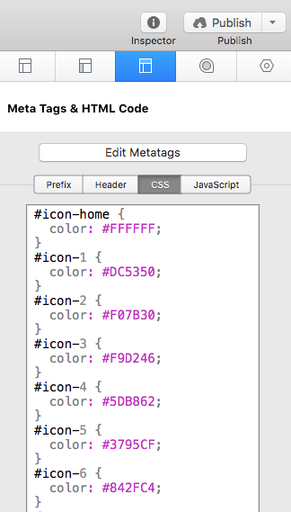
SPECIFIC ICON COLORS
Use Hexadecimal Color Values. These values can be found in the Color Picker > Color Sliders > RGB Sliders section. The value will appear after you have selected the color you wish to use.
Example:
To change the first page’s icon color from red (#DC5350) to teal (#19979) you would change #icon-1’s “color: #DC5350;” to “color: #19979;”
================ */
#icon-home {
color: #FFFFFF;
}
#icon-1 {
color: #DC5350;
}
#icon-2 {
color: #F07B30;
}
#icon-3 {
color: #F9D246;
}
#icon-4 {
color: #5DB862;
}
#icon-5 {
color: #3795CF;
}
#icon-6 {
color: #842FC4;
}
/* ===============
TOGGLE ICONS
Refer to the Icon Cheatsheet to get the correct “CSS Content” values for the icon you want to use. You may also adjust the "font-size" pixel (px) value to adjust the size of the icon.
Example:
To change the Sidebar Toggle icon to the "ion-android-options" icon, "content: '\f396'" would become "content: '\f39d'"
================ */
#menu-toggle:before {
content: '\f394';
font-size: 24px;
}
#sidebar-toggle:before {
content: '\f396';
font-size: 24px;
}
/* ===============
BACKGROUND TEXTURES
Drag and drop a pattern image into your "Resources" section (located on the left side of the RapidWeaver window) to use as a background pattern. You can find some great free patterns to use at http://subtlepatterns.com
Example:
If I have a pattern image titled retina_wood.png in my Resources section and I want to use it for the menu background I would replace #menu's "RESOURCE_NAME.jpg" with "retina_wood.png"
================ */
#menu {
background-image: url(%resource(RESOURCE_NAME.jpg)%);
}
#topbar {
background-image: url(%resource(RESOURCE_NAME.jpg)%);
}
#sidebar {
background-image: url(%resource(RESOURCE_NAME.jpg)%);
}
#content {
background-image: url(%resource(RESOURCE_NAME.jpg)%);
}
#footer {
background-image: url(%resource(RESOURCE_NAME.jpg)%);
}
/* ===============
CONTENT WIDTH
To change the content width adjust the "max-width" pixel (px) value. If you would rather your content be left aligned instead of centered, remove the "margin: 0 auto;" line of CSS code.
================ */
#content .container, #footer > div {
max-width: 960px;
margin: 0 auto;
}
/* ===============
FONT WEIGHT
To change the font weight adjust the number value to one of these values: 100,200,300,400,500,600,700,800,900 (100 is very thin, 400 is normal, and 700 is bold)
================ */
/* Titles */
h1, h2, h3, h4, h5, h6 {
font-weight: 200;
}
/* Content */
body, p, span {
font-weight: 200;
}
Advanced HTML Snippets (Copy/Paste & Edit)
These snippets are for advanced users who feel comfortable working in HTML. Each snippet should either be placed inside of an HTML stack or in a text field with “Ignore Formatting” enabled.
Pay close attention to the quotation symbols. RapidWeaver’s auto formatting will sometimes change straight quotation symbols “ into curly ones “. Curly quotes do not work inside HTML code. In order to replace the curly quotes with the correct straight quotes you can select and delete them and then retype them in. Alternativly, whenever you apply “Ignore Formatting” to HTML code it will automatically change the curly quotes to straight quotes.
Icon
<i class="icon ion-email"></i>
Unordered List with Icons and Links
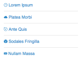
<ul>
  <li><a href="http://www.LINK-ADDRESS-HERE.com"><i class="icon ion-checkmark"></i> LINK TITLE HERE</a></li>
  <li><a href="http://www.LINK-ADDRESS-HERE.com"><i class="icon ion-checkmark"></i> LINK TITLE HERE</a></li>
  <li><a href="http://www.LINK-ADDRESS-HERE.com"><i class="icon ion-checkmark"></i> LINK TITLE HERE</a></li>
  <li><a href="http://www.LINK-ADDRESS-HERE.com"><i class="icon ion-checkmark"></i> LINK TITLE HERE</a></li>
  <li><a href="http://www.LINK-ADDRESS-HERE.com"><i class="icon ion-checkmark"></i> LINK TITLE HERE</a></li>
</ul>
Pop-up Message
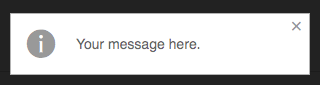
<div class="notify">Your message here.</div>
Pop-up Error Message
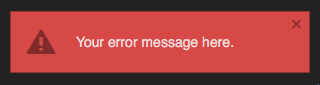
<div class="notify error">Your error message here.</div>
Pop-up Success Message

<div class="notify success">Your success message here.</div>