Slider Images
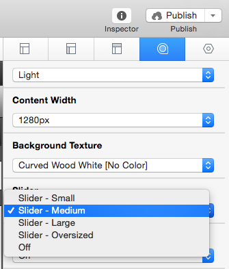
Step 1: Turn on the built in Camera slider in the Page Inspector Styles section.
Step 2: Add all the images you want to use to the Resources section.
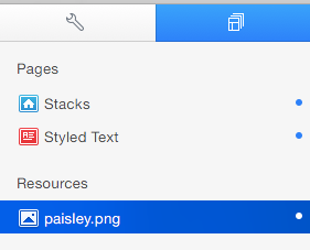
Image sizes for site 960px width
Small: 960×200 Pixels
Medium: 960×288 Pixels
Large: 960×480 Pixels
Oversized: 960×720 Pixels
Image sizes for 1280px site width
Small: 1280×200 Pixels
Medium: 1280×384 Pixels
Large: 1280×640 Pixels
Oversized: 1280×960 Pixels
Step 3: Copy and Paste the code below into the main content editor or into the sidebar content. (If you are using Stacks, and have the Extra Content Stack copy the code below labeled Extra Content Stack).
Content or Sidebar Editor
<div id="myExtraContent1">
  <div id="camera_wrap">
    <!--Paste Step 4's Code Here -->
  </div>
</div>
Extra Content Stack
<div id="camera_wrap">
  <!--Paste Step 4's Code Here -->
</div>
Step 4: Copy and Paste the code below into the Extra Content & Camera wrap Div you pasted from Step 3. (Or into the Extra Content Stack if you are using stacks).
<div data-src="%resource(IMAGE_NAME.jpg)%" data-fx="simpleFade">
  <div> Caption here </div>
</div>
Step 5: Change “IMAGE_NAME.jpg” to exactly match the name of your image in the Resources section (case sensitive)
Step 6: Change “Caption here” to your desired caption or delete the entire section if you wish not to display a caption.
Delete
<div> Caption here </div>
Step 7: Repeat Steps 4-6 until you have as many photos you want to display in the slider. If you are using the main content or sidebar areas, make sure to highlight the code and select “Ignore Formatting” from the Format drop down menu.
<div id="camera_wrap">
  <div data-src="%resource(image1.jpg)%" data-fx="simpleFade">
    <div> Caption One </div>
  </div>
  <div data-src="%resource(image2.jpg)%" data-fx="simpleFade">
    <div> Caption Two </div>
  </div>
  <div data-src="%resource(image3.jpg)%" data-fx="simpleFade">
    <div> Caption Three </div>
  </div>
</div>
Transition Slider Effects
Step 1: After you have added images to your slider you will notice a data-fx value after the resource names. You can change the data-fx value to one of the values below to get a different transition effect.
‘random’
‘simpleFade’
‘curtainTopLeft’
‘curtainTopRight’
‘curtainBottomLeft’
‘curtainBottomRight’
‘curtainSliceLeft’
‘curtainSliceRight’
‘blindCurtainTopLeft’
‘blindCurtainTopRight’
‘blindCurtainBottomLeft’
‘blindCurtainBottomRight’
‘blindCurtainSliceBottom’
‘blindCurtainSliceTop’
‘stampede’
‘mosaic’
‘mosaicReverse’
‘mosaicRandom’
‘mosaicSpiral’
‘mosaicSpiralReverse’
‘topLeftBottomRight’
‘bottomRightTopLeft’
‘bottomLeftTopRight’
‘bottomLeftTopRight’
‘scrollLeft’
‘scrollRight’
‘scrollHorz’
‘scrollBottom’
‘scrollTop’
Example: data-fx=”simpleFade” would be changed to data-fx=”curtainTopRight” for a curtain transition effect.
Extra-Content (non-Stacks page)
Step 1: Navigate to the Sidebar Tab of the Page Inspector.
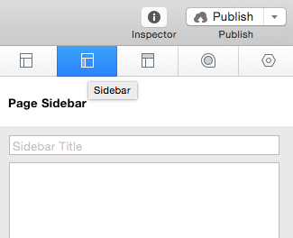
Note, if you are using a styled text page you may also use the Main Content editor
Step 2: Copy and Paste the code below into the text area.
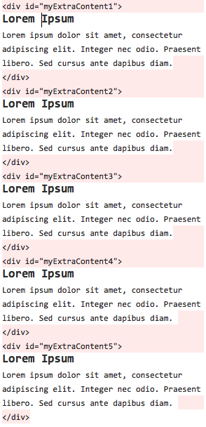
<div id="myExtraContent1">
  Extra-Content 1 content Here
</div>
<div id="myExtraContent2">
  Extra-Content 2 content Here
</div>
<div id="myExtraContent3">
  Extra-Content 3 content Here
</div>
<div id="myExtraContent4">
  Extra-Content 4 content Here
</div>
Step 3: Highlight all the code & select Ignore Formatting from the Format Drop down menu (or press command + . ).
Step 4: Add your desired content to each section. Highlight everything between and & select Ignore Formatting from the Format Drop down menu (or press command + . ).
Step 5: Preview and you are complete. Your finished code in the Sidebar(or Main Content editor) should be simular to the screen shot below.
Create Button
Step 1: Type into the editor whatever you would like the button to read.
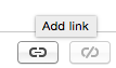
Step 2: Highlight your text & select the Add Link button.
 or
or 
Step 3: Type in the URL or select where you would like the button to navigate to.
Step 4: Add a new Custom Attribute named “class with” the value “button”
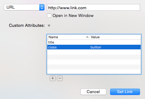
Click Set Link and you are done!
Using Font Awesome Icons
Font Awesome’s Icons can just about be used anywhere on your site. Check out the links below to learn more about how to use Font Awesome.
Chocolat Lightbox
Step 1: Turn on Chocolat Lightbox in the Styles section of the Page Inspector.
Step 2: In order for the Lightbox to work correctly you will need the original image and a thumbnail (smaller version) of the image.
Step 3 Drag and drop the original image into the Resources section of RapidWeaver. Then drag and drop the thumbnail image into the place you would like the image link to display.
Step 4: Next, right click the thumbnail image and select Add Link. (Or click the Add link button after selecting the image)
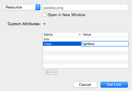
Step 5: Click on the URL drop down and select the resource from the list.

Step 6: Add a custom attribute titled class with the value lightbox and then click Set Link.
Step 7: Switch to preview mode to see if it worked and you are done. To add more photos repeat Steps 3-6.