Category : News

2 Major Stack Updates

Note: The updates are free for those who already own the stacks.

Clean Menu 1.2.0

Now with all new options to support more menu styles. Keep your navigation menu clean by showing only your most important links up top. Store less commonly used links inside a sleek dropdown menu with this fully customizable menu stack for RapidWeaver.

  • (1.2.0) New option to swap in submenu dropdowns instead of a toggle.
  • (1.2.0) Parent page links can now automatically be disabled.
  • (1.2.0) Toggle/submenu dropdowns will no longer close when the page is scrolled.
  • (1.2.0) Toggle/submenu dropdowns menu colors are now adjustable without enabling custom text colors.
  • (1.2.0) New option to center the logo in mobile screens.
  • (1.0.6) Fixes a bug that could cause extra menu items to briefly show unformatted while the page is loading.
  • (1.0.5) Fixed a Font Awesome icon alignment issue
  • (1.0.5) Same page scroll now works with the toggle menu as well
  • (1.0.4)  Increased compatibility with 3rd-party themes and frameworks (IE Foundation)
  • (1.0.4) Added an option to bold the menu items
  • (1.0.4) Long menus no longer get cut off when the sticky option is enabled
  • (1.0.4) Fixed a few item alignment bugs
  • Various minor bug fixes

Check it out here

Quick Editor Admin 1.2.0

Now with pop up notifications, an image manager, and global image storage/access. Quick Editor Admin is a WYSIWYG (what you see is what you get) editor that can be used to update & add text or images to a website directly through any OS’s desktop or mobile browser. Make quick edits or even allow someone else to manage the content of your website through a non-technical user friendly interface. This stack is great for those who need to update often or for those who need to make changes without access to RapidWeaver.

Important: You must use order lookup to download version 1.2.0
This update changes where data is stored. In order to not effect your current projects this update will install as a separate stack.

Order Lookup

  • (1.2.0) Changes made to content through the editor are now consolidated into a single data file.
  • (1.2.0) The image upload window now has global access to all uploaded images, no matter what page they were uploaded from.
  • (1.2.0) New styled message and error notifications.
  • (1.2.0) Messages  will be dismissed automatically after a few seconds.
  • (1.2.0) Errors  will be dismissed automatically if the editor interface is used.
  • (1.2.0) Improved compatibility with 3rd-party stacks.
  • (1.2.0) Image dialog now properly updates with images if you upload multiple.
  • (1.2.0) Image upload errors now properly cancel the upload progress.
  • (1.1.0) Image upload window now has an image manager for selecting images and deleting images.
  • (1.1.0) Experimental feature: Disable saving changes made in the editor.
  • (1.1.0) Experimental feature:  Add selectable custom css classes through the properties window. The properties window is opened by clicking on the element’s tag in the bottom left of the editor.
  • Various minor bug fixes

Check it out here

Stacks 3

Stacks 3

Stacks 3 is created by YourHead Software – we are not affiliated with or being paid to promote this software.

Stacks 3 is faster and full of great new features: responsive features, partials that allow you to save and reuse stack sections, customizable workflows, and more.

There’s so much more I could say about how much I love this update, but it’s best you go see for your self. If you’re reading this you probably already own a copy as it’s very necessary for the best RapidWeaver experience, so got get the discounted update – it is definitely worth it I guarantee!

Check it out!

RapidWeaver 6 eBook

Coming Soon

I’ve been getting a lot of requests for a book on RapidWeaver 6 and plan to start working on it shortly. I am also currently involved in the testing for the new RapidWeaver 6.3 update, which continues to add to the speed of the software and weed out some of the minor bugs that are left. For more news on this stay tuned.

I’ve reduced the prices of my RapidWeaver 5 eBook since 6 is now the the latest version. There is still a lot of cross-over between 5 and 6 so most of the topics are still very relevant and easy-to-compare, but many buttons are moved and have new terminology added to them… there’s a lot of cool new stuff too, so a new book is definitely going to be coming soon.

Now for your help

One thing I’d really value from you, my customers, is to know what medium’s you value you most for the book. For my previous book I created things in PDF, Kindle & iBooks. PDF was the easiest for obvious reasons, though Kindle was pretty easy too… iBooks on the other hand was a bit more of a hassle. Not only thing, but the PDF and Kindle appear to be preferred much more than the iBooks version.

I still wanted to ask and hear some input from you. What do you prefer? PDF, Kindle, iBooks, all of them, a couple of them, etc. (please use comments below or contact me directly through our support page).

Also, are there any topics you wished 5 covered that you want to see in this one?

Thanks in advance and I hope to make this next book the best to date 🙂

Waterfall

Waterfall Support

In Nimblehost’s words Waterfall is “Easy, Automatic Theme Updating for Both RapidWeaver® 5 & 6” and it is exactly that.

Simply add Waterfall to any of your RapidWeaver projects and you can receive updates for your themes provided the developer’s theme supports Waterfall. The process is the same as you’re already used to with Stacks.

Waterfall enabled

I’m also proud to announce that all our themes now support Waterfall. We will continue to announce updates and you can always use our manual downloading, but I highly recommend to all my customers the added convenience that Waterfall has to offer.

For any of our themes you own you will first need to manually download a copy so that the need code is in place to start delivering you updates. Purchase Order Lookup.

Go check it out!

Mark

Mark’s Big Thank You Fundraiser

My 4th child is due in a couple months and everything looks good so far, but myself and my wife wanted to give our own thanks by giving to whatever new batch of babies are adventuring through their own recovery in the NICU, which is intensive care for newborns. We’ve partnered up with the same local NICU that helped Mark and have already received lots of support.

My second son, Mark, was born almost 2 months early due to a fairly uncommon disorder called gastroschisis. Due to the surgery and medicine that was needed to help patch up his tummy he had to spend his first month in the NICU. Personally, my own birth was not too dissimilar, though the details were a bit different.

Mark

During Mark’s first month we visited him quite frequently and during that process we continually received small gifts in the hospital ranging from baby blankets to comforting stuffed animals that doubled as Mark’s first pillows.

We’re happy to extend this offer to any of our customers who would like to do so – no pressure either… really! We just want to repay back the same generosity that was extended to us during our first month with Mark and figured there might be others who shared similar experiences or feelings 🙂

Here’s what we put together to give to each Mom and baby combo that we can.

Fundraiser
(My wife’s art above… just saying)

Each donation of $25- sends out a package including all of those items: diaper bag, soap, onesies, blankets, beanies/booties, toys, and kleenex. It’s a heck of a deal thanks to some discounts I was able to get from others wanting to help sponsor the gift.

Last, but not least, I’d like to say thank you to any of my RapidWeaver customers and friends who donate. For every donation you make I’ll give you any of my stacks – your choice. Donate 2 bags and you can have any theme (or 2 stacks of course). 3 or more and you can grab yourself a copy of Pure! (or whatever equivalent you prefer).

I’m going to be a little archaic and make this thing simple too – if you wish to donate simply use a link to choose your amount of donations, then send me an e-mail and let me know what product(s) you would like and I’ll send them right over!

Link to donate
Email me at jhawes@onelittledesigner.com

Here’s a video of Mark to let you know how he’s recovering too 😛

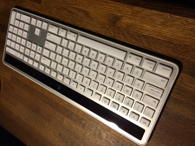
Solar Wireless Logitech Keyboard Mac

Solar, Wireless Logitech Keyboard

Just got a new keyboard and I love it so much I have to blog about it.

It is almost spot on with the look and feel when it comes to being a “Mac” product, just slightly heavier than they aim to be typically, though I’m guessing for a reason.

It’s solar so you can save your batteries and wireless so you can still move that thing a very good distance from your Mac. Also, by solar it doesn’t mean you have to be outside under the sun, you just need a light source (like your old calculators). I actually work out of a pretty dimly lit area with a single desk lamp to light my work area and it even it isn’t that great of a light source, but it is still plenty.

I have literally no speed issues and never get connection lost. What’s even better, if you’re picky about this stuff like me, it actually feels really good to type on.

Is that it? Nope! It’s even cheaper than buying a new mac keyboard and comes with a “full keyboard” set of keys including larger arrow keys, number pad area, and all that other sort of junk you are used to seeing in a larger keyboard… I don’t know what it’s all called, just look at the picture… bottom line, if you like the larger keyboards then you’ll be happy.

Only bad thing – it is a bit heavier and larger, so portability could be a thing if you’re used to throwing your keyboard into a tiny backpack or something like that. Other than that, this keyboard is awesome.

Solar Wireless Logitech Keyboard Mac

Sorting Added to the Shop

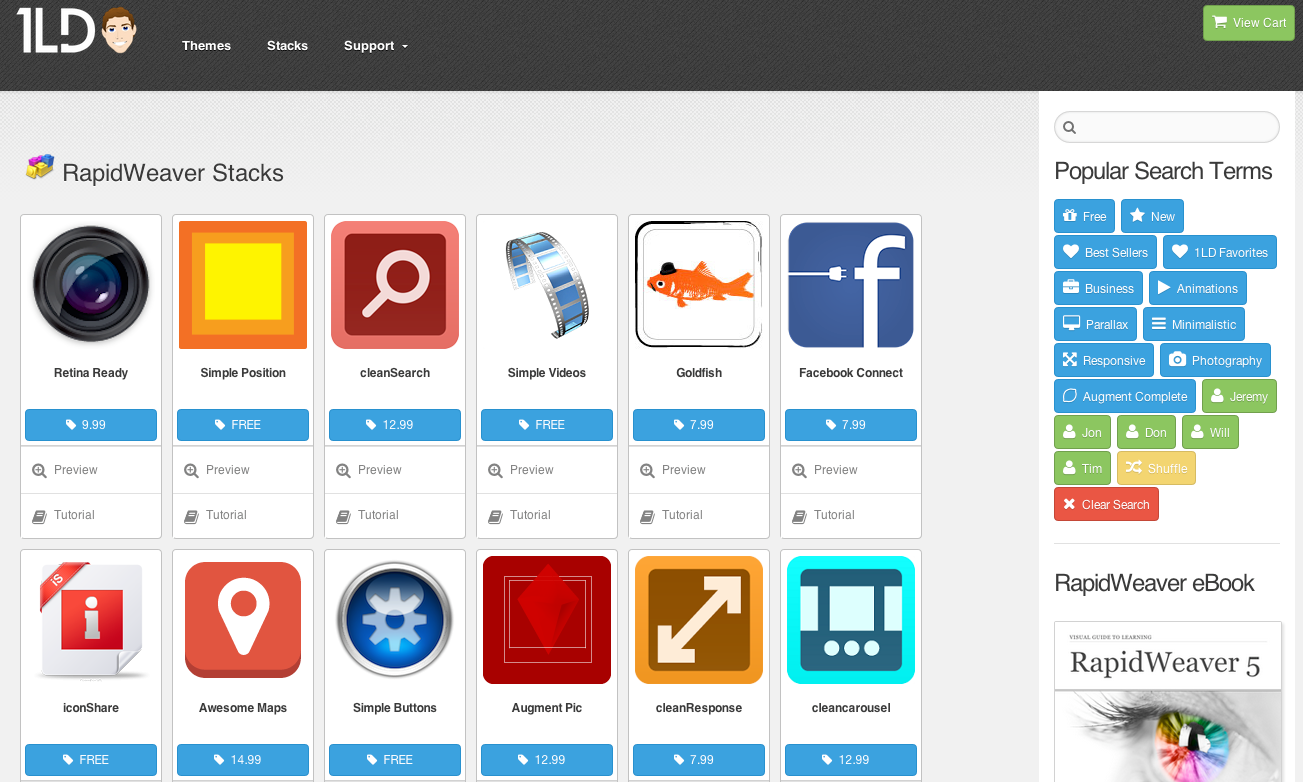
As our inventory has grown it has become increasingly difficult for us to show our customers what products we have available. In response, we’ve added a very cool and lightening fast search engine including one-click categories that are all powered by Angular.js, so your results load without the whole page having to. We did this back in July, but we haven’t stopped there.

To improve the site even more we’ve added some very cool new sorting options.

Sorting

Select the icons to change the sorting. The first icon (calendar) sorts by date. The second icon (US dollar) sorts by price. The third icon (A) sorts alphabetically.

Ascending Descending

We’ve also added an Ascending (Asc) and Descending (Desc) option so you can control in what direction the sort filters.

Latest News

We also added a “Latest News” section in our header so you can stay caught up with any updates or new releases we’ve launched. This shows our latest 4 blog posts, which we update whenever we have news, major product updates, or new product releases.

featured

Finally, you’ll notice we’ve added a cool little star to some of our products. This is simply to represent some of our most popular products, which we imagine a majority of customers will want to know about.

Want to see any added features? Let us know! Not only are we thankful, but if we choose your suggestion you will be handsomely rewarded 🙂

Stacks 2.5.2

Stacks 2.5

Stacks 2.5 offers some very cool new features that every Stacks user should know about.

Note that you should make sure you’re running version 2.5.2 if you’re having any problems running Stacks (there were some brief bugs with certain Mac OS versions, but nothing that was not quickly patched).

Stacks 2-5 New Tools

After installing 2.5+ you’ll notice some new tool icons in the top right above the customization options.

Minimize Stack

The icon on the furthest lest (eye) minimizes stacks sections in the main editing section. This makes working on Stacks pages much easier when there are several stacks on a single page and when stacks take up a lot of vertical real estate.

Editing Display Sizes

Depending on which display icon you have selected will depend on how much smaller the stack is made. In the screenshot above I have the largest display setting selected, which will show the minimized stack as dotted lines with the name of the stack centered. Selecting the middle icon will display the icon as dotted lines without the name and the icon on the furthest left will hide the stack entirely from view (not even clickable), which can really save visual space, but the only way to edit the stack again will be to select a larger viewing option again.

Lock Stack Customization

The lock icon simply locks all your customization settings. This option might be more useful if more than one individual was working on a page.

Create User Stack

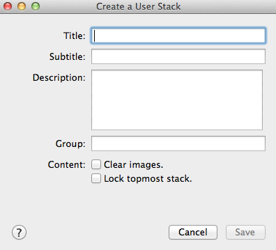
Perhaps my favorite new feature and one that is very useful for RW users who have multiple projects is the User Stack generator.

User Stack

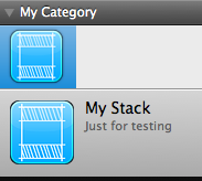
When clicked on a pop up box appears. Create a title and subtitle, which will display as text on the stack icon. Also be sure to add a group – this could either be a grouping for all your custom stacks, by project, by your own personal categories, etc. The grouping is the expandable section that will appear in the drop down that contains all your stacks.

Example User Stack

Here is an example of a stack I created. The title is ‘My Stack’, the subtitle is ‘Just for testing’, and the grouping is ‘My Category.’

Very cool new features so I hope you can find out about them quick and begin using them 🙂

Stacks Grouping Change

A while back we received several requests to separate our Stacks into groups as some of our users had a ton of them and they could be hard to sort through. However, we’ve now had a ton of requests to do away with this change, so we’ve heard your voices and we’re returning back to a single group title. This will be a process so give us a bit of time with it – we’ll likely prioritize some new releases and updates, but we’ll get things moved over :).

The original Stack group was 1LD Stacks – this is the group we’ll return to.

The new groups that will be done away with are as follows:

  • 1 Little Designer
  • 1 Little Designer – cleanSuite (all our general use stacks)
  • 1 Little Designer – Simple Series (all our free stacks)
  • 1 Little Designer – Augment Complete (all our CSS3 animation/display stacks)


SPARKLE

SPARKLE Update 2

In the second round of updates all the following Stacks are now SPARKLE ready.

  • Simple Buttons Free
  • cleanAccordion
  • cleanTabs
  • cleanQuotes
  • cleanCaps
  • cleanLists
  • Control Panel
  • Juice Box

As mentioned in the last blog, many Stacks are also re-categorized in your Stacks section depending on certain Stack categories we’ve created. Categories right now include: 1 Little Designer, 1 Little Designer – Simple Series, 1 Little Designer – cleanSuite, 1 Little Designer – Augment Complete.

To update please use our Purchase Order Lookup page… for the last time when it comes to Stacks most likely 🙂

Due to the update please remove your previous version of the Stack – note that this can cause all previously edited website’s using that stack to require being added again and customized. Please backup any information.

To delete previous Stacks simply click on them, then in the gear icon below select “Show in Finder” then remove the Stack.

Sorry for the inconvenience in that – it shall not happen again 🙂

SPARKLE

SPARKLE Update 1

In the first round of updates all the following Stacks are now SPARKLE ready.

  • Simple Buttons Pro
  • Simple Videos
  • Simple Divider
  • Simple Text
  • Cyklone Links
  • Cyklone Pix
  • Parallax Stacks

Many Stacks are also re-categorized in your Stacks section depending on certain Stack categories we’ve created. Categories right now include: 1 Little Designer, 1 Little Designer – Simple Series, 1 Little Designer – cleanSuite, 1 Little Designer – Augment Complete.

To update please use our Purchase Order Lookup page… for the last time when it comes to Stacks most likely 🙂

Due to the update please remove your previous version of the Stack – note that this can cause all previously edited website’s using that stack to require being added again and customized. Please backup any information.

To delete previous Stacks simply click on them, then in the gear icon below select “Show in Finder” then remove the Stack.

Sorry for the inconvenience in that – it shall not happen again 🙂

Consolidate CSS

What is it?

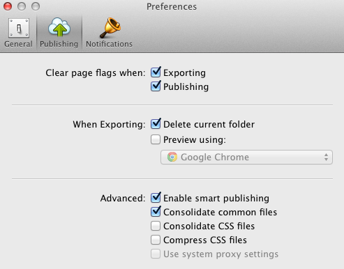
The Consolidate CSS option can be found in the RapidWeaver > Preferences section as a Publishing > Advanced option.

Consolidate CSS

By default RapidWeaver will not consolidate your CSS files.

If selected, all your CSS files will be combined into one CSS file. This works well with RapidWeaver’s built-in themes, but can cause major conflicts with 3rd party developers’ themes and more specifically with those that have a high amount of customization options.

What Use It?

The only reason, that I’m aware of, why anyone would like to use this option is entirely due to Internet Explorer’s (IE) nonsensical structure. IE is the only mainstream browser on the market that limits the amount of stylesheets that can be called within a single webpage. If you go over that limit, 31 stylesheets, all additional stylesheets (32 and up) will be completely ignored.

Well of course Microsoft has realized this problem and made sure to stop such nonsense in the latest versions of IE (8, 9, 10) right? NOPE! They haven’t – nothing has changed in this area. If you’re running IE6 or IE10 you are still limited to this archaic rule. Will they ever fix this? My guess is no, because they don’t care at all about their customers or developers as you might have noticed, whether you follow any of their products (i.e. Windows, Office, XBox, etc).

My Recommendation

If you’re using a browsers with built-in code inspecting tools, my favorite being Chrome, you can right click and select “Inspect Element,” which will bring up a section in your browser where you can view the code. If you go to “Resources” you can see all the stylesheets that are being called in.

I recommend that if this amount is not over 31 then you really have no reason to consolidate CSS.

A majority of our themes often contain a stylesheet count somewhere in the lower 20’s. Why so many? RapidWeaver structure requires theme style options to work largely by alternating between different stylesheets – in other words, it’s just the way RapidWeaver is built.

What if I have a ton of Stacks on a page? No worries there – Stacks already consolidates the CSS, so if you have one stack or several there is still only a single stylesheet being called in.

twitterConnect Rapidweaver Stack Icon

twitterConnect Offline Due to Major API Change

Twitter’s API has been at version 1.0 for some time and gone through little to no changes since Twitter released (from what I could fine).

A new API, version 1.1, released within the last 24 hours, which will cause anything (Theme, Plugin, Stack, etc) that uses the old API to fail – unless they were prepared with the new API, which I’m guessing few were.

For 1 Little Designer this means only that our twitterConnect Stack is current not operating, though we hope to have this fixed asap.

We also advice any business website’s that rely or weigh heavily any 3rd party Plugins or Stacks that use Twitter to check and make sure things are functioning… if not, likely the developer is working to fix this, but you may want to check in periodically.

Read a larger article by someone who explains this all in more depth.

1LD Forum Support

New Forum Based Support

To help best facilitate the customer service for all our customers we have created a very awesome and fully responsive forum support page.

Creating an account is quick and painless. It will generate a password for you automatically that you’ll receive in your confirmation e-mail. Once you log in you can easily change the password to whatever you like.

In addition to answering tech support questions the page will also be used as a Knowledgebase and FAQ archive.

You can create an account for better tracking of previous tech support questions, though one is not required for asking forum based questions.

Go check it out!

Update & Tutorials Added

cleanLists & cleanResponse now both have video tutorials located on their respective tutorial page. In addition, you can find these videos on our YouTube channel.

A small update to cleanLists also attempts to fix the standard bullets from appearing, which would occur in some themes. An unneeded file was also removed.

Internet Explorer 10 Released

If the headline of this post didn’t interest you much then hats off to you – you’ve probably realized that Microsoft’s onslaught of advertisements, as impressive as they were, had little to no truth in them and the Internet Explorer (IE) is perhaps the worst internet browser on the market. Perhaps you don’t use IE for another purpose though… there’s probably a slew of reasons not to use it.

If you are a developer IE 10 does move in the right direction now finally supporting much needed CSS3 effects that pretty much every other browser already supports. On top of that you’ll still need to code accordion to IE 9 because IE doesn’t automatically upgrade its users (in any versions of the browser) and IE 10 requires Windows 7.

The browser does run a tested 20% faster, though if you are running Windows XP and upgrade to 7 to get IE 10 then your Windows software will now be running about 20% slower (or worse), which means your browser may not be running faster at all and now your whole computer runs slower.

If you are not a developer and you already have Windows 7 then the upgrade is a “no brainer” and you should definitely go download it. Though I’m guessing you will not notice too much change. Maybe it will launch a tiny bit quicker and you will now be able to see some of the cool CSS 3 effects such as gradients and transitions (subtle animation effects). However, you still will not have access to inspect code elements like you can in most other browsers now, which is a huge downside in my opinion.

My recommendation – if you haven’t already just forget IE all together and go get Google Chrome.

If you just can resist though, go ahead and upgrade to IE 10.

Resources – SitePoint