Augment Reflect allows you to place images with an easily customizable reflection’s opacity and distance.
30% OFF Discount Code: 30_auReflect_082013
Offer Expires 8/24/2013
Augment Reflect allows you to place images with an easily customizable reflection’s opacity and distance.
30% OFF Discount Code: 30_auReflect_082013
Offer Expires 8/24/2013

Free flat styled browser icons.
Icons come as PNG images at 150×150 pixels.
or you can manually download from images below.


Ragnarok brings a minimal & modern design into a photography based site. Display beautiful and stunning backgrounds into a theme that has intuitive customization options & runs amazingly fast. Works on all modern browsers back to IE7.
30% Off Coupon Code: 30_ragnarok_082013
Expires Aug 16, 2013

Pop Box is a fully responsive product or Info Display Lightbox stack. Show off pretty much anything on your site in a beautiful and engaging way with subtle and beautiful animation transitions. Looks amazing on mobile devices too – be sure to check that out.
30% OFF Coupon Code: 30_popBox_082013
Expires Aug 16, 2013

We got enough requests to decide to build some web icons into easily editable Photoshop formats and pre-cropped png files so here’s our first two (more to come). To promote the web icons we’re giving a whopping 50% Off. Don’t like them? Give us feedback and let us know what you’d like to see. Illustrator files coming soon too.
50% OFF Discount Code: 50_webicons_082013
Expires Aug 16, 2013
Check out – Pure Business Web Icons
Check out – Small Business File Icons

Project management software becomes pretty dang important when you work with a team, though a lot of times teams don’t end up using them due to expense. Wouldn’t it be great if there was one that was competitive with the most popular project management web apps only it was Free? Well of course and you read the title of this blog already so you know where I’m going.
I first used Wiggio years back when it was a lot newer and still in its infancy – I tried it a little, but didn’t last to long. Years later I started using it again and gosh did they improve it. I’m loving it so dang much I wanted to share it all of you (I’m in no way affiliated with Wiggio and this is a non-sponsored posting).
Easily create schedule events, discussions, documents, to-do lists that are checked off, send text messages, and lots more. The best feature is the ability to control how often and to what you are e-mail alerted, so you can always stay up to date with your team’s discussions and also project progress. Heck you can even take anonymous polls to see what the team thinks about project details. Also, there is an iPhone app if you want to stay even further connected, though I find the website to be the best portal.
End the end, it’s still free, so give it a try and see if it’s a fit for your team.

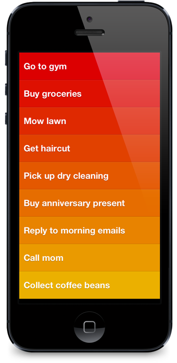 I’m somewhat of an organization nut – it’s so bad I usually fail to resist temptations to walk down organization isles when at stores even if I have no need or intent on purchasing something.
I’ve gone through quite a few organization and to-do apps. There’s the built-in ones like ‘Notes’ and ‘Reminders,’ and then other popular ones like Evernote, Paperless, and GoTasks. I got into some of these for a while, but over time would always resort back to my blank 3×5 cards, spiral bound flip books and traditional lined binder paper… heck even plain white printing paper. Like I said I’m an organization nut… when I gave that list of tangible organization tools there too I’m meaning that I would use them all simultaneously and for different things. I’m not even mentioning my various moleskins.
I still like good old ink on paper for some things, but when I tried Clear by RealMac I was pretty blown away… and no this is not a sponsored blog post (I really just like this app). First off, Clear is not more advanced that the other to-do list apps, there are no super amazing features that I was missing in my other to-do list apps. As a matter of fact, the opposite is almost the point, it was far far more simpler. I mean, to-do list apps are already pretty dang simple to begin with, but there was some intuitive aspect to clear that made things for comfortable and enjoyable.
I really thing the magic to it is just a few simple things:
I read some other reviews and hear some people whining about the steep price of $2.99, which is higher than probably most other to-do apps, but come on that’s like a bag a chips. Shovel out the few measly (insert your currency here) and check it out!

A super simple stack that gives users control over container element positioning.
A knowledge of CSS is helpful, but not necessary. The concept of positioning is very simple to understand and explained in our tutorial section – also described below.
You can then place any other stack inside of Simple Position.

Built to perfectly integrate with the Parallax Standalone stack for beautiful parallax effects as shown in the preview. Buy them both to take full control of a powerful parallax website, or just buy the theme (if you own the Parallax Standalone stack already). Tutorial will be out this Friday.
Want it for free? Check out our Hosting offer.
30% OFF Theme: 30_Asgard_072013
30% OFF Theme + Parallax Standalone: 30_Asgard_Para_072013
Expires August 2nd

Allows you to add Facebook integration, easily and seamlessly, to any RapidWeaver stacks page. Follow, Send, and Like buttons included as well as a Facebook commenting section.
30% OFF Discount Code: 30_fbConnect_072013
Expires August 2nd

In the second round of updates all the following Stacks are now SPARKLE ready.
As mentioned in the last blog, many Stacks are also re-categorized in your Stacks section depending on certain Stack categories we’ve created. Categories right now include: 1 Little Designer, 1 Little Designer – Simple Series, 1 Little Designer – cleanSuite, 1 Little Designer – Augment Complete.
To update please use our Purchase Order Lookup page… for the last time when it comes to Stacks most likely 🙂
Due to the update please remove your previous version of the Stack – note that this can cause all previously edited website’s using that stack to require being added again and customized. Please backup any information.
To delete previous Stacks simply click on them, then in the gear icon below select “Show in Finder” then remove the Stack.
Sorry for the inconvenience in that – it shall not happen again 🙂

In the first round of updates all the following Stacks are now SPARKLE ready.
Many Stacks are also re-categorized in your Stacks section depending on certain Stack categories we’ve created. Categories right now include: 1 Little Designer, 1 Little Designer – Simple Series, 1 Little Designer – cleanSuite, 1 Little Designer – Augment Complete.
To update please use our Purchase Order Lookup page… for the last time when it comes to Stacks most likely 🙂
Due to the update please remove your previous version of the Stack – note that this can cause all previously edited website’s using that stack to require being added again and customized. Please backup any information.
To delete previous Stacks simply click on them, then in the gear icon below select “Show in Finder” then remove the Stack.
Sorry for the inconvenience in that – it shall not happen again 🙂

Parallax Shift allows you to create Stack sections that can appear/disappear, cycle through images, or even change between different stacks. These events change on mouse scrolling as is typical in Parallax effects.
30% OFF Discount Code: 30_ParaShift_062013
Offer Expires July 5, 2013

Augment Mobile allows you to easily put stack content inside of an iPhone or iPad device. Images are fully responsive.
30% OFF Discount Code: 30_AugMobile_062013
Offer Expires July 5, 2013


cleanResponse now includes control of collapsing positions for screensizes. You can turn the collapsing off and for odd numbered columns you can choose if top or bottom sections collapse into full width.

Simple Buttons allows you to drag and drop buttons into any Stacks section – Modern browsers can take advantage of beautiful new CSS3 effects, such as rounded corners & gradients. Pro adds background image options, Font Awesome icons and Advanced options.
The Consolidate CSS option can be found in the RapidWeaver > Preferences section as a Publishing > Advanced option.
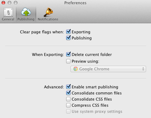
By default RapidWeaver will not consolidate your CSS files.
If selected, all your CSS files will be combined into one CSS file. This works well with RapidWeaver’s built-in themes, but can cause major conflicts with 3rd party developers’ themes and more specifically with those that have a high amount of customization options.
The only reason, that I’m aware of, why anyone would like to use this option is entirely due to Internet Explorer’s (IE) nonsensical structure. IE is the only mainstream browser on the market that limits the amount of stylesheets that can be called within a single webpage. If you go over that limit, 31 stylesheets, all additional stylesheets (32 and up) will be completely ignored.
Well of course Microsoft has realized this problem and made sure to stop such nonsense in the latest versions of IE (8, 9, 10) right? NOPE! They haven’t – nothing has changed in this area. If you’re running IE6 or IE10 you are still limited to this archaic rule. Will they ever fix this? My guess is no, because they don’t care at all about their customers or developers as you might have noticed, whether you follow any of their products (i.e. Windows, Office, XBox, etc).
If you’re using a browsers with built-in code inspecting tools, my favorite being Chrome, you can right click and select “Inspect Element,” which will bring up a section in your browser where you can view the code. If you go to “Resources” you can see all the stylesheets that are being called in.
I recommend that if this amount is not over 31 then you really have no reason to consolidate CSS.
A majority of our themes often contain a stylesheet count somewhere in the lower 20’s. Why so many? RapidWeaver structure requires theme style options to work largely by alternating between different stylesheets – in other words, it’s just the way RapidWeaver is built.
What if I have a ton of Stacks on a page? No worries there – Stacks already consolidates the CSS, so if you have one stack or several there is still only a single stylesheet being called in.
