Category : Reviews

RapidWeaver 6 Logo

RapidWeaver 6.3

RapidWeaver 6 keeps getting even more awesome

RapidWeaver 6.3 is a major new update, free to all RapidWeaver 6 customers.

The update includes even faster publishing, and a number of other great new features and enhancements. Along with it are several bug fixes that some of you might have been experiencing.

Be sure to get the update!

For more details click here

RapidWeaver Central

RapidWeaver Central (beta)

Some of you might have noticed that StacksCenter is no more… or rather it’s redirected to RapidWeaver Central’s StackCentral page.

For more information on the move and the New RapidWeaver Central Beta read here.

The move is likely a permanent one and serves as a great resource for checking out new RapidWeaver Stacks, Stack reviews, deals, and more.

Thanks also to Marten for the great and thorough Carousel Complete review.

Stacks 2.5.2

Stacks 2.5

Stacks 2.5 offers some very cool new features that every Stacks user should know about.

Note that you should make sure you’re running version 2.5.2 if you’re having any problems running Stacks (there were some brief bugs with certain Mac OS versions, but nothing that was not quickly patched).

Stacks 2-5 New Tools

After installing 2.5+ you’ll notice some new tool icons in the top right above the customization options.

Minimize Stack

The icon on the furthest lest (eye) minimizes stacks sections in the main editing section. This makes working on Stacks pages much easier when there are several stacks on a single page and when stacks take up a lot of vertical real estate.

Editing Display Sizes

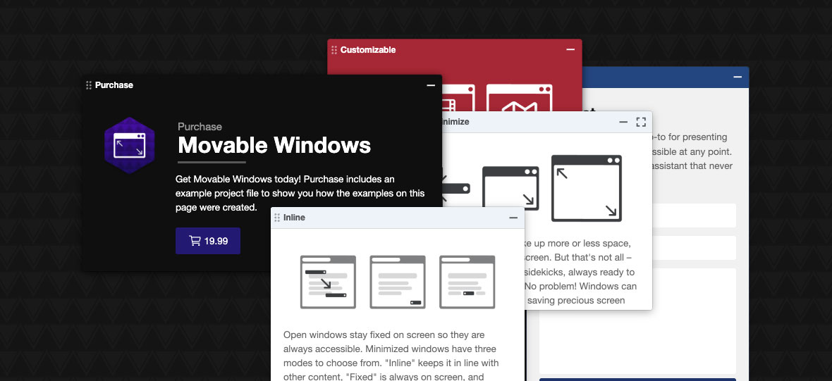
Depending on which display icon you have selected will depend on how much smaller the stack is made. In the screenshot above I have the largest display setting selected, which will show the minimized stack as dotted lines with the name of the stack centered. Selecting the middle icon will display the icon as dotted lines without the name and the icon on the furthest left will hide the stack entirely from view (not even clickable), which can really save visual space, but the only way to edit the stack again will be to select a larger viewing option again.

Lock Stack Customization

The lock icon simply locks all your customization settings. This option might be more useful if more than one individual was working on a page.

Create User Stack

Perhaps my favorite new feature and one that is very useful for RW users who have multiple projects is the User Stack generator.
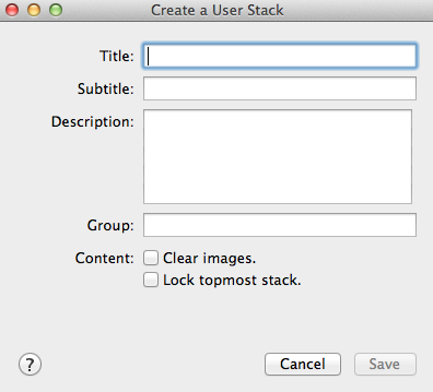
User Stack

When clicked on a pop up box appears. Create a title and subtitle, which will display as text on the stack icon. Also be sure to add a group – this could either be a grouping for all your custom stacks, by project, by your own personal categories, etc. The grouping is the expandable section that will appear in the drop down that contains all your stacks.
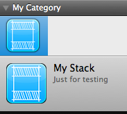
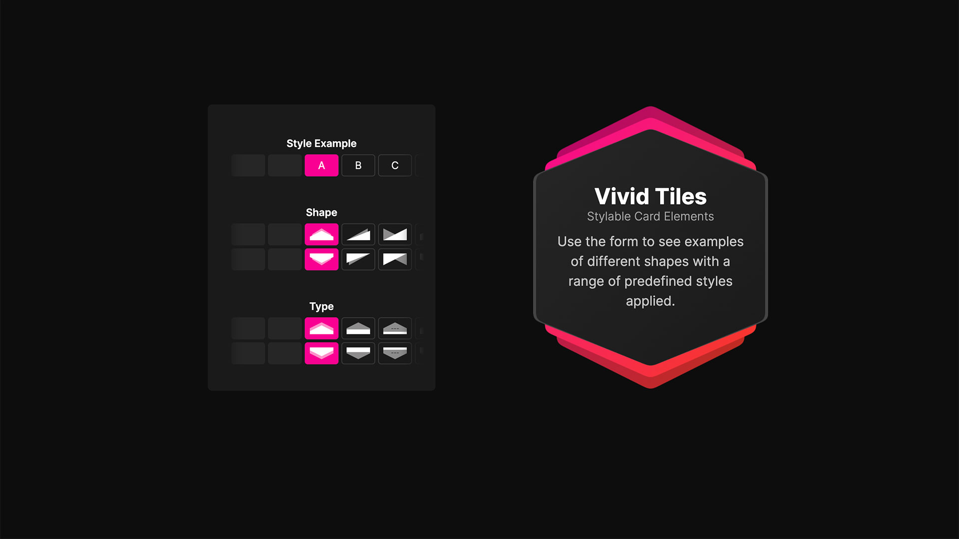
Example User Stack

Here is an example of a stack I created. The title is ‘My Stack’, the subtitle is ‘Just for testing’, and the grouping is ‘My Category.’

Very cool new features so I hope you can find out about them quick and begin using them 🙂

Wiggio Logo

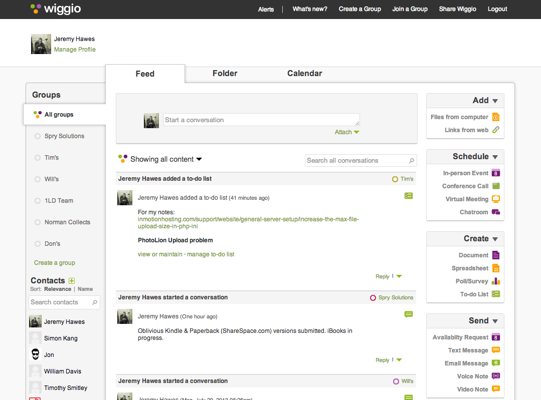
Wiggio – Free Project Management Web App

Project management software becomes pretty dang important when you work with a team, though a lot of times teams don’t end up using them due to expense. Wouldn’t it be great if there was one that was competitive with the most popular project management web apps only it was Free? Well of course and you read the title of this blog already so you know where I’m going.

I first used Wiggio years back when it was a lot newer and still in its infancy – I tried it a little, but didn’t last to long. Years later I started using it again and gosh did they improve it. I’m loving it so dang much I wanted to share it all of you (I’m in no way affiliated with Wiggio and this is a non-sponsored posting).

Wiggio Free Project Management Web App


Easily create schedule events, discussions, documents, to-do lists that are checked off, send text messages, and lots more. The best feature is the ability to control how often and to what you are e-mail alerted, so you can always stay up to date with your team’s discussions and also project progress. Heck you can even take anonymous polls to see what the team thinks about project details. Also, there is an iPhone app if you want to stay even further connected, though I find the website to be the best portal.

End the end, it’s still free, so give it a try and see if it’s a fit for your team.

Clear To-Do List iPhone App

Clear App Review

Clear App for iPhoneI’m somewhat of an organization nut – it’s so bad I usually fail to resist temptations to walk down organization isles when at stores even if I have no need or intent on purchasing something.

I’ve gone through quite a few organization and to-do apps. There’s the built-in ones like ‘Notes’ and ‘Reminders,’ and then other popular ones like Evernote, Paperless, and GoTasks. I got into some of these for a while, but over time would always resort back to my blank 3×5 cards, spiral bound flip books and traditional lined binder paper… heck even plain white printing paper. Like I said I’m an organization nut… when I gave that list of tangible organization tools there too I’m meaning that I would use them all simultaneously and for different things. I’m not even mentioning my various moleskins.

I still like good old ink on paper for some things, but when I tried Clear by RealMac I was pretty blown away… and no this is not a sponsored blog post (I really just like this app). First off, Clear is not more advanced that the other to-do list apps, there are no super amazing features that I was missing in my other to-do list apps. As a matter of fact, the opposite is almost the point, it was far far more simpler. I mean, to-do list apps are already pretty dang simple to begin with, but there was some intuitive aspect to clear that made things for comfortable and enjoyable.

I really thing the magic to it is just a few simple things:

  • beautiful colors and themes
  • subtle, yet very enjoyable sounds and animations (the sounds are so cool I literally make sure my phone is not on vibrate when I use this app… sounds silly I know, but my co-worker does the same thing so if I’m crazy he is too)
  • progress unlocks more themes (I honestly love the default theme the most, but it does feel good to get rewarded for using it)

I read some other reviews and hear some people whining about the steep price of $2.99, which is higher than probably most other to-do apps, but come on that’s like a bag a chips. Shovel out the few measly (insert your currency here) and check it out!