Bridge (Anamorphic) from Andrew Reid on Vimeo.
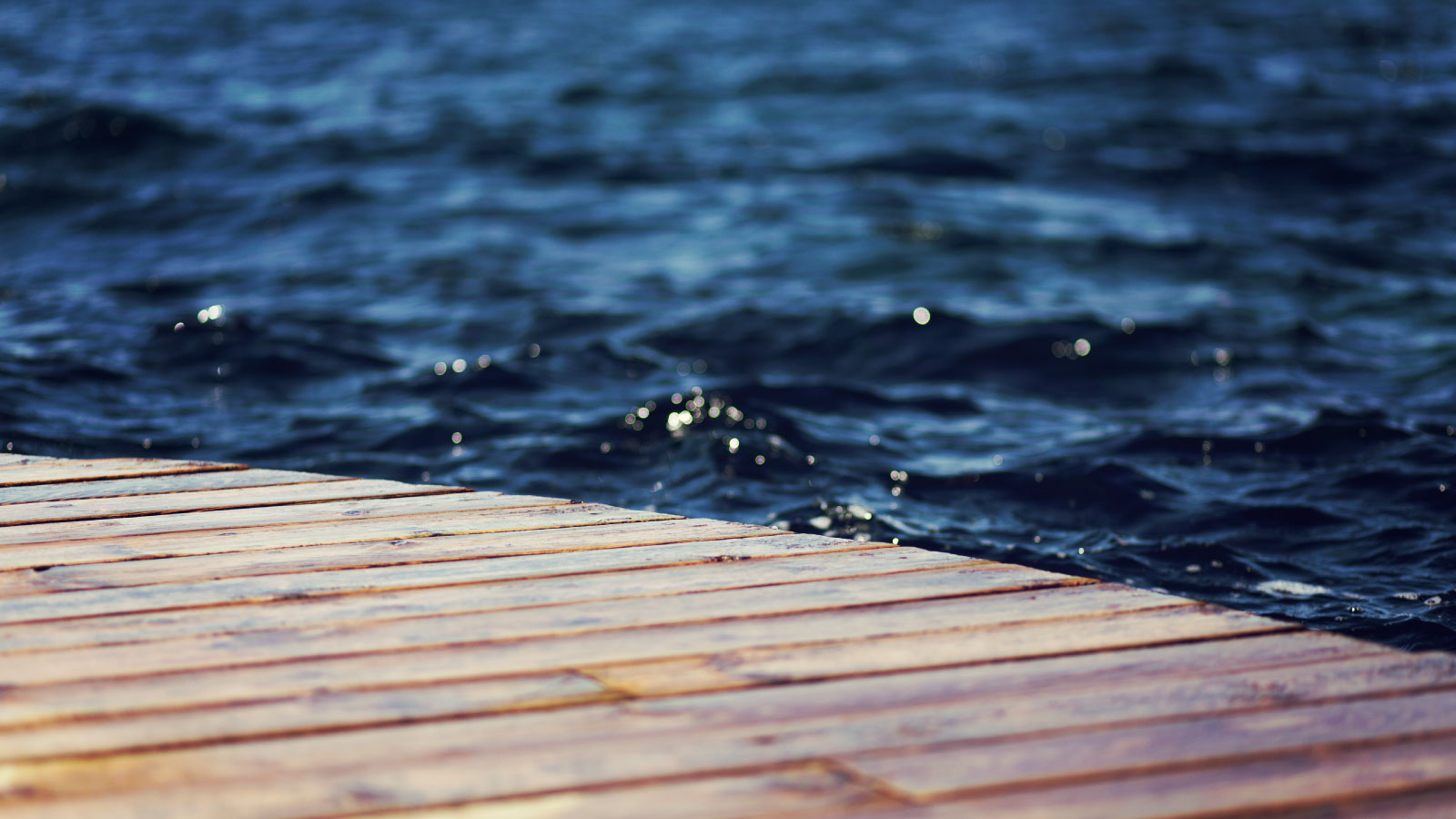
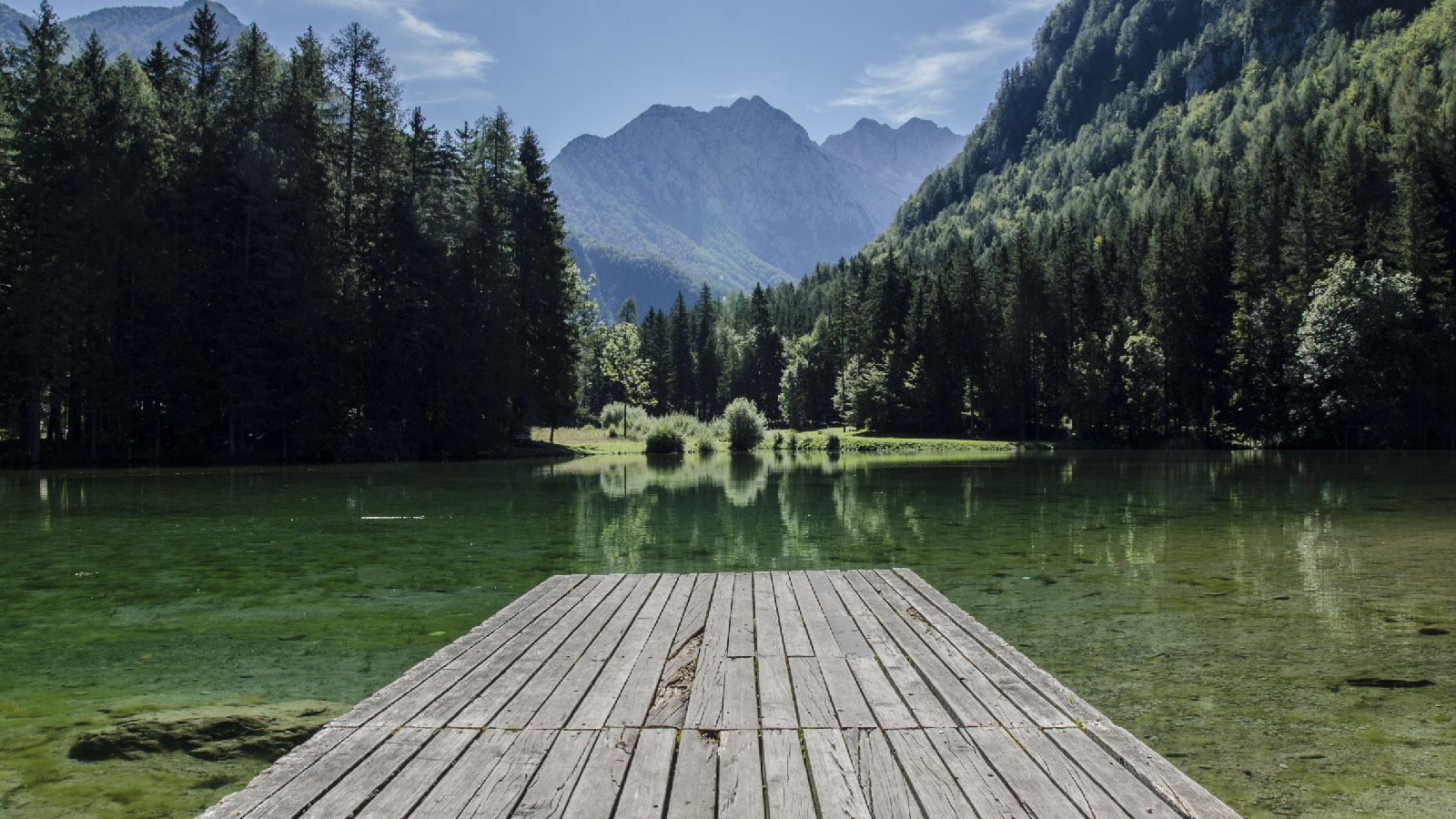
SLIDER
Possibly the easiest slider to use in RapidWeaver - simply include the word "slider" into your images name the Affero will make it a slider and in the same order as you place them on the page. Affero's slider is also fully responsive and supports video.
TEXTURES
Packed with 16 awesome textures including some that were built to include any color for a backdrop. Each page comes built with 3 different sections to call in textures.
LIGHTBOX
Like the simplicity of the slider? Good, we added it to our Lightbox too! Simply add the word lightbox into any image name on ANY page and it will function as a Lightbox. Additionally, the alternate text will automatically serve as the title for the pop-up.
NEW FONTS
9 built-in fonts gives an engaging and professional experience to your readers that are customized to be consistent with the theme's layout and can be set on headers and main content sections.
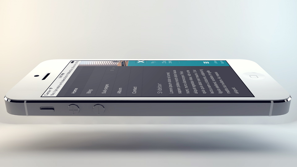
LAYOUTS
6 different layout widths that are all fully responsive, which include a full width option and the option to collapse the menu into a button (this automatically occurs for smaller devices and is touch ready).
MORE ICONS
Affero comes loaded with Font Awesome 4.2, which includes 479 icons. Affero also includes 25MB+ of detailed & fully colored web icons.
Magnific Popup Lightbox
App style Menu
Affero was designed specifically with small, mobile, & touch screens in mind (as well as large desktop screens), so that it will look great on any device. The powerful menu automatically collapses behind on tablets & mobile devices leaving space for your site’s content. With sleek animations & easy touch friendly sub-page navigation, this menu is the best for an app look-alike website.
