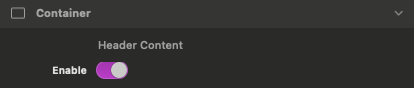
Container
The Pick a Card component includes a stylable background container that wraps the card elements. It also serves as a clipping boundary for cards that are shifted out of focus.
Add Container Content
Header Content
Found in the Inspector Settings Panel > Container section. When toggled it will reveal a content dropzone in the header of the container above the cards.
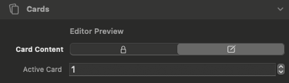
Cards
Cards are the main items in this component. Use the editor controls below to select a card, edit its content, and adjust its appearance.
Edit Card Content
Editor Preview: Card Content
Found in the Inspector Settings Panel > Cards section. When toggled it will move a single card into view and allow you to edit the content.
Active Card
This input field lets you choose a card by number. The corresponding card appears so you can edit its content.
The Card Content toggle must be used to enable selecting and editing any card content.
Add & Remove Cards
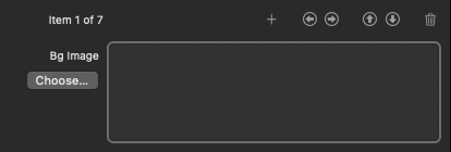
Item Collection
This collection field allows you to add new cards, select and delete cards, and swap background images between cards.
Add new item
Use the plus icon to add new items.
Select previous item
Select next item
Delete selected item
Use the left and right select item arrows to choose which item to delete then click the trash can icon to delete it.

The Item Collection field select arrows are NOT used to select a card to edit content.
Define Individual Card Background Colors & Images
Bg Image
This image field allows you to optionally add a background image to the item selected in the Item Collection field.
Select previous item
Select next item
Use the left and right select item arrows to change which item background you are currently editing.
Swap with previous item
Swap with next item
Use the swap item arrows to change what card the background applies to.
The swap item arrows only affect background image and overlay. Card content will not be swapped.
Bg Overlay
This color field allows you to optionally add a color overlay on top of the background image.
Overlay Opacity
This slider adjusts the opacity of the background color overlay.
Setting the value to 100% will apply the overlay as a solid color background.
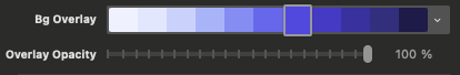
The Bg Overlay does not apply unless the opacity is greater than 0.
The remaining settings apply to all cards in a collection.
Adjust Card Dimensions & Alignment
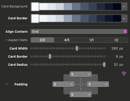
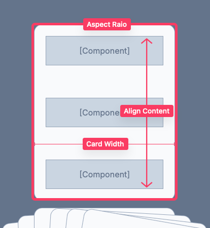
Align Content
This select field changes the vertical alignment of the card content.
Aspect Ratio
Choose an option to change the outer dimensions of the cards. This value is used to determine the height of the cards.
Use the right most option to define your own custom aspect ratio.
Card Width
This slider allows you to adjust the width of the cards. The height is determined by the selected Aspect Ratio.
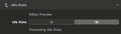
Idle State
The idle state is the default card layout before the user interacts with the component.
Preview Idle State
Editor Preview: Idle State
Found in the Inspector Settings Panel > Idle State section. When toggled the cards will display in their idle position.
It’s best to toggle this on when editing the Idle State appearance to see the changes in real time.
Adjust Idle State Appearance
Appearance
Fanned
This option displays the cards spread out in the horizontal direction when idle.
Stacked
This option displays the cards stacked overtop of each other when idle.
Use this if you want a cleaner resting state when the user isn’t interacting or you want the cards to look less busy and more compact.


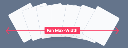
Fan Max-Width
Available when Appearance is set to Fanned. This slider adjusts the outer width of the fanned cards.
If the defined max-width is larger than the available space, the cards will scale down to fit.
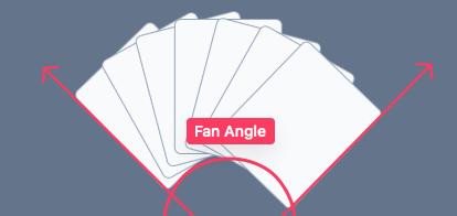
Fan Angle
Available when Appearance is set to Fanned. This slider adjusts the overall angle of the fanned cards in the idle state.
Stack Depth X
Available when Appearance is set to Stacked. This slider adjusts offset of the cards in the horizontal direction.
Adds a tiny sideways shift between stacked cards (creates a layered depth effect). Higher = more “spread” side-to-side.

Stack Depth Y
Available when Appearance is set to Stacked. This slider adjusts offset of the cards in the vertical direction.
Adds a tiny up/down shift between stacked cards. Higher = more “spread” vertically.

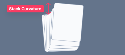
Stack Curvature
Available when Appearance is set to Stacked. This slider adjusts the height of the up and down curvature of the stacked cards.
Adds a subtle curve to the stacked layering so it feels more natural. Negative values create a downward curve. Positive values create an upward curve.
Stack Fan Angle
Available when Appearance is set to Stacked. This slider adjusts the overall angle of the stacked cards in the idle state.

Offset & Clip
This slider controls how much the cards are pushed downward and clipped by the bottom edge of the outer container.
Use this if you want the cards to have a more pronounced animation with more visual appeal.

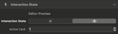
Interaction State
The interaction state is when the cards have been hovered by a cursor or when the navigation slider is being dragged.
Preview Interactive State
Editor Preview: Interaction State
Found in the Inspector Settings Panel > Interactive State section. When toggled the cards will display in their interactive position.
It’s best to toggle this on when editing the Interaction State appearance to see the changes in real time.
Active Card
This input field allows you to choose a card by number. The corresponding card will be shown in an active hovered over position.
Adjust Interactive State Appearance
Fan Max-Width
Available when Appearance is set to Stacked. This slider adjusts the outer width of the fanned cards in the interactive state.
Fan Angle
Available when Appearance is set to Stacked. This slider adjusts the overall angle of the fanned cards in the interactive state.
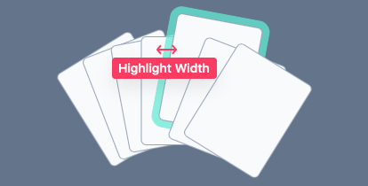
Highlight Width
This slider adjusts the thickness of the highlight ring that appears around hovered cards.
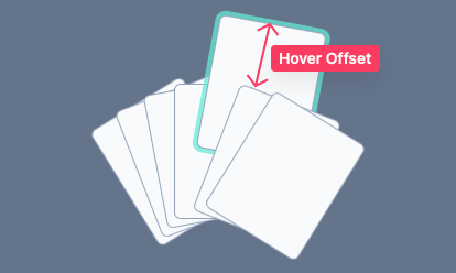
Active Offset
This slider adjusts the distance a card shifts upward when hovered over.
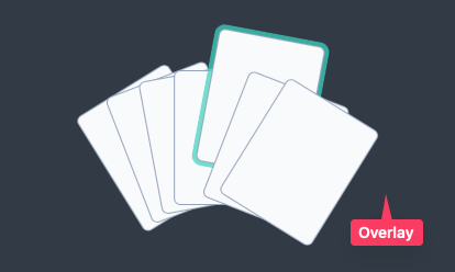
Overlay & Overlay Opacity
This color field allows you to apply an overlay over the container behind the cards.
This overlay displays over the content added to the container and brings the cards into clearer focus.
Animation Speed
This slider adjusts the overall animation speed of the state transitions.
Faster (150ms) = snappier UI feel, better feedback and usability. Slower (500ms) = smoother, more “premium” motion.
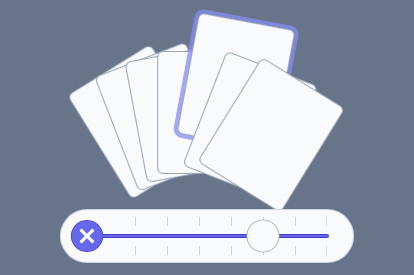
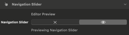
Navigation Slider
The Navigation Slider provides a consistent scrolling interface for cards, especially on touch devices which do not support cursor hover interactions.
Preview Navigation Slider
Editor Preview: Navigation Slider
Found in the Inspector Settings Panel > Navigation Slider section. When toggled the navigation slider will be visible.
It’s best to toggle this on when editing the Navigation Slider colors.
Switch to Slider Navigation
Navigation Slider: Enable
Touch Only
The option only enables the Slider Navigation for touch devices where cursor interactions are not supported.
Touch & Click
This option disables all cursor interactions and always displays the Navigation Slider.
Use this if you want one consistent behavior across all devices or you have many cards and prefer “scroll/slide” navigation.