Introduction
Basic setup
The fastest way to use the component is to treat it as a motion wrapper around content you already have. Add the component, drag in an existing layout, and you are basically done.
1.
Add the component
Drag the Perspective Motion component onto the page anywhere you want to add the effect.
2.
Drop in content
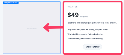
Drag an existing element layout into the component’s content zone. Element layouts that wrap headings, tags, paragraphs, lists, links, and images all work well.
3.
Pick a mode and refine
Choose a mode and a preset for quick and easy setup or customize the effect with the settings described in the Settings Panel section below.
How motion works
Modes
There are 3 modes to choose from and they define what controls the motion of the component.
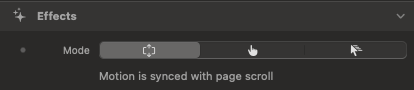
Scroll
The scene responds to page scroll. This is the most configurable mode.
Hover
On cursor devices it behaves like an on-hover reveal. On touch-only devices it behaves like an in-view entrance animation.
Follow
The motion follows the cursor. X and Y movement control the tilt, cursor distance affects depth.
Scroll
Hover
Follow
Motion states
When using Scroll or Hover mode, motion transtions betwen 2 to 3 different states.
Enter / Idle
This is the state before focus, when the component has not entered the viewport yet. For Hover mode it is when the cursor is not over the component.
Focus / Hover
This state is when the component is near or at the center of the viewport. For Hover mode it is when the cursor is over the component.
Exit
This is the state after focus, when the component has scrolled out of the viewport.
This state only exists in Scroll mode.
Tiers
To create a pronounced 3D effect, elements are assigned tiers to offset them in 3D space. Tiers are automatically assigned to headings, tags, paragraphs, lists, links, and images within the content layout.
Tier 1
Typically headings. Furthest forward.
Tier 2
Tags, paragraphs, lists, and surfaced blocks.
Tier 3
Supporting links and smaller utility elements.
Non-tiered
Images and other elements. Appear flat inline with the background of the layout.
Non-tiered
Tier 1
Tier 2
Tier 3
Non-tiered
Choosing a mode
Mode
Chose how the motion of the component is determined.
Scroll
Motion is synced with page scroll.
Hover
On cursor devices the motion executes on hover. On touch-only devices it behaves like an on-view entrance.
Follow
Motion follows cursor movement. On touch-only devices the scene returns to focus whenever the screen is not actively touched.
Scroll Mode
Motion Settings
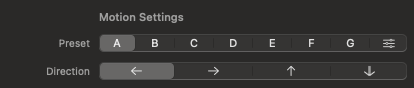
Preset
Presets quickly load a full motion recipe. They set tilt, rotation, depth, opacity, and focus-window behavior for you. Select the Custom option when you want direct control.
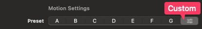
A
B
C
D
E
F
G
Direction
Changes the direction of the preset’s motion when moving from the Enter state to the Focus state.
This is only for presets. In Custom mode, you set each axis directly instead.
Exit Motion
Exit Motion decides what happens after focus:
Continue
Motion continues past the Focus state into a defined Exit state.
Freeze
Motion stops at the Focus state and holds there instead of animating into an Exit state.

Continue
Freeze
Custom Preset Settings
Enter
The sliders under this heading define the position the component transitions from when moving to the Focus state.
Focus
The sliders under this heading control the component position at focus. If all are zero, the scene becomes fully flat at focus. If not, focus can still retain angle and personality.
Exit
The sliders under this heading define the position the component transitions to when moving from the Focus state.
These sliders are only available if Exit Motion is set to Continue.
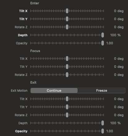
Tilt X
Controls the rotation of the component along the horizontal axis. Positive values rotate the component clockwise or backwards while negative values rotate it counter-clockwise or forwards.
Tilt X
-80deg to 80deg
Tilt Y
Controls the rotation of the component along the vertical axis. Positive values rotate the component clockwise or to the right while negative values rotate it counter-clockwise or to the left.
Tilt Y
-80deg to 80deg
Rotate Z
Controls the 2D or planar rotation of the component. Positive values rotate the component clockwise negative values rotate it counter-clockwise.
Rotate Z
-20deg to 20deg
Depth
Controls how far the component shifts away fromt he viewport in 3D space. Higher values make the component appear farther away.
Only available for Enter and End states.
Depth
0% to 100% to 0%
Opacity
Sets the opacity the component transitions from when moving into the Focus state. 1 means fully visible.
Only available for Enter and End states.
Opacity
0 to 1 to 0
Focus Window Settings
Size
Controls the vertical size of the focus window. The focus window is the area where the component is considered to be in the Focus state. Use longer values to broaden the Focus state. Use Single Point to essentially remove the focus window.
Only available when using the custom preset.
Single Point
Short
Moderate
Long
Extra Long
X Y & Z Motion
Defines how much motion there is while the component is in the Focus state. Use heavier values to increase the intensity of the motion on that axis. Use Freeze to completely stop all motion on that axis.
Only available when using the custom preset.
Freeze
Light
Moderate
Heavy
Extra Heavy
Hover Mode
Motion Settings
Preset
Presets quickly load a full motion recipe. They set tilt, rotation, depth, opacity, and focus-window behavior for you. Select the custom option when you want direct control.
A
B
C
D
E
F
G
Direction
Changes the direction of the preset’s motion when moving from the Initial state to the Focus state.
This is only for presets. In Custom mode, you set each axis directly instead.
Motioin Duration
Controls how long the transition takes in milliseconds. Use short values for snappy motion and longer values for motion that feels more dramatic.

200ms
800ms
1600ms
3000ms
Custom Preset Settings
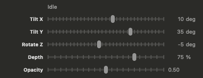
Idle
The sliders under this heading define the default position the component and where it transitions from when moving to the Hover state.
Tilt X
Controls the rotation of the component along the horizontal axis. Positive values rotate the component clockwise or backwards while negative values rotate it counter-clockwise or forwards.
Tilt Y
Controls the rotation of the component along the vertical axis. Positive values rotate the component clockwise or to the right while negative values rotate it counter-clockwise or to the left.
Rotate Z
Controls the 2D or planar rotation of the component. Positive values rotate the component clockwise negative values rotate it counter-clockwise.
Depth
Controls how far the component shifts away fromt he viewport in 3D space. Higher values make the component appear farther away.
The component will also transition to this depth when the compontent is activly being clicked.
Follow Mode
Intensity Settings
Tilt X
Controls how much the component tilts vertically toward or away from the pointer.
Tilt Y
Controls how much the component tilts horizontally toward or away from the pointer.
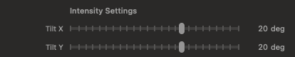
Positive Tilt values point toward the cursor. Negative Tilt values point away.
Toward
20deg Tilt X & Y
Away
-20deg Tilt X & Y
Rotate Z
Adds a small rotational twist while following the pointer.

-10deg Rotate Z
10deg Rotate Z
Depth
Controls how much the component is shifted away from the viewport in 3D space when the cursor is away from the component.

100% Depth
50% Depth
Focus Point
Controls where the cursor must hover over the component to determine when it is considered fully in focus.
Center
When the cursor is over the exact center of the component, no tilt, rotation or depth will be applied.
Edges
When the cursor is over any part of the component, no tilt, rotation or depth will be applied.

Edges
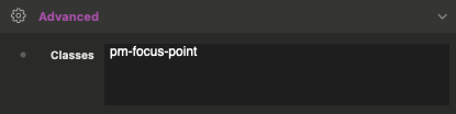
Manually assigning a focus point
By default, the Focus point is assigned to the entire component. You can manualy assign the focus point by adding the following class to an element within the component.
pm-focus-point
The Focus Point "center" or "edges" options will be calculated using the element with this class instead of the entire component.
Default
Default
Default
Default
pm-focus-point
pm-focus-point
x
All Modes
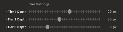
Tier Settings
Tier 1-3 Depth
Tiers control how far different content elements sit forward in 3D space.
0px
120px
60px
30px
0px
Manually assigning tiers
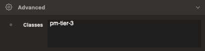
Tiers are assigned automatically. You can manualy assign or override them by applying any of the following classes to an elment within the component.
pm-tier-1
Asigns an element to tier 1. If added to an element that was automatically assigned a tier it will override it.
pm-tier-2
Asigns an element to tier 2. If added to an element that was automatically assigned a tier it will override it.
pm-tier-3
Asigns an element to tier 3. If added to an element that was automatically assigned a tier it will override it.
pm-tier-off
If added to an element that was automatically assigned a tier it will remove it from from all tiers and appear flat.
Previewing states in the editor
Editor Preview: State
Changes the 3D position of the component in the editor to match the selected state.
This setting does not change the final front-end behavior and just helps you preview different states inside the editor.
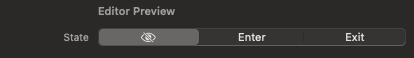
Scroll mode
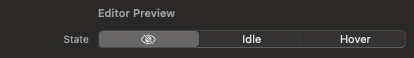
Hover mode
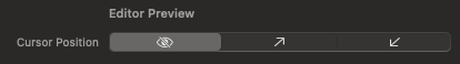
Editor Preview: Cursor Position
Changes the 3D position of the component in the editor to match the location of the cursor in relation to the component.
This setting does not change the final front-end behavior and just helps you preview different positions inside the editor.
Follow mode