Sweep is a unique RapidWeaver theme that allows you to build one page websites. In order to make this possible we have created simple to use stacks that you can use to make the different sections of your one page website.
Note: Sweep requires that you have the Stacks Plugin. More info about stacks here.
Adding Sweep Page Stacks
After you have created a new Stacks page. Open the Stacks library and locate the “Sweep Page” stack.

Drag and drop the “Sweep Page” stack into the Stacks editor to add a new section to your one page website.
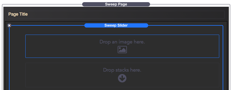
Once the stack is in the editor you will see a section at the top that reads “Page Title”. Double click this section to change the title. This title is what will display in the navigation menu.
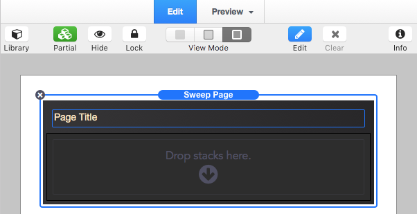
In the “Drop stacks here” section located under the title add any other stacks (text, images, other 3rd-party stack, etc) to build and add content to your Sweep section. Then repeat these steps to add more sections to your website. Each “Sweep Page” stack has additional settings (found in the sidebar) that you can customize.
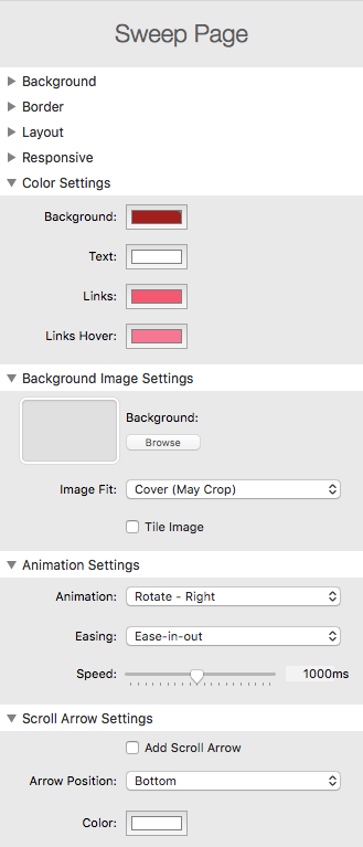
Background Image Settings
Image Fit – Adjust how the background image fits into the browser window.
Tile Image – This option will set the background image to repeat which is useful for texture images. Note: You will want to set the “Image Fit” option to “Actual Size” if you enable this option.
Animation Settings
Animation – This option will let you choose between 17 animations that will effect how the current page will animate out when the next page is navigated to.
Easing – This option allows you to adjust how quickly/slowly the beginning/end of the animation runs.
Speed – This sets the width of the caption content (in pixels) if you have added any.
Scroll Arrow Settings
Add Scroll Arrow – Enabling this option will force a navigation arrow to appear on the page. By default, the scroll arrow is automatically be added to pages who’s content needs a scroll bar. This is to prevent visitors from accidentally going to the next page when scrolling to the bottom of the current page.
Arrow Position – This option allows you to place the arrow on the bottom, left, or right of the window. This option also effects the automatically added scroll arrow.
Color – This will adjust the color of the scroll arrow. This option also effects the automatically added scroll arrow.
Adding An Image Slider or Slideshow
Open the Stacks library and locate the “Sweep Slider” stack.
Drag and drop the “Sweep Slider” stack into a “Drop stacks here” section found inside of a “Sweep Page” stack.
In the settings menu on the left select the number of slides you would like to display. Then simply drag and drop your images into the “Drop an image here” sections. You can optionally add text stacks to the “Drop stacks here” sections to add captions to each slide.
There are some additional settings that you can use to customize your slider.
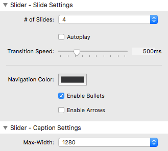
Autoplay – Enabling this option will make the slider automatically transition between the slides.
Transition Speed – This option sets how fast (in milliseconds) the transition animation will play.
Enable Bullets – Enabling this will display a navigation dot for every slide at the bottom of the slider. If a user clicks on one of these dots the slider will navigate to the corresponding slide.
Enable Arrows – Enabling this will display navigational arrows to the left and right of the slider.
Max-width – This sets the width of the caption content (in pixels) if you have added any.
Adding Extra External or Internal Links to the Navigation Menu
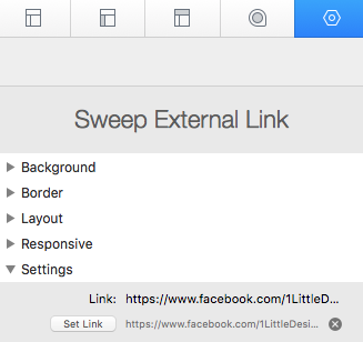
Open the Stacks library and locate the “Sweep External Link” stack.
Drag and drop the “Sweep External Link” stack either at the very top or very bottom of your stack editor.
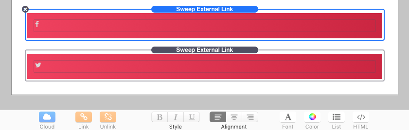
Click the “Set Link” button in the sidebar settings to set where you would like the external link to navigate to.
Using Font-Awesome Icons in the Navigation Menu
If you would like to use Icons instead of text or bullets in your navigation menu just place the Font Awesome code in-place of the page title. For example if I wanted to use a home icon instead of the word “Home” in my menu I would replace the title with the code below.
1 |
<i class="fa fa-home"></i> |
I would then highlight that code and select “Ignore Formatting” from the Format drop-down menu. For more information on Font Awesome’s Icons and for a complete list of icons vist: http://fontawesome.io/examples/
NOTE: Sometimes the editor will change your ” straight quotation marks into ” curly quotation marks. The curly quotation marks will cause the menu to not work. To change them from curly to straight just delete the quotes and retype them.
How To Enable Lightbox on an Image
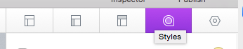
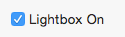
Step 1: Navigate to your Page Inspector > Styles Menu and enable the Lightbox by selecting checking the ‘Lightbox On’ checkbox under the Toggles heading.
 ->
->  ->
-> 
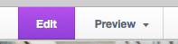
Step 2: View your project in Edit mode by clicking the edit button.
Step 3: Import or drag and drop an image into your editor.
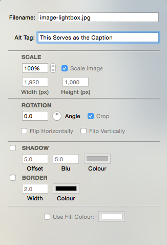
Step 4: Double click the image and in the popup menu change the Filename to something that includes the word ‘lightbox’. You can also change the Alt Tag to set what will display as a caption for the image.
How To Add A Button
Step 1: Type in your desired button text into your editor and highlight the text.
Step 2: click the Add link button.
Step 3: Add a link to where you would like the button to navigate to and then add a ‘class’ with the value ‘button’.
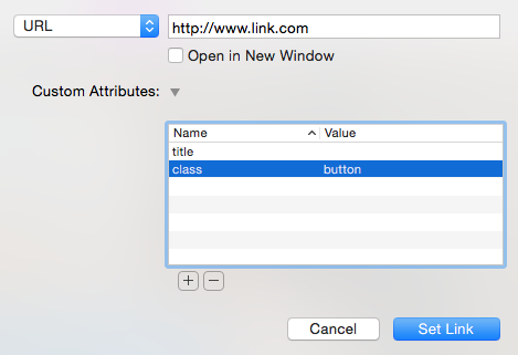
Step 4: Click ‘Set Link’ and you are done.